Dollar Heads Higher, Euro Lower
Author: Bruce Liegel
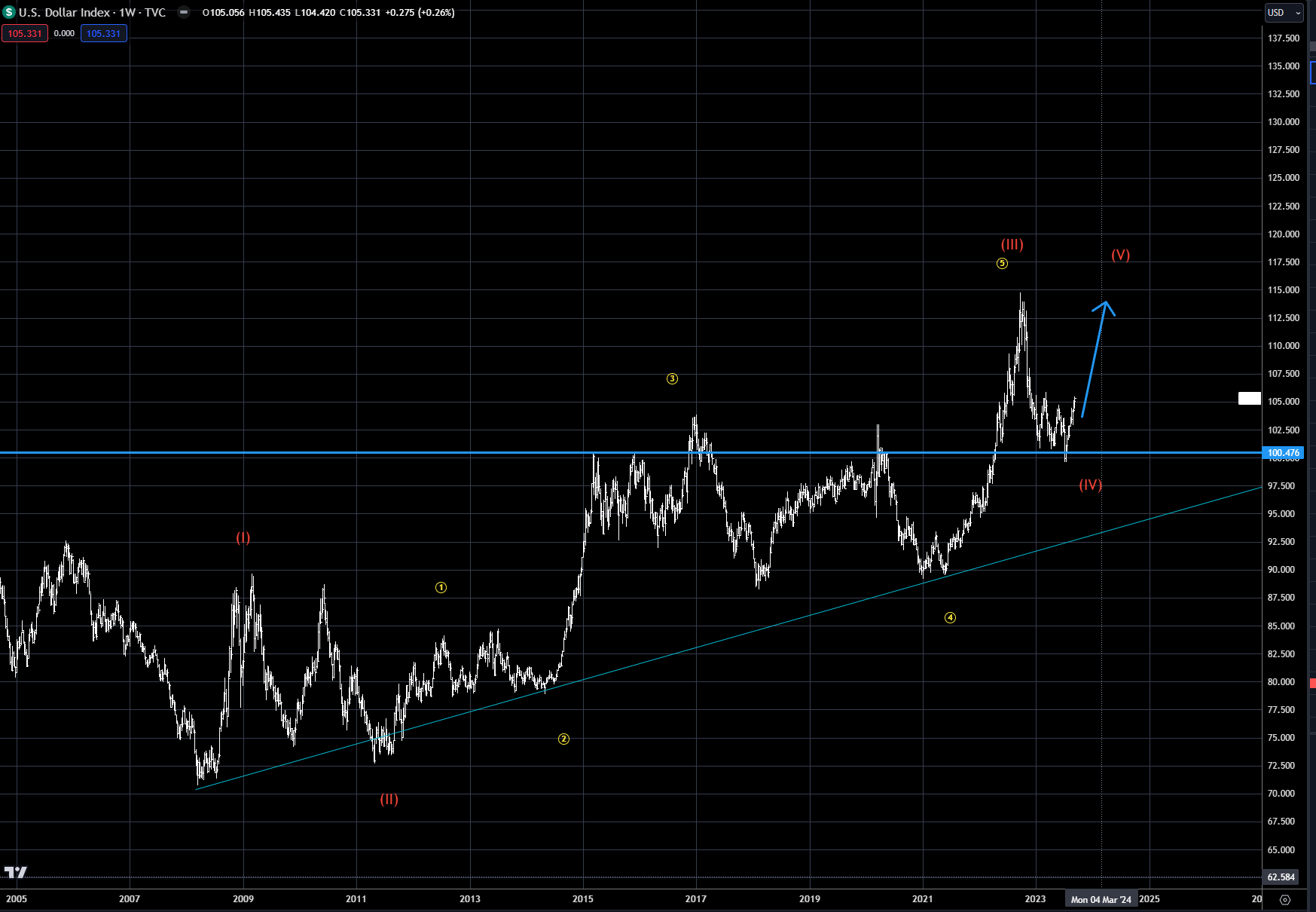
The US dollar continued to grind higher last week, now up almost 6% after the critical 100 level held in July, as outlined in our previous weekly outlooks (see Chart 1). The overall trend continues to point to potential higher levels over the next few months.
Chart 1: US Dollar Index
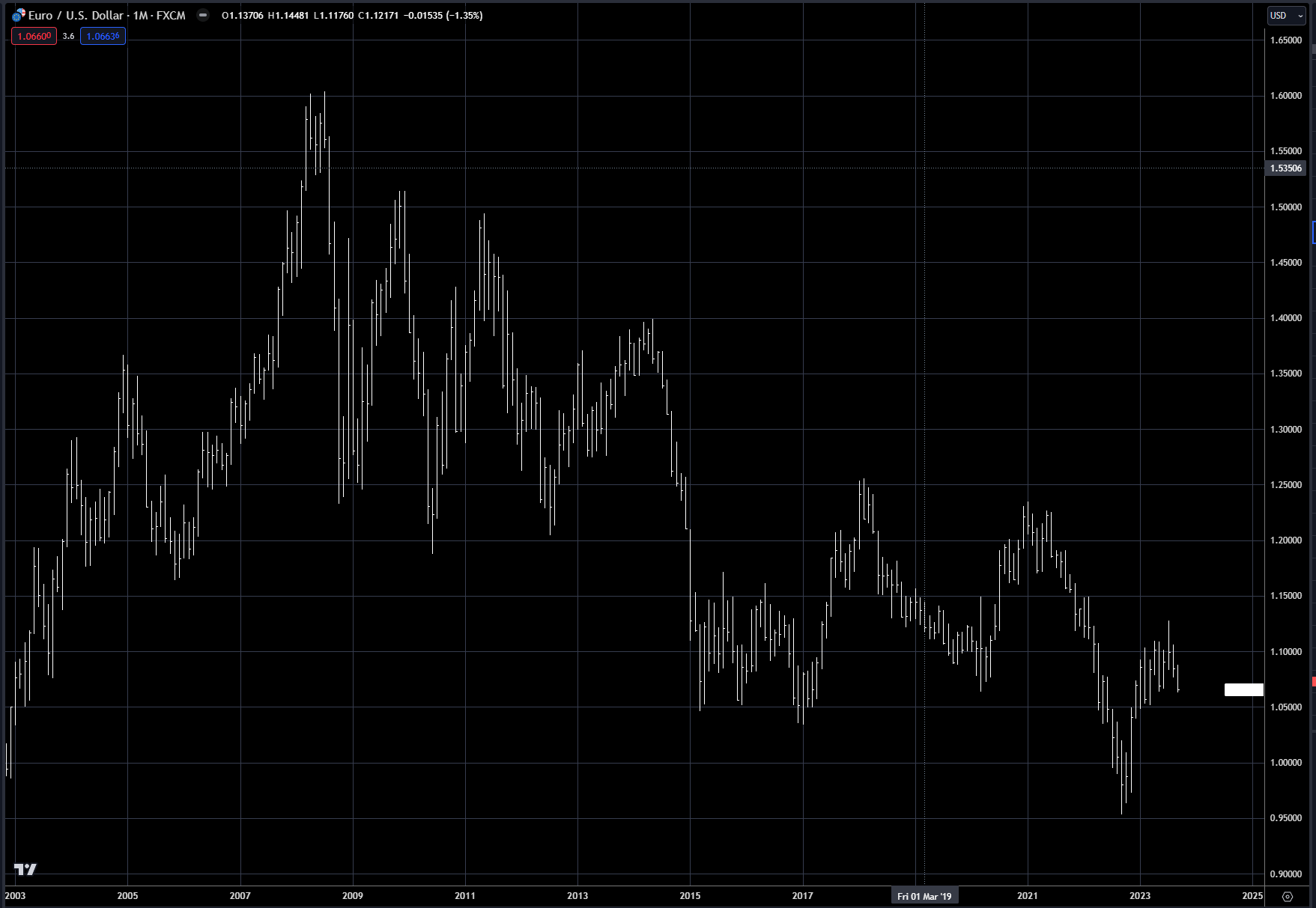
A somewhat dovish ECB meeting last week pushed the euro lower, continuing the decline lower from the highs made near 1.13 in July (see Chart 2). In the interim, the 1.05 level should offer good support. With that in mind, I will be focusing on pullbacks in the next week for possible short-term buying opportunities, but there is ongoing risk that the .95 level could be retested later this year or early next.
Chart 2: Euro FX
The yen continues to be the weakest G7 currency, weaker by almost 50% since the 2020 low - read my recent deep dive on Japan for more information on the Japanese devaluation policy. In Chart 3, the long-term view on the Japanese yen clearly shows we are reaching a level that historically has been very symbolic. The 150 level has not been crossed since 1987, and historically the Bank of Japan has been an aggressive buyer of the yen at levels over 120 (see Chart 4). It’s now been almost a year since the BOJ intervened, so watchful eyes should be on the outlook for BOJ action, possibly over the next week.
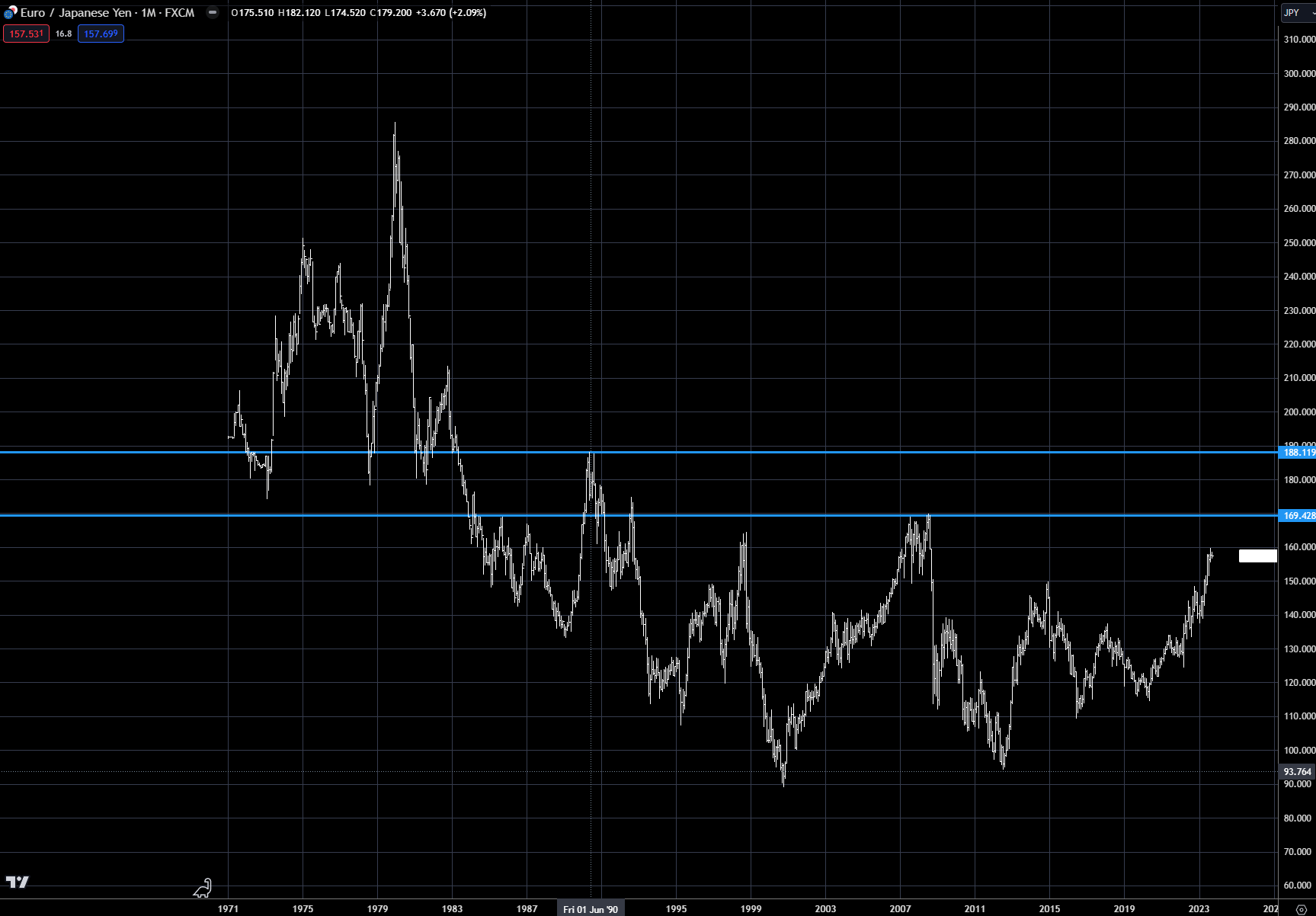
EuroYen is also approaching critical levels, as outlined in Chart 5, with the 170 level capping rallies over the last 25 years. As outlined in the deep dive on Japan, devaluing has multiple risks, especially on the inflation front. As a major importer of its commodity needs, Japan is nearing the end of the runway when it comes to its devaluation policy not having major ramifications.
Chart 3: Japanese yen FX
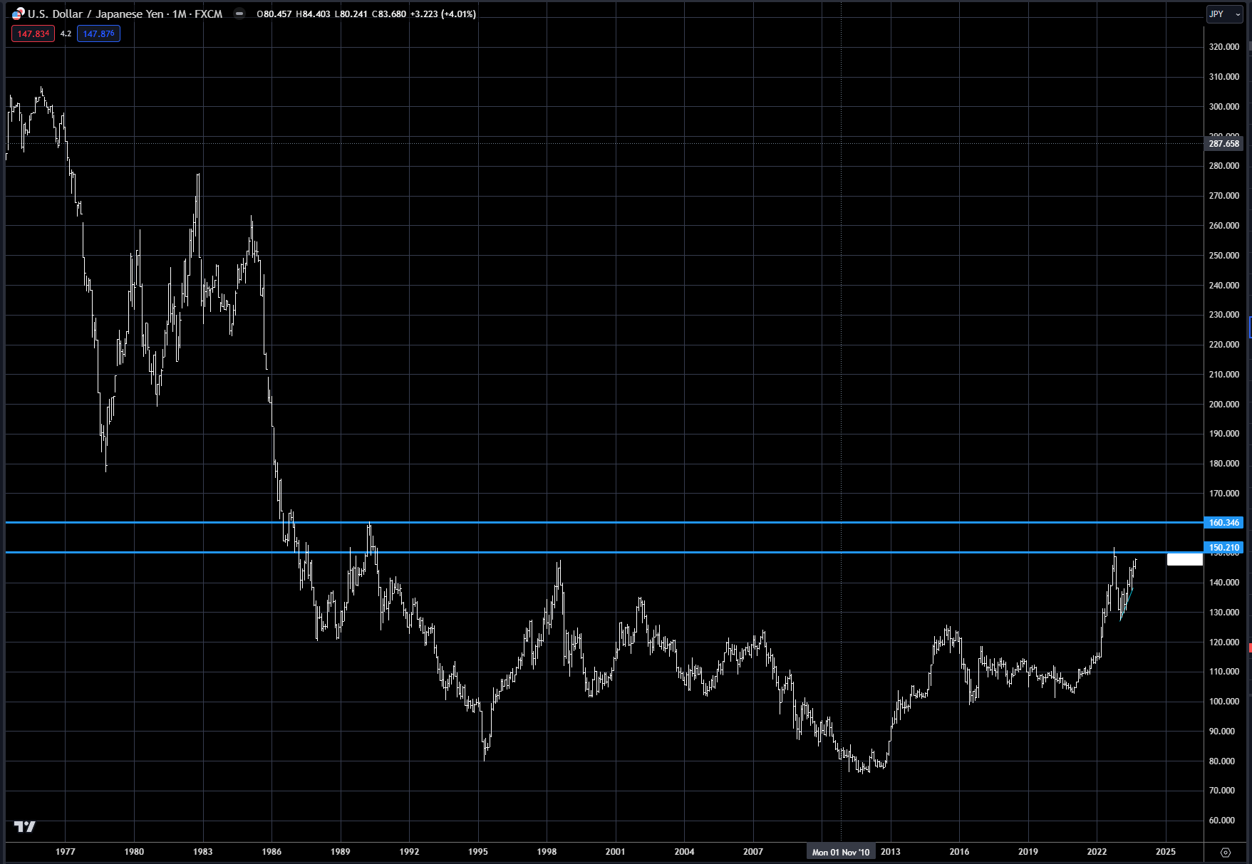
Chart 4: Yen intervention history
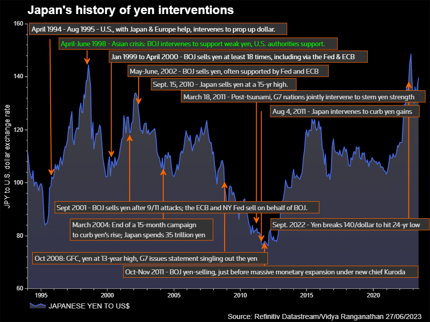
Chart 5: EuroYen FX cross rate
The Aussie dollar, as we know, is highly correlated to commodities, which is because of the major change in resource exports over the last 25 years. Chart 6 shows this massive transformation of the Australian economy, from primarily agricultural to a major resource exporter, mainly to China. Chart 7 shows the % change by country for Australian exports back over 100 years. Exports to China have surged to 35% of total exports - in effect tying their fortunes to the heartbeat of the Chinese economy.
In Chart 8, the Australian dollar (in orange) is overlaid with the Chinese yuan (in white) and the pair have been quite correlated, especially in the past couple years. The FX pair has had a direct correlation over the past 25 years, but it has also had periods of higher volatility. Recently, with the economic weakness in China, the Australian dollar has been one of the main recipients of this bearishness. Over the last year, the Aussie dollar has weakened from .80 cents to the USD in 2020 to .64 cents currently. Historically, when the currency has traded in the low 60s or high 50 cent range it has been a very good long-term buy.
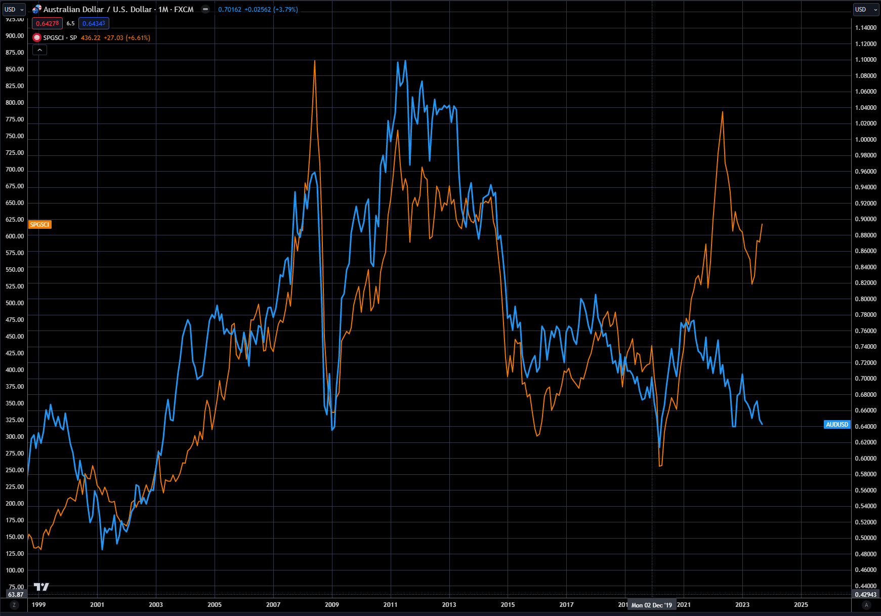
Chart 9 shows the overlay of the Aussie dollar and the S&P GSCI commodity index - notice the high correlation since China entered the WTO over 25 years ago. This past year there has been major divergence in the commodity index and the Aussie currency, with commodities in orange up sharply. The point to be made here, if one is bullish commodities, is that the Australian dollar can be a very cheap way to play this view.
Chart 6: Australian exports
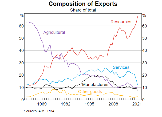
Chart 7: Australian export history by country
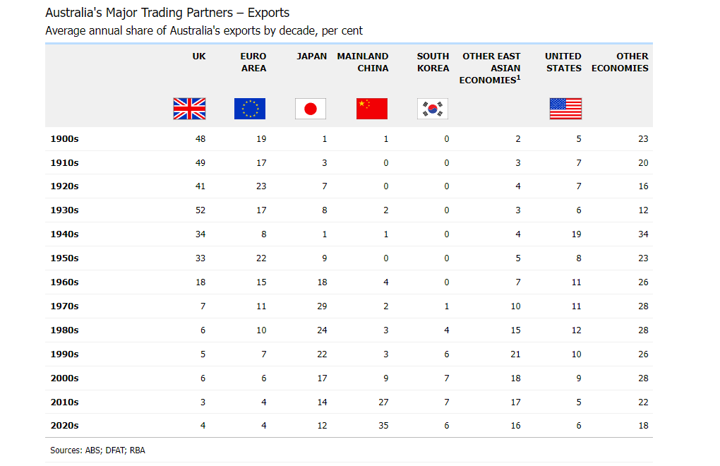
Chart 8: Aussie dollar (inverted LHS in orange) versus Chinese yuan (RHS in white)
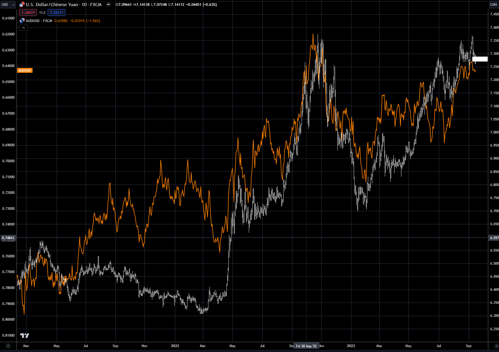
Chart 9: Aussie dollar (RHS in blue) versus S&P GSCI Commodity Index (LHS in orange)
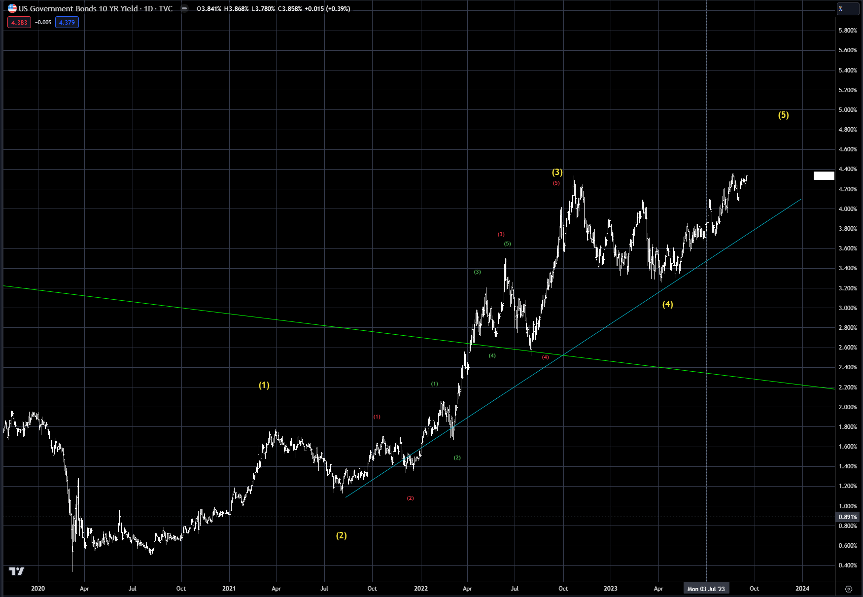
Interest rates continue to grind higher, as shown in Chart 10. As argued since the start of the year, rates are trending higher, and there is no sign the trend is changing yet. The pain trade here is still higher, but as discussed earlier, the trend is in its final wave 5 sequence, and caution is necessary as most of the easy money has been made on rates trending higher. The upside in the 10-year is still 4.75-5%.
Chart 10: US 10-year yield
Trading strategy is based on the author's views and analysis as of the date of first publication. From time to time the author's views may change due to new information or evolving market conditions. Any major updates to the author's views will be published separately in the author's weekly commentary or a new deep dive.
This content is for educational purposes only and is NOT financial advice. Before acting on any information you must consult with your financial advisor.