2024 Equity Outlook
Author: Bruce Liegel
Stock markets had a furious rally into year-end after the Federal Reserve finally capitulated and announced the “end” of rate hikes. Based on the long-term trend in interest rates, this may be the end of the first tightening cycle, but just the beginning of a longer secular environment for higher rates. Global stock markets continue to price in a scenario that central banks return to their easy monetary policy stance, as buyers went on a frenzy to load back up before year end. Maybe they are right on easy money, but with that stance comes a greater risk of potential runaway inflation later.
As our deep dives argued last year the big macro drivers are changing – the end of cheap labor, aging demographics and debt overhang all put upside pressure on pricing and down side pressure on equities. The current respite in inflation is driven by the slowdown in China, and other parts of the globe. Easy money, if that is the path taken, will eventually open up the risk for round two, which will be more painful than what was just experienced.
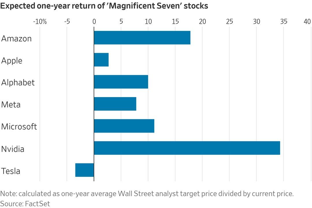
Last year's rally was led by the “Seven” as shown in Chart 1 below. Artificial Intelligence was the driver, propelling technology stocks to new stratospheric levels. The returns on Nvidia and others are astronomical, boasting triple-digit gains over a 12-month period — not a 10-year period, which would be the norm. Not to be outdone, but the analyst forecasts for 2024 continue to price in double-digit gains (shown in Chart 2). Can anyone say “Bubble”?
Chart 1
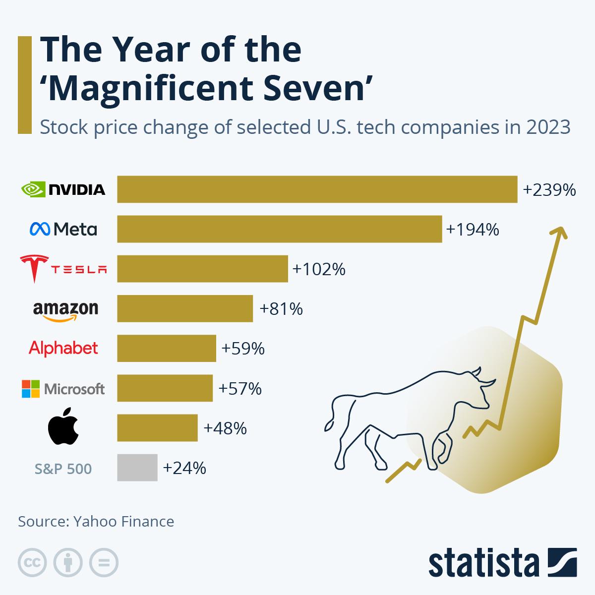
Chart 2
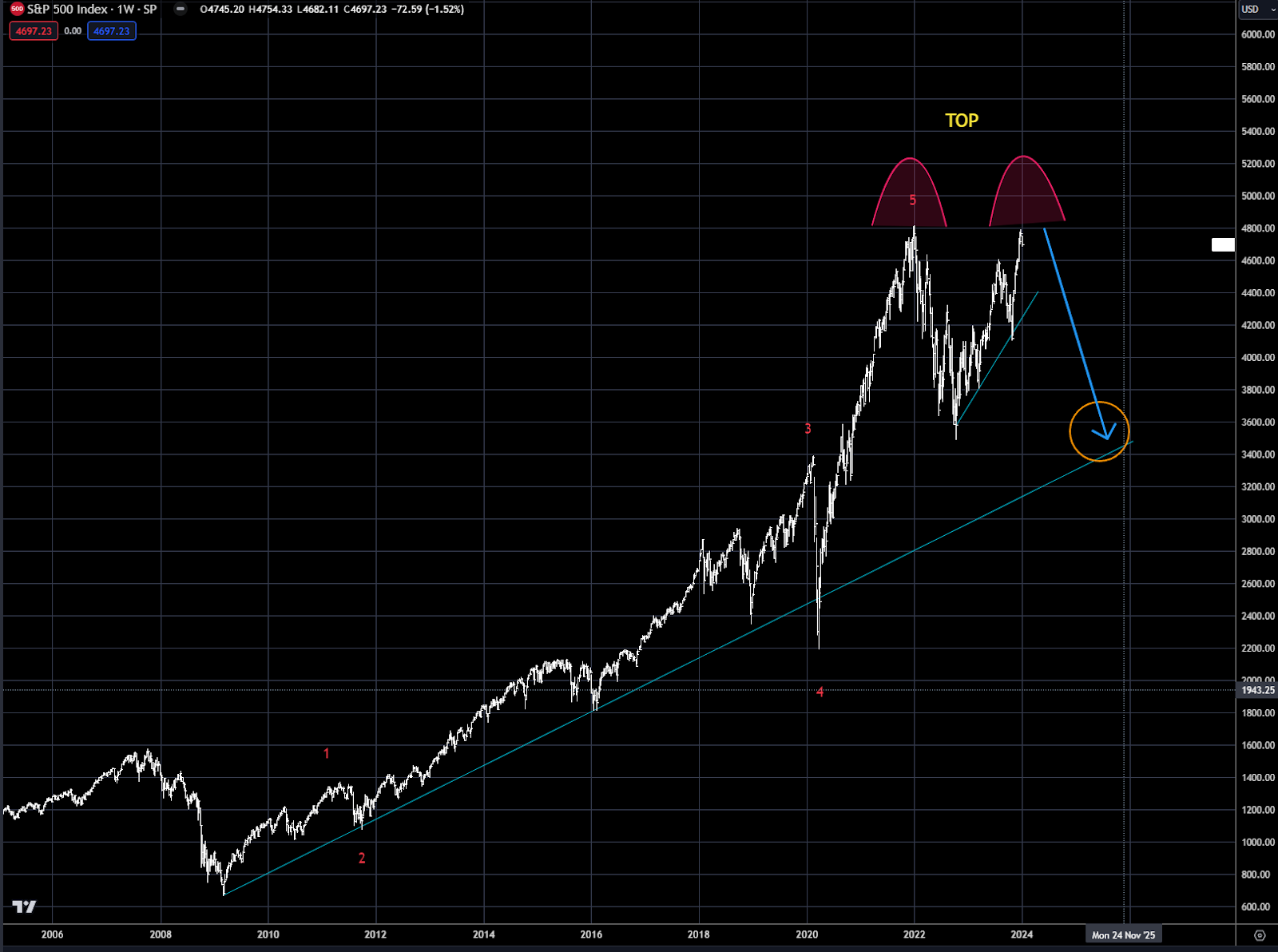
The global barometer for stock indices, the S&P500, had a tremendous rally to end 2023 as shown below in Chart 3 — led by the “Seven”. What appears to be setting up though is a broad-based double top, with the 2024 top to be completed in the first few weeks of 2024. Once the pullback begins, the target should be the major trendline from the 2008 low and the market bottom in 2022—indicated by the orange circle.
Growth stocks have led the way since the 2008 bottom, and now are quite expensive relative to Value stocks. This is again because of the “Sevens” monstrous gains over the past 15 years. If AI is really the next generational transition, then in the long run maybe growth continues to out gain value stocks — but in the short term, the excess needs to be unwound before this trend can continue
Chart 3 S&P500 Index
The technology led Nasdaq was obviously the biggest performer last year, but like the S&P500 it is also in the process of building a major double top as shown in Chart 4. Once completed in the short term the downside corrective should test the 11,000 level — which is the 2022 low and the first trendline from the 2015 low. The Nasdaq is at risk with the obvious correction in the “Seven” and the over valuation in growth stocks.
Chart 4 Nasdaq

Another area where the Nasdaq looks rich is in comparison to the Russell 2000/3000. Undoubtedly, the Russel components have been weighed down by higher interest rates as they tend to have more leverage. This can be seen by chart 5 which compares the Russell 3000, 2000, 1000 and the S&P500. No doubt this trend has been ongoing, but has been accelerating the past couple years. Relative to the Dot Com bubble in 2000, the current data shows even more risk for the smaller segment of the stock market.
Chart 5
Chart 6 shows the rampage that the Nasdaq has been on over the past 20+ years relative to the Russell 2000. This trend aligns well with the increasing technological integration of the global economy, but everything has its point of maximum involvement, and it looks quite likely that the Nasdaq is at this stage in its growth phase.
We can see this becoming apparent when looking at Growth versus Value and the divergence that is becoming relevant. Chart 7 shows large cap Growth (VUG) versus large cap Value (VTV) via the Vanguard ETFs. While growth did continue to rally versus Value last year, the rate of growth is slowing relative to the absolute market , namely the Nasdaq. This is a clear sign that the underlying fundamentals are changing — in this case rotation from rich growth to more stable value. It's still early, but this transition is beginning, which will weigh on high flying growth stocks and be more supportive for low leveraged value stocks.
This divergence is even more obvious when you look at mid cap and small cap growth versus Value. See chart 8 and 9. Growth has barely rallied versus Value in both market sub-sectors, which is a clear indication how centric the rally has been the past year. These are all classic signs of the end of an era – when all participants pile into the same play.
Chart 6 NDX/RTY ratio

Chart 7 Large Cap Growth (VUG) versus Large Cap Value (VTV)

Chart 8 Mid Cap Growth (VOT) versus Value (VOE)

Chart 9 Small Cap Growth (VBK) versus Value (VBR)

Closing the loop on the main US equity indices is the Russell 2000 shown in Chart 10. Last year we argued that a pullback to the green horizontal line was an area that would offer good long-term support. The bounce off the lows has been met by continued overhead selling, as the index continued to underperform. On the next move lower, look for the trendline to fail with the next level of support near 1000 — marked by the “iv” label.
Chart 10 Russell 2000

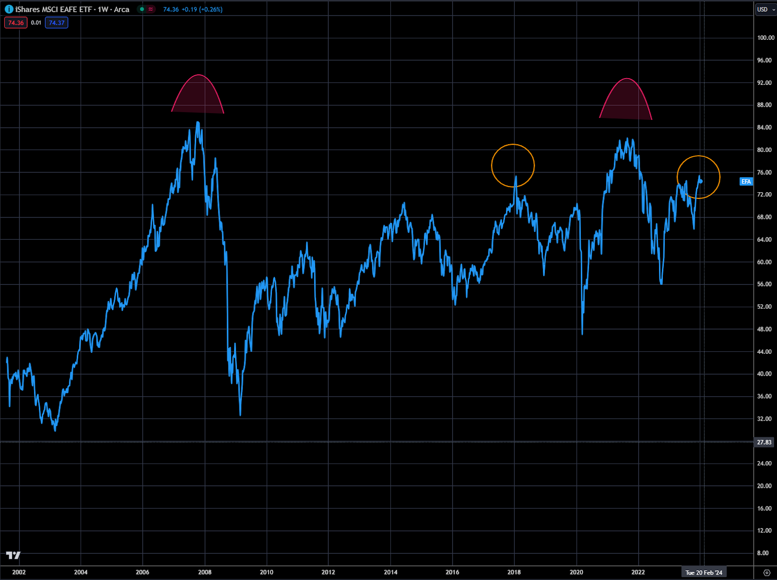
Moving outside the US and looking at global indices, the MSCI EFA index is a good global market evaluator as it includes a well-diversified portfolio of countries excluding the US and Canada. Chart 11 outlines the sector and country weights for the index, while Chart 12 shows the price action over the past 20 years. Relative to the US markets, the EAFE index has traded sideways for a majority of the time period, but a very obvious topping process appears to be near completion. The two arcs indicate a potential double top, while the two circles argue for completing head and shoulders formation.
Chart 11
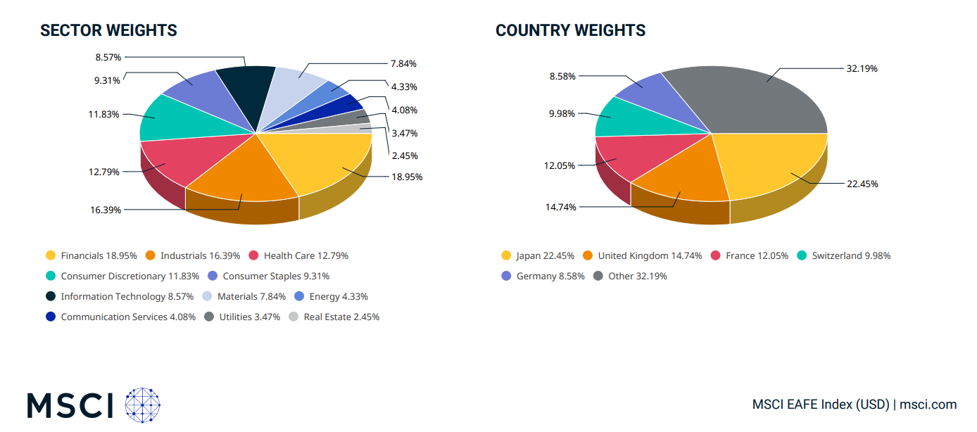
Chart 12 MSCI EAFE
The German DAX, shown in Chart 13, has been the leading stock market for most of Europe since the 2009 low, with a notably strong uptrend. As was the case with the Nasdaq and S&P500, there is no double top or topping formation to trade from. But being more of a technology index, indicating growth stocks, the DAX’s correlation to the Nasdaq has been quite high over the past few years.
Chart 14 outlines the correlation with the DAX (RHS) in Blue and the Nasdaq (LHS) in orange and since the 2020 low, they have been moving in lockstep with each other. While the DAX is not indicating a topping process, the high correlation with the Nasdaq argues that they will move lower together when the Nasdaq and “Seven” turn lower.
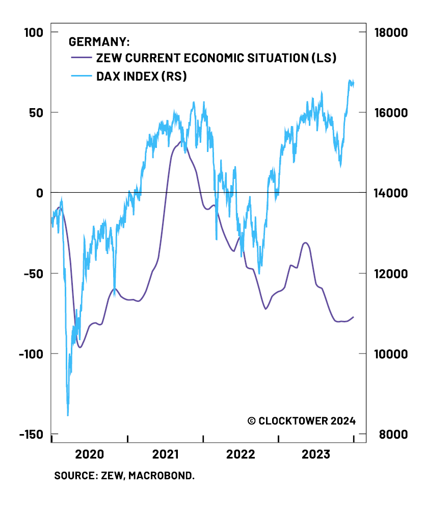
The ZEW economic sentiment indicator in Germany has also been flashing negative signs for the past year, with the indicator flashing a negative outlook ahead, based on a survey of economist’s outlook for the German economy. Chart 15 shows the glaring divergence with the German economy and the DAX stock market.
Chart 13
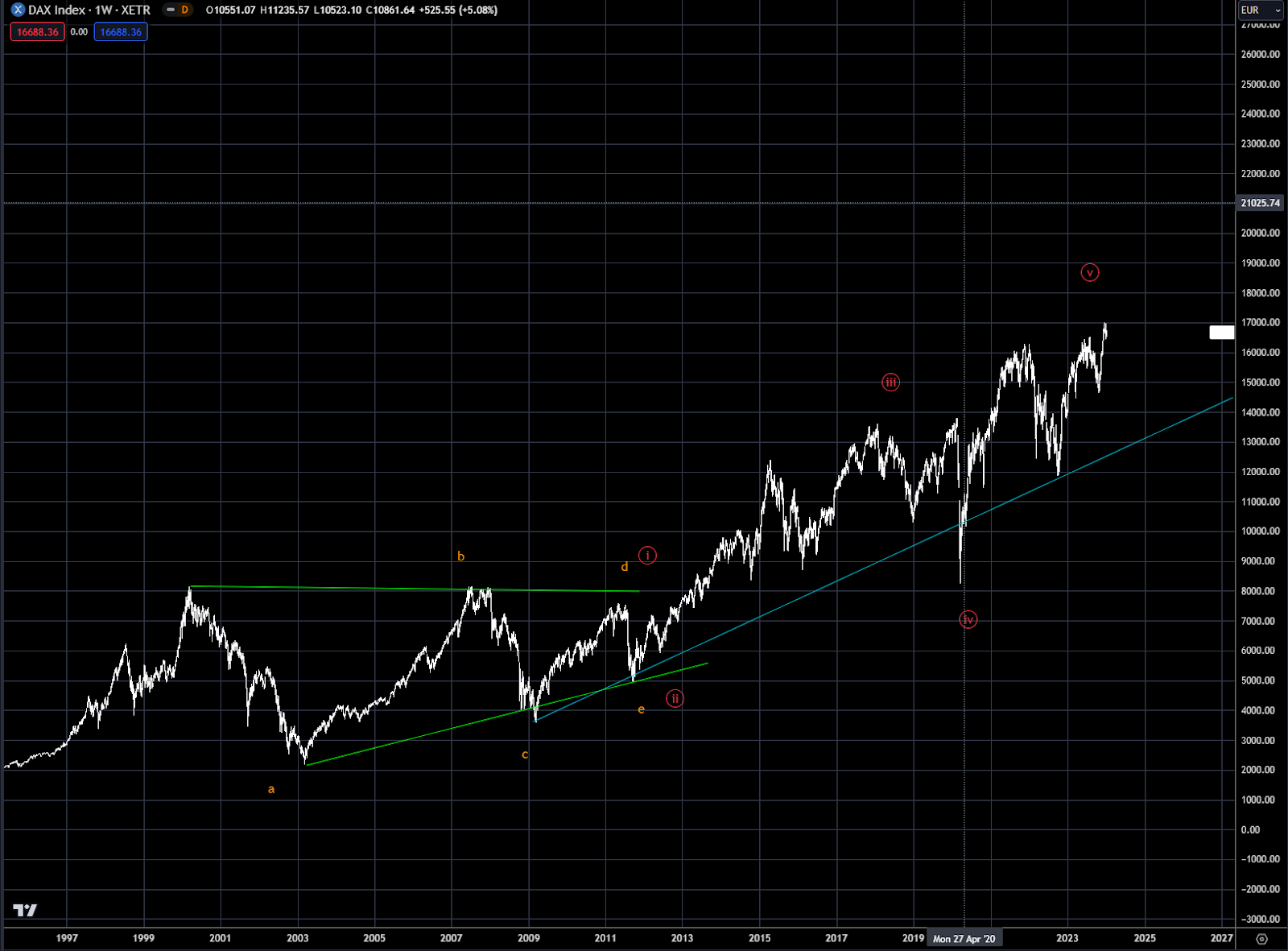
Chart 14 DAX index (RHS) in Blue versus Nasdaq (LHS) in Orange
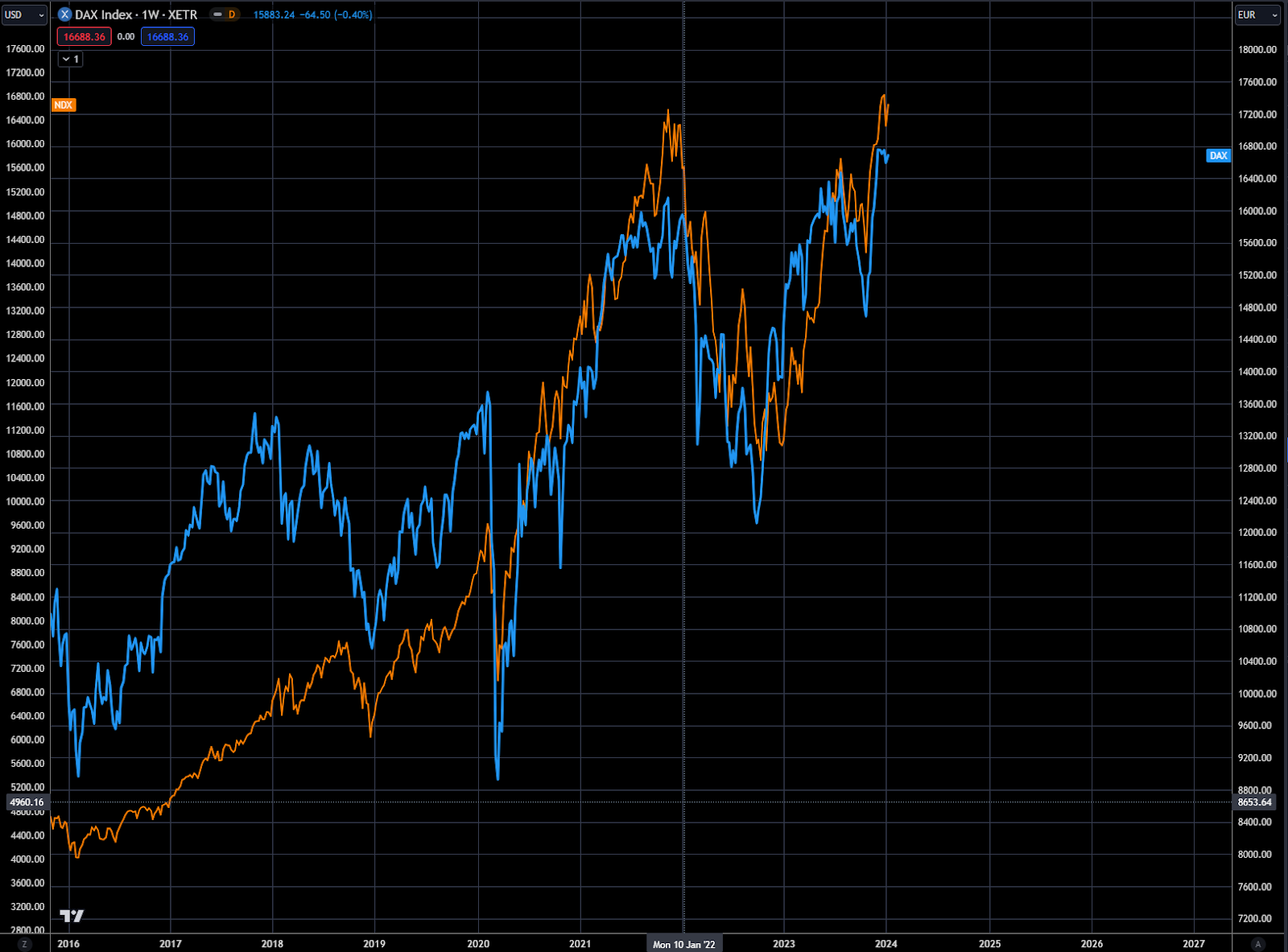
Chart 15
Last year’s deep dive on the Japanese economy laid the groundwork for the bullish long-term view on the Nikkei and other Japanese stocks. The Nikkei, featured in Chart 16, continues to grind higher towards the all-time high, marked by the horizontal blue line. Ultimately the goal was to reach the all time high, which still could occur, but the rally is potentially running out time.
Chart 17 shows the Nikkei overlaid with the Nasdaq, and as was the case with the Dax, it has become highly intertwined with the Nasdaq and the “Seven”, putting the rally at risk when the Nasdaq turns over. The Nikkei’s negative correlation with the Yen also puts it at risk if the BOJ becomes more hawkish — strengthening the currency.
Chart 16 Japanese Nikkei
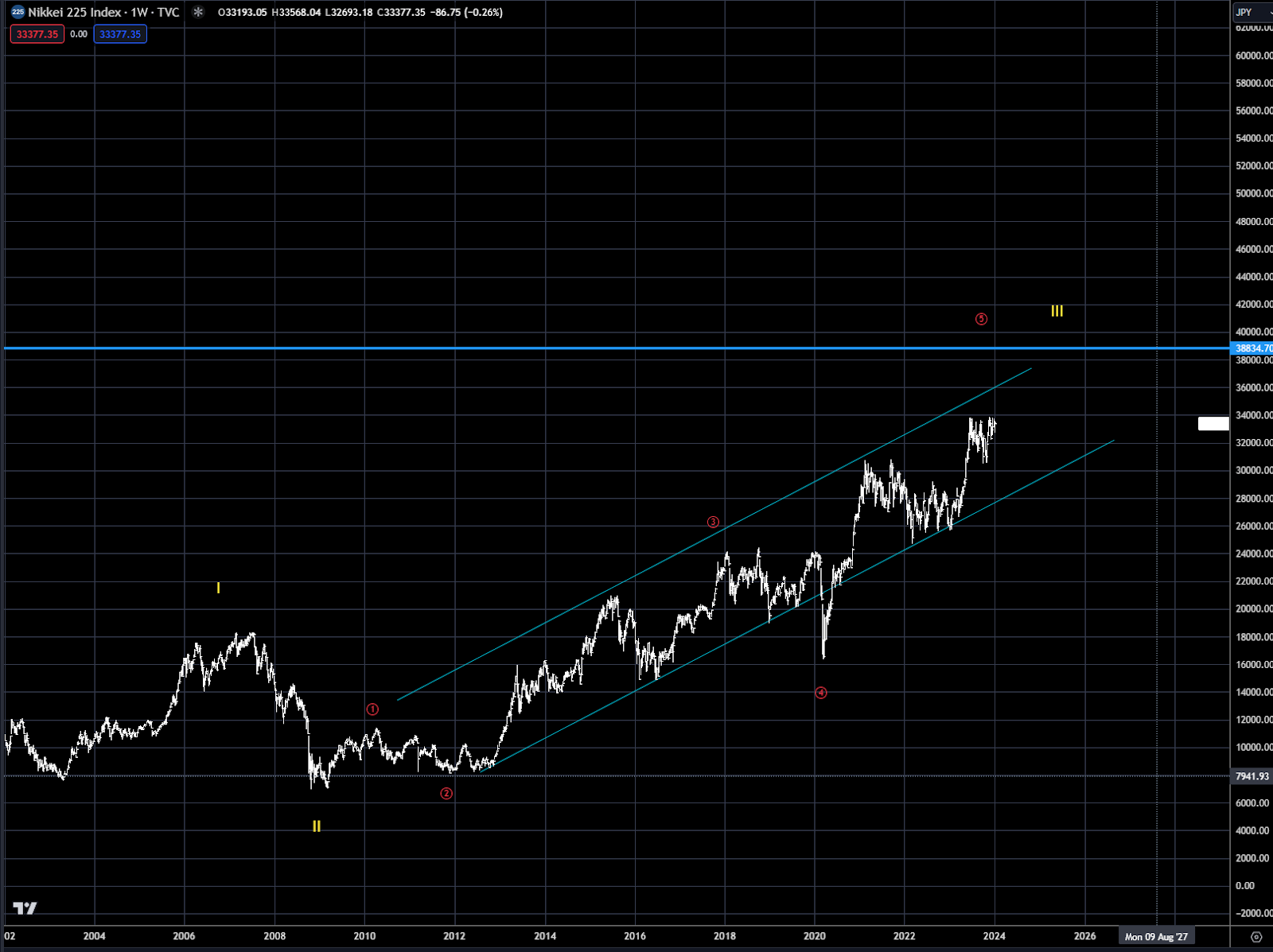
Chart 17 Nikkei (RHS) in Blue and Nasdaq (LHS) in Orange

The Chinese stock market has been the laggard for most of the top global market indices as it continues to grind lower as the economy weakens, and the lack of appetite for Chinese exposure weakens. After turning over in 2021, the Chinese market continues to grind lower, with the next support near 10,000. With the Chinese market turning over first and in a steep bear market, it will most likely be the market that bottoms first. With no sign yet, patience will be needed to trade from the long side.
Chart 18 Chinese A50 Index

Trading strategy is based on the author's views and analysis as of the date of first publication. From time to time the author's views may change due to new information or evolving market conditions. Any major updates to the author's views will be published separately in the author's weekly commentary or a new deep dive.
This content is for educational purposes only and is NOT financial advice. Before acting on any information you must consult with your financial advisor.