The Carry in the Conundrum
Author: Bruce Liegel
Preamble
This is the first of what I hope will be a long-term monthly publication of my thoughts on investing in markets. My hope is that I can show you how institutional investors look at markets and how they invest. I have had a front-seat view as an institutional investor for the past 20 years -- managing billion-dollar portfolios for some of the largest institutional investors in the world.
During the past 20 years I have had access to the best investment advice and market analysis available. I plan on sharing: the knowledge that I have gained, how to find this information, how to use it to implement your own investment strategy, how to construct portfolios and, most importantly, how to manage the risk.
During the early 2000s, I co-managed a $1 billion-dollar hedge fund with a FX and Interest Rate Carry strategy -- this was an arbitrage strategy between global foreign exchange and interest rate markets. I will go over this strategy in more detail when trading opportunities arise over the coming months. Carry strategies such as this work well in volatile interest rate markets.
I have also managed stand-alone discretionary macro portfolios for the past 20 years, including for one of the top names in the investment industry. I have had a very successful history of investing in all kinds of markets, in all asset classes. In this article and future pieces, I will dive into how to use top-down macro analysis with bottom-up fundamental analysis to come up with portfolio construction. Below is the process I have developed over the past 20 years -- always adjusting and changing according to market conditions and opportunities. As you will see from further reading, I will show how to build the themes to trade from and the asset classes and individual instruments to use to invest in them.
I learned early on that all the great traders use some form of technical analysis as a supplement to their fundamental thinking. Each one has their own favorites, but they move around, always finding the ones that are working in the current market environment. I will share things that have worked, how I use them, where to go to learn, and how to implement them on a trade-by-trade basis. There is no secret recipe or formula, but a toolbox to pick from, which can be used to help analyze markets and for trade entry and exit.
A great site to learn about different types of technical analysis is the Pattern Site. The author of the site, Thomas Bulkowski, covers numerous types of chart patterns and other methods of technical analysis. I will add more of these sites as time goes on. I know you will find this site very useful.
The first article I am writing will be on the unwinding of the financial carry trade, built up over the past 10-15 years via global central bank easy monetary policy.
I hope you enjoy reading and find my thoughts interesting enough to try a subscription. I look forward to your feedback and comments.
Part I: Unwinding the Greatest Carry Trade in Financial History
“Carry trade” involves borrowing at a low interest rate and investing in a higher-yielding asset. Typically, this has a term or duration before the investment is unwound.
What I will argue is that this concept has been financially engineered across multiple asset classes over the past 15-20 years. Some examples rely on extreme sophistication, while others are as simple as a second home/rental with a floating-rate mortgage.
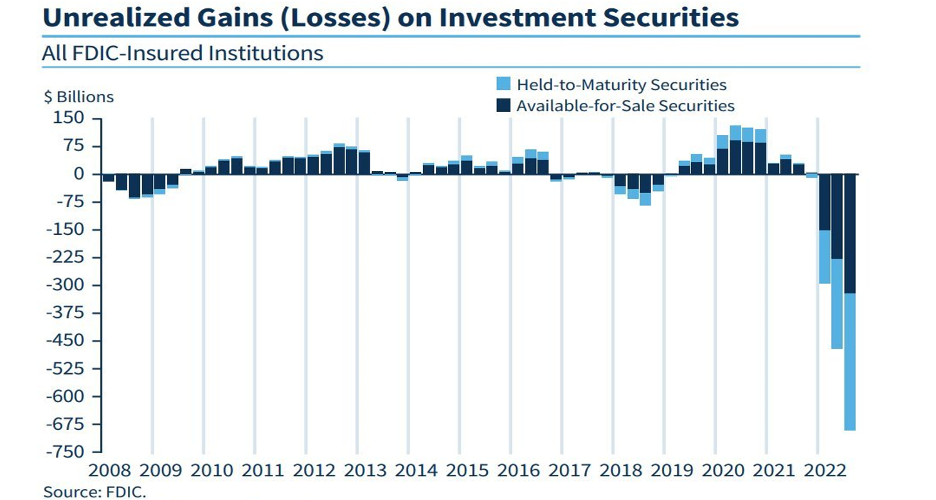
Borrowing at an assumed rate that has now blown up will put extreme financial pressure on many investors -- big and small -- in all corners of the globe. There will be no place to hide. As I write this, we are starting the see the first stages of this unwind with the collapse of Silicon Valley Bank and the efforts by global central banks to limit deposit withdrawals. This is just the start; it will take multiple years to unwind. The financial losses (unrealized) occurring in the U.S. banking industry -- see Chart 1 -- shine the light on how potentially big this problem will or could be.
The chart below has been well publicized – it shows the significant impact caused by the sharp increase in interest rates. But what if the rise in interest rates is just the start of a long-term trend? If so, the compounding effects of being short the carry trade are just now getting started.
Chart 1:
One Easing Cycle After Another
Since the peak in interest rates in the early 1980s, global financial market valuations have been driven by lower interest-rate policies. The chart below shows this decline in interest rates, based on the U.S. 10-year treasury note. This policy stance accelerated after the 2008 financial crisis with the introduction of quantitative easing (QE) and the zero interest rate policy (ZIRP), opening up the door for the greatest borrowing binge in global history.
While Federal Reserve Chairman Paul Volcker is credited with breaking the back of inflation in the 1970s and 1980s using an aggressive monetary policy, this all switched with the so-called Greenspan Put. Fed Chairman Alan Greenspan, known as the “Maestro,” ran the Federal Reserve from1987 to 2006 and can, it could be argued, be seen as the inventor of the stock-market bubble. This is cleverly depicted in the book, ‘Greenspan’s Bubbles: The Age of Ignorance at the Federal Reserve,’ by Fleckenstein and Sheehan.
The Greenspan put has been defined as “a monetary policy response to financial crises that Alan Greenspan, former chair of the Federal Reserve, exercised beginning with the crash of 1987.” Future Federal Reserve chairs had monetary put versions of their own. The Bernanke Put, The Yellen Put and finally the Powell Put -- where it is ending.
Essentially, this extremely loose monetary policy started a pattern of one easing cycle after another, resulting in lower interest rates and higher equity/asset valuations. Each crisis needed even lower interest rates to get the market to recover, and each crisis was followed by an even more aggressive accumulation of debt and leverage.
But how did governments manage to get away with the inflationary pressure that is typically associated with a loose monetary policy? Such side effects were not seen because of a number of factors, but one can argue cheap global labor supply and globalization were the primary factors in keeping inflation subdued.
With free money, everything becomes investable
This prolonged period of cheap money forced market participants to invest in low-yielding projects or assets. The upshot was that we have witnessed, for the past 15 years, the greatest carry trade of all time: the entire market operated on the basis of carry.
In essence global central banks locked rates at near 0%, pushing huge amounts of liquidity into the system forcing investors to go further out on the risk spectrum to find yield. This pseudo-carry trade is now coming to roost — as these risky investments turn sour with higher rates and inflation. These investments only made sense in a world full of liquidity at extremely low interest rates.
The Great Unwind
As recent as the first quarter of 2022, the Fed was still holding interest rate at near 0%, but since then they have aggressively raised interest rate to tame inflation, and central banks around the world have followed suit. Investors now are rethinking this process, and have to either unwind these investments at significant losses or in the case Silicon Valley Bank, depositors moved their money at lightning speed into a higher yielding investment.
A simple example of this ticking time bomb is someone buying a vacation rental property — with a low floating rate interest rate at the purchase. They borrowed short term (floating rate mortgage) and invested in a property that would take 20-30 years to pay off. Now that mortgage rates have gone from sub 3% to over 7% and inflation has increased other carrying costs of the property — the investment now doesn’t make sense and may be forced to liquidate/or sell. There are hundreds of these types of examples — thus, the term the “Great Unwind” is born.
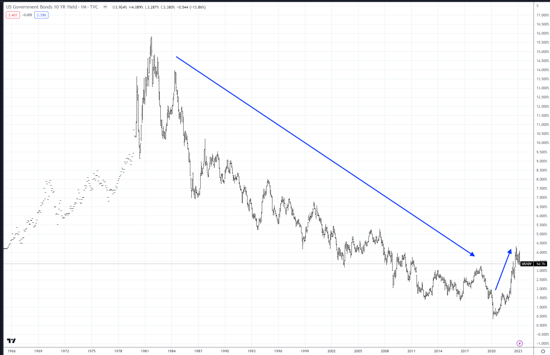
Interest Rates Breakout
The first major change that has occurred is shown in Chart 2—referred to as the “Great Breakout”, is that interest rates have broken out of their down trend. Interest rates (10-yr in this case) had been in a declining pattern since the mid 1980’s. As the saying goes—the trend is your friend—and clearly this trend has now broken. You don’t have to be a market technician to see that something BIG has changed here.
Chart 2: The Great Breakout (US government bond 10-yr yield)
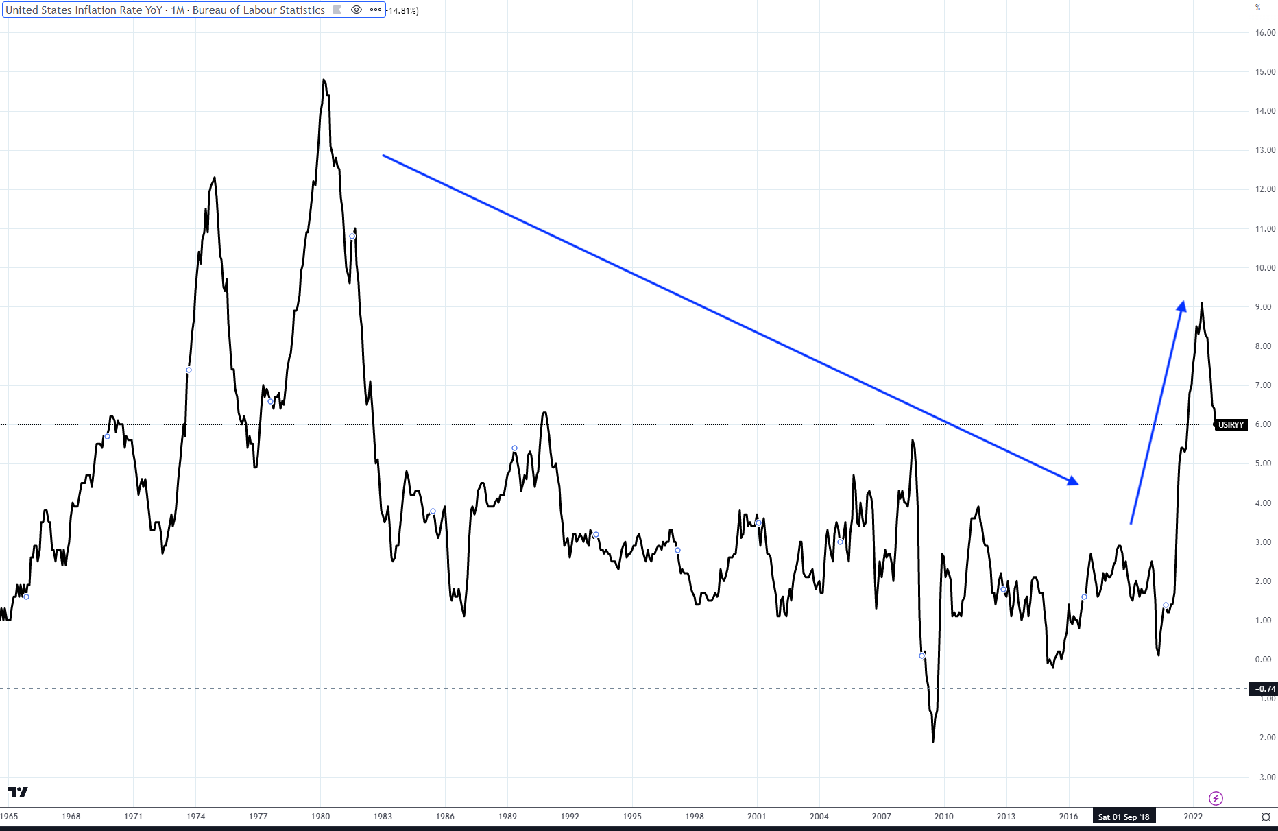
Inflation Breaks Out
The second major change causing the unwind of the greatest carry trade of all time is the breakout of inflation (see Chart 3).
Inflation, like interest rates, had been in a long-term downtrend since the early 1980s. We can argue about what caused this, whether it was increased money supply, supply disruptions, Russian President Vladimir Putin, weather demographics or other factors. The bottom line is that it has reached the highest level in decades, and most central banks around the world are forced to tighten monetary policy and raise interest rates as an attempt to bring inflation down. Federal Funds rates have now gone from near 0% in 2021 to near 5% in 2023 via the U.S. Federal Reserve Bank.
Chart 3: The Great Breakout (US inflation rate)
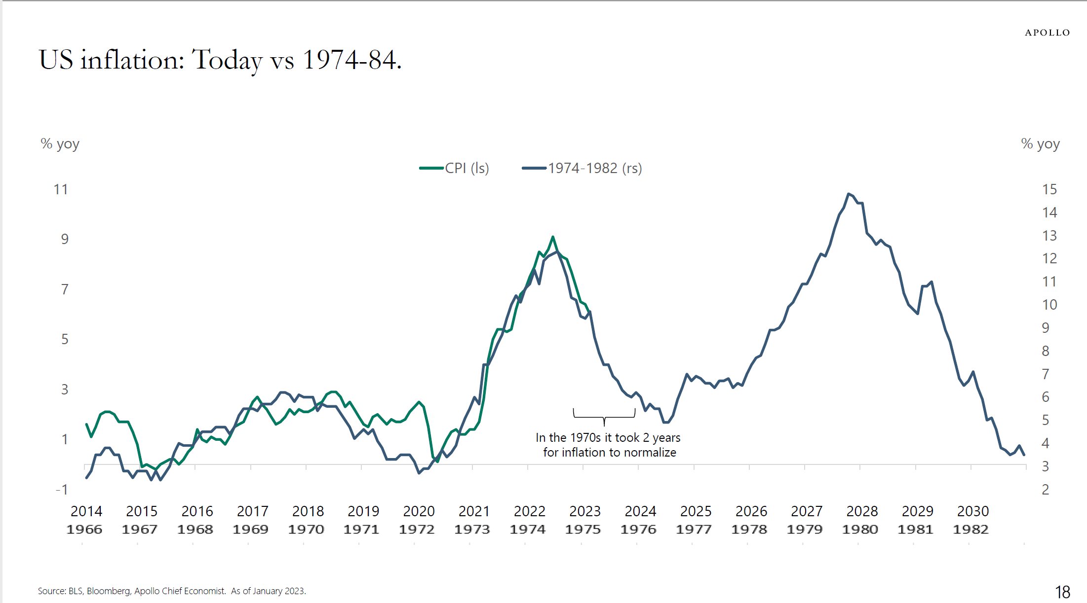
The last time we saw this volatile change in interest rates and inflation was in the 1970s. If you review charts 2 and 3, you can see the large increases in both. Many are comparing the current market with the price action from the 1970s. There are many similarities, which we will touch on later, all leading back to similar monetary policies by central banks. Chart 4 below shows both time periods, with a great overlay.
The current economic environment correlates with the slowdown that occurred in 1975-1976, with the Federal Reserve closer to pivoting on monetary policy today, and economic growth slowing dramatically. But as we will show later, the underlying fundamentals are potentially setting up a similar revival of higher inflation and interest rates in the next few years. We all know that things don’t repeat in exactly the same way; my goal will be to show things that cause divergence and adapt to the changes as we go forward.
Chart 4:
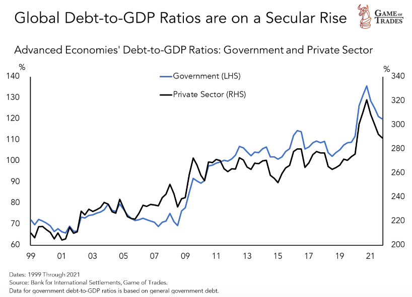
Surging Debt, Particularly in Japan
Because of easy monetary policy and lax lending standards, global debt has surged over the last 20 years, especially since the lows of 2008. Chart 5 below shows the debt-to-GDP ratio for the G7 economies, otherwise known as advanced economies. Debt has grown on a global basis, but the unwind began with the rise in interest rates. Percentage of GDP is a common measure used to compare year-over-year changes.
The red light had been flashing for years prior to 2022, but it is the increase in inflation and the breakout of interest rates that is putting an end to the carry trade of all time. Global debt has been growing because of the easy monetary policy by all central banks -- they have been encouraging investors and governments to believe that the risk is low. This is now changing!
Chart 5:
Looking at one country which has added a massive amount of debt is shown in Chart 6 relative to the US debt accumulation. Japan has been the greatest debt accumulator over the last 20 years of all major economies in the world. According to Nikkei Asia, the central bank of Japan now owns over 50% of all Japan’s debt outstanding. So yes, they are monetizing their debt. Borrowing in Yen and investing globally has been one of the largest funding markets for the carry trade for the past 20 years.
When you look at Chart 6 — this data goes back to the late 1800’s. It shows how much debt has been added by Japan and the US. Only after WWII was there greater debt in the system. This is true on a global basis for all major economies. The great unwind of this debt bubble can be done either by inflating or by deflating. The market is currently in the inflating stage as shown in Chart 3. Market price action is always the signally tool.
One important point to make here is that compared to the last inflationary cycle that we had (1970’s), today we have a much, much higher debt level (chart 6). For this reason alone, the current situation is a lot trickier than the 1970s, as the economy is now hit with the double whammy of a rising inflation and soaring debt service burden. Society will not want a repeat of the 1930’s style depression either, that’s why I think the bureaucrats will attempt a soft inflation cycle — that lasts 10+ years. If we judge how they did the first go around (2020-2023), it will not end well. We should be prepared for anything but a soft outcome.
Chart 7 shows year-over-year inflation in Japan. The Japanese government is doing everything in its power to keep inflation subdued, but this will be a losing battle as the inflation genie has escaped from the bottle. BOJ wants to keep inflation manageable — within their target of 2% so they can keep their ultra- low interest rate policy in place. Higher rates equals BIG TROUBLE they want to avoid. Some would argue that Japan is the Godzilla in the financial marketplace, waiting to destruct everything in its path.
Chart 6:
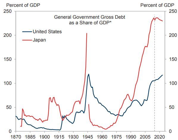
Chart 7: Japan YoY inflation
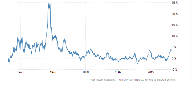
Shorting the BOJ monetary policy has even been termed the “Widow Maker” by many traders who actively trade Japanese Bonds. For the past 15-20 years it has always been a loser’s proposition to trade against these bonds, but now that inflation is breaking out the tide is changing.
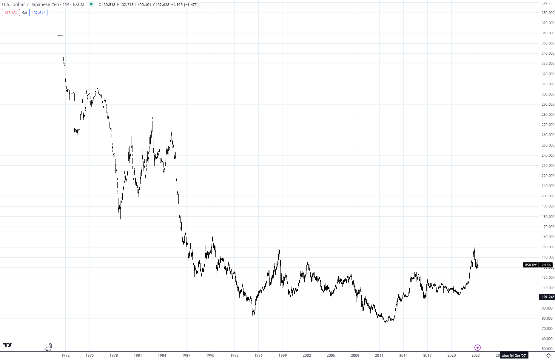
Chart 8 below shows how the Japanese two-year bond is now tracking the inflation rate -- this is something to keep monitoring. The 10-year yield, which is pegged by BOJ near 50 basis points, is also a must-watch for signals that the BOJ is losing control of its monetary policy and will need to begin aggressively tightening. Chart 9 shows the yen FX rate over the past 50 years, but you can see it is now depreciating against the USD. It’s not coincidental that the yen is now moving with the inflation rate. If you haven’t noticed, the yen is also pseudo-pegged to the U.S. rate market. Compare charts 2 and 9, especially for the past two years. I can’t state this enough -- this is another example of the Great Unwind. I will be doing more in-depth analysis on Japan in the months ahead.
Chart 8: Japan 2yr government bond yield
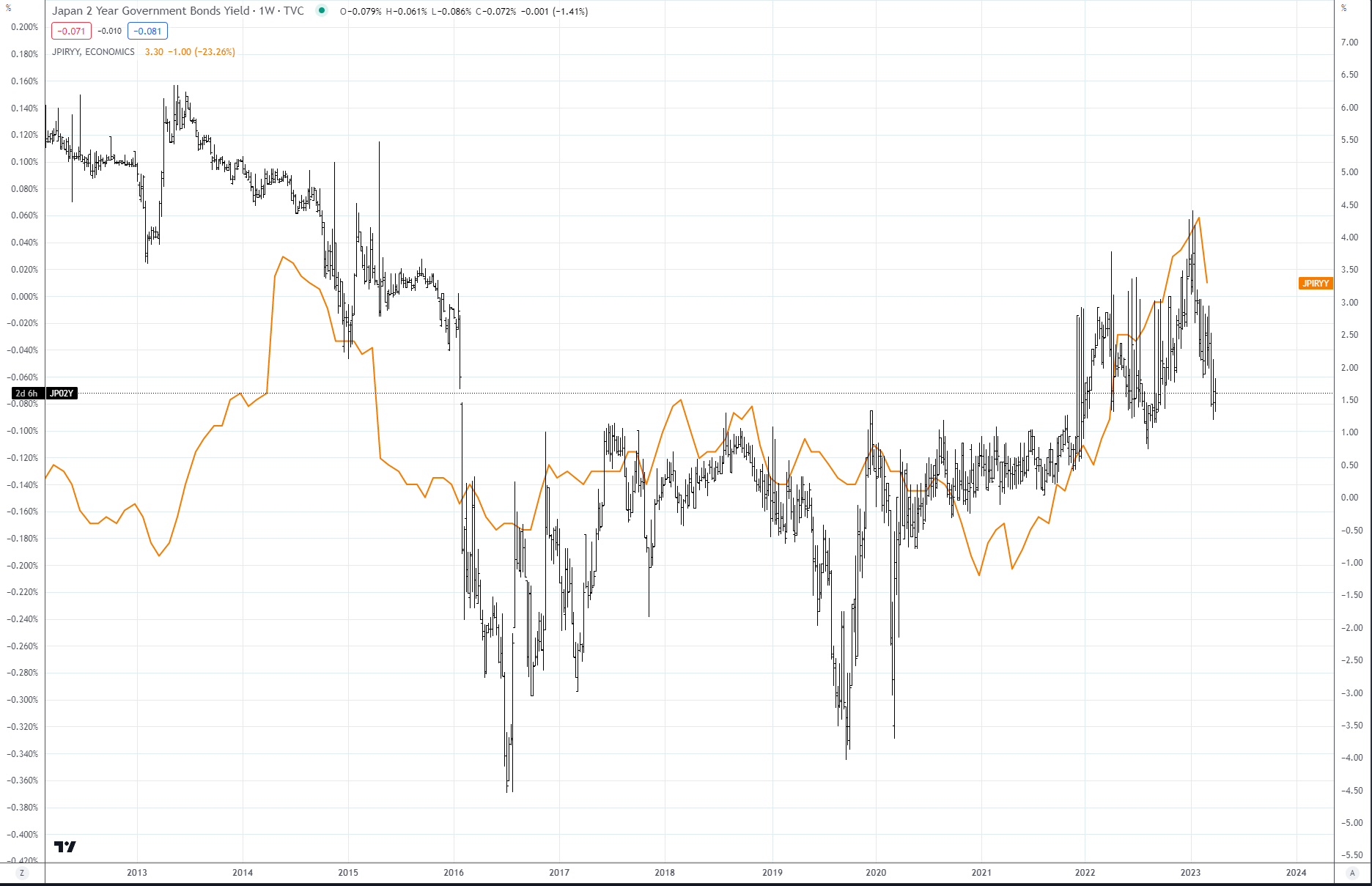
Chart 9: USD/JPY
All Points to a Sea Change
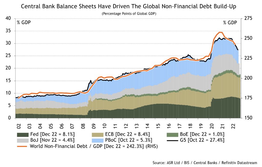
Up to this point this article has focused on the impact of easy monetary policy and its impact in the last year on inflation and interest rates. In the last few charts of this segment, I want to focus on the amount of debt outstanding within central banks and the impact it has had.
Chart 10 shows the outstanding debt on the balance sheet of the largest central banks in the world. While the debt build-up started earlier, it really exploded after the 2008 financial crisis. As the graph clearly shows, global central banks’ balance sheets have continued to build, even taking into account the impact of the Covid-19 pandemic.
Chart 10:
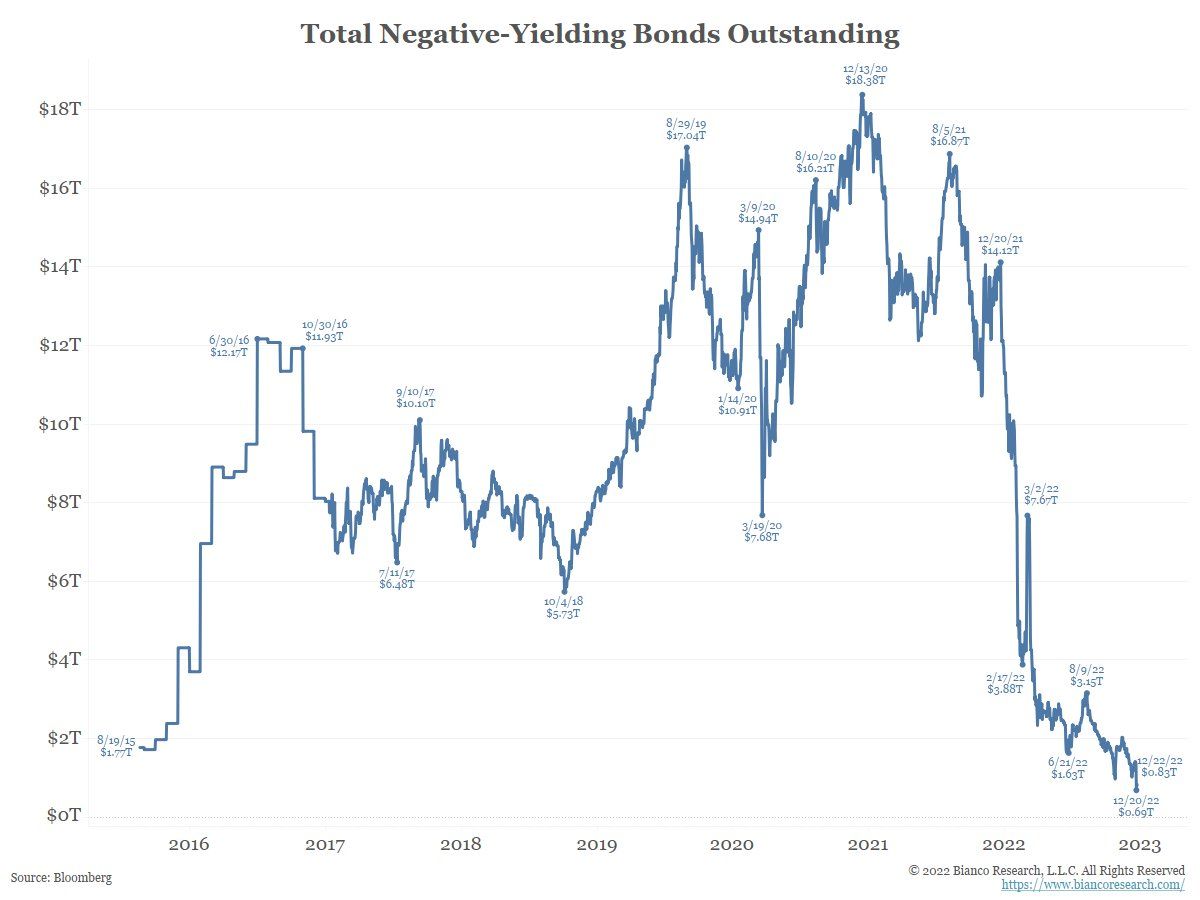
The other monetary policy mistake in place was negative interest-rate policy. As chart 11 documents, there was over $18 trillion dollars of debt globally in 2020 that had been issued with negative rates – we all knew how that was going to turn out. All kinds of crazy investment ideas are borne out when the cost of money is below zero. This is where the carry trade went crazy – the first to fall from this was Credit Suisse, which was merged with UBS just last month
Chart 11:
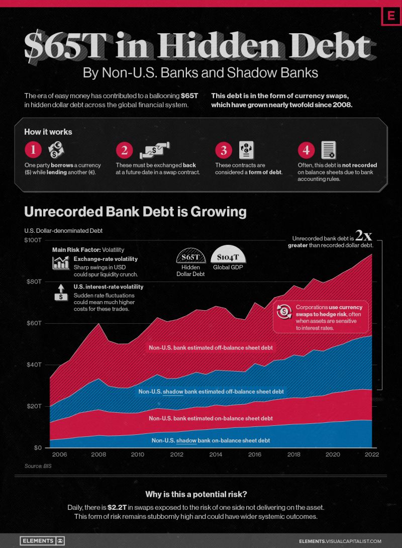
The end result of all this easy money can be seen in this infographic. The off-balance sheet amount is the scary amount -- and that total is $65 trillion. As you can see, this has grown tremendously over the last 15 years. If the banking system is having issues with debt collateral, and escaped regulators until it was too late, one can only ponder the amount of embedded risk in the system that is still hidden. To learn more about the shadow banking system, the International Monetary Fund has a good article on this.
Have we finally reached the tipping point where there was just too much liquidity in the system causing inflation to finally rear its head? That is the easy conclusion and probably the correct one. Was it transitional or is it transitional? My answer is no. There are too many fundamental arguments that would suggest that we have seen a sea change in demographics, supply-demand balances of key commodities and other factors to think that this is a one-off.
Part 2: Trade Ideas and Analysis
Part 1 set the tone for the macro theme -- the Great Breakout and the Great Unwind. One could argue that this theme is getting mature in the short term, but just developing in the long term. As a trader/investor, our job is to figure out how to implement trades under both scenarios. Coming up with a disciplined plan is paramount to making money in the long term. There is an old saying from economist John Maynard Keynes, “Markets can stay irrational longer than you can stay solvent.” Part 2 introduces technical analysis, which is used for market timing for entry and exit of trade ideas. Part 2 will also break down the macro into the micro -- or individual trade ideas that are related to the theme set out in Part 1.
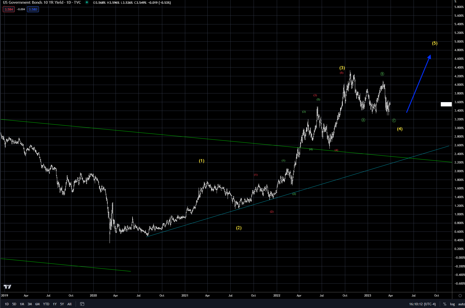
Our analysis looks at asset classes that have been impacted by the greatest carry trade of all time and develops trade ideas. The first two charts below show the US 10-year yield. Chart 1 shows the channel that the market has been in since the mid 1980s. We have now seen a clear breakout of that channel -- which is a “ring the bell” event. For more information on channels, use this link from the Pattern Site. Chart 2, which is shorter-term, uses the Elliott Wave to formulate where the trend is, or potential price action. There are other methods to use in this analysis, but I will focus this paper on Elliott Wave Analysis.
In classic wave analysis, markets proceed upwards in three waves, with two corrective phases within the main uptrend. I have marked the primary waves in yellow and the sub-waves in red and green. Without going into greater detail here, the bottom line is that the 10-year still has the potential for one more wave or leg up before the five-wave sequence is complete. The corrective wave (4) is still in process and, once complete, I fully expect the uptrend (higher interest rates) to resume.
Using this as our guide, we can now evaluate other markets, which are correlated or impacted by the direction of interest rates and inflation. Typically, the Elliott Wave on its own is a good tool, but combining it with other tools and wave patterns from other markets increases the likelihood of success.
Chart 1: US 10-year rate (1984 - present)
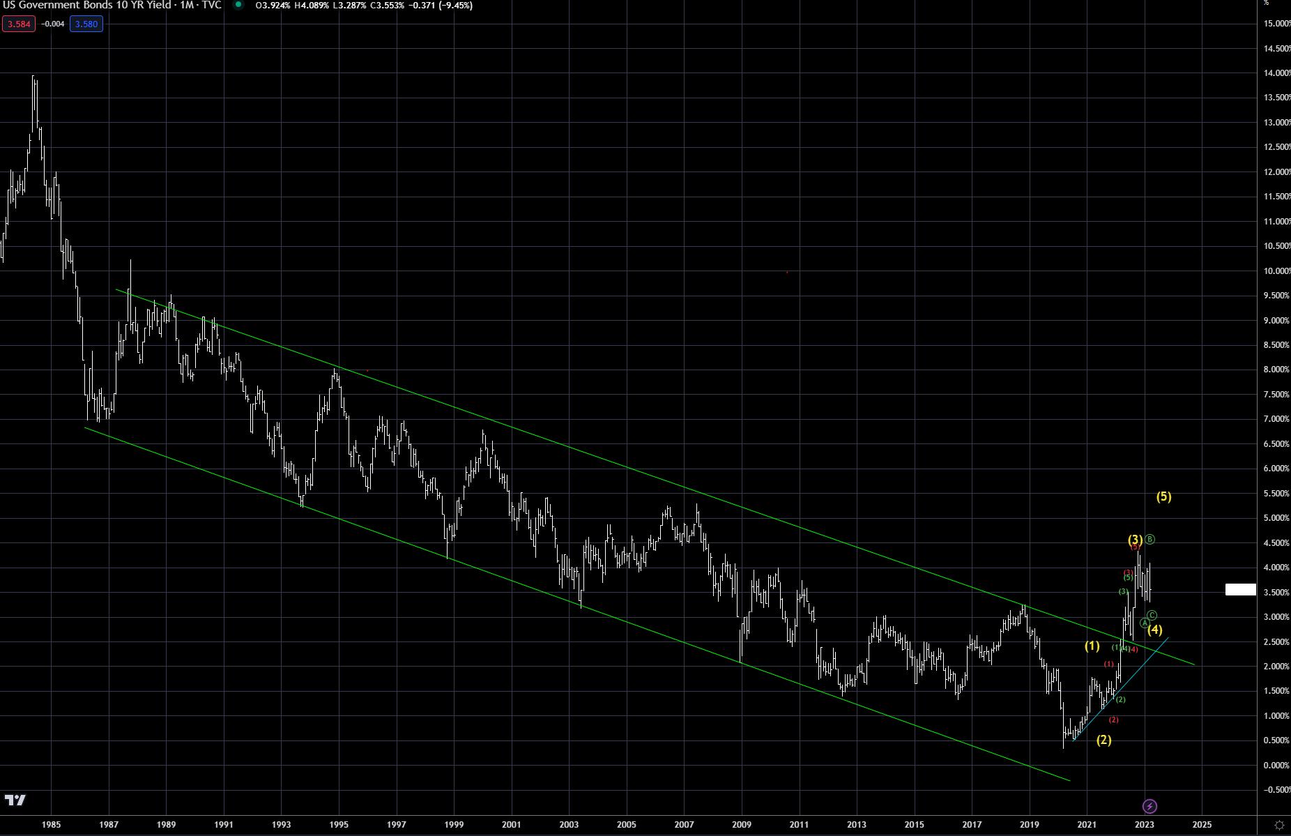
Chart 2: US 10-year rate (2019 - present)
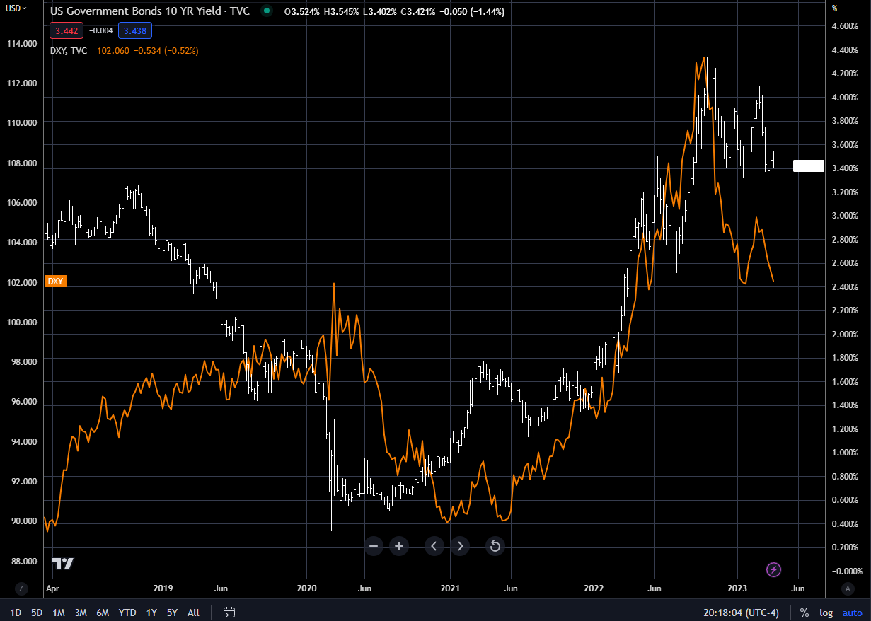
Historically, currency markets are driven by central bank policy. Chart 3 below shows the US 10-year rate verse the dollar index. Since interest rates bottomed in 2020, the two have been running together -- this can, and does, diverge. But for now, the Federal Reserve's interest rate policy is driving the direction of the dollar. When the Fed, or economic data, is more hawkish, the higher the dollar firms. The Fed says it is data-dependent, so the market has become more sensitive to each data release, causing more market volatility.
Chart 3: 10-yr rate (RHS) vs DXY Index (LHS)
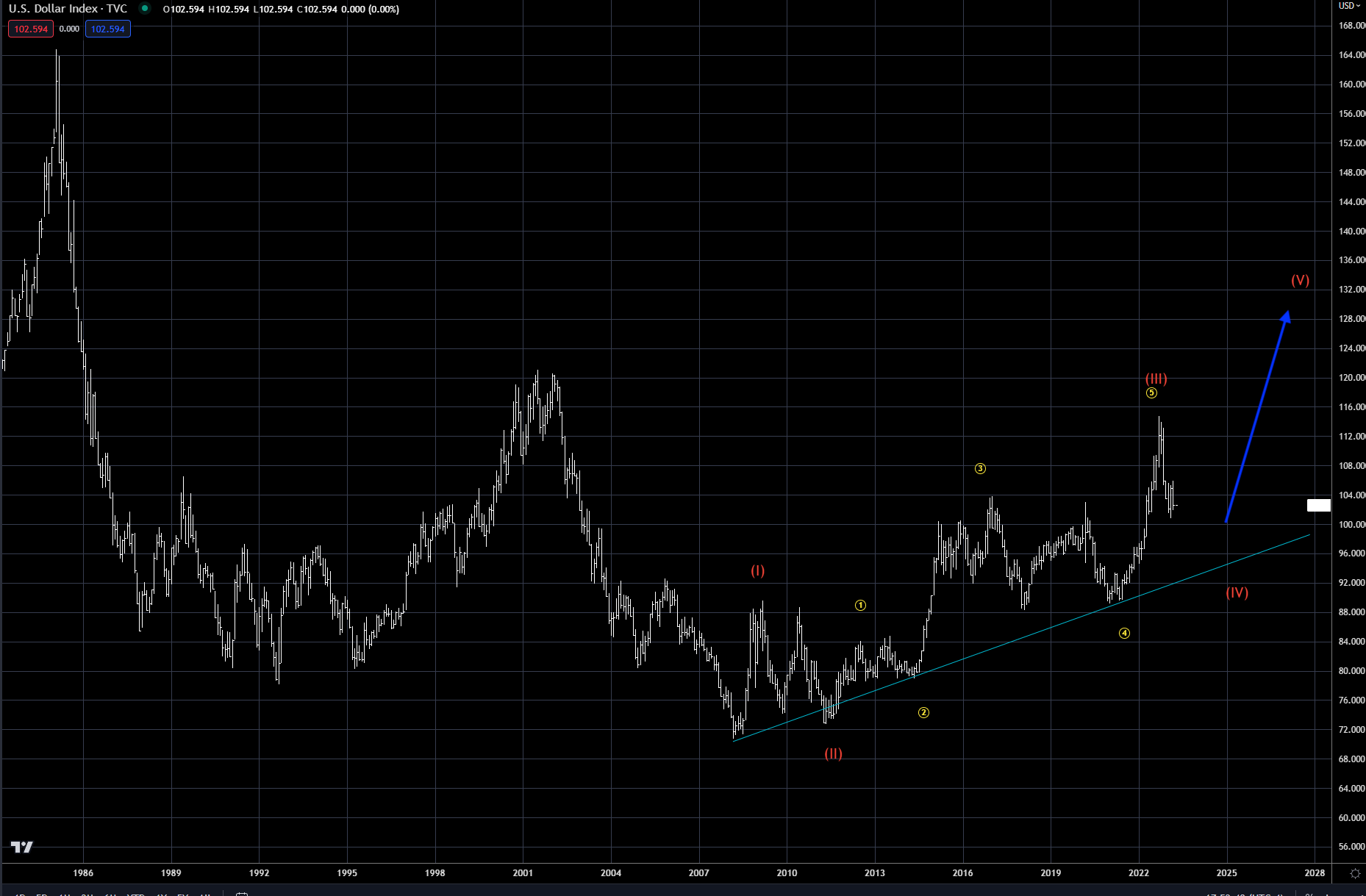
The Elliott Wave can be more powerful when the dollar index (Chart 4 below) is combined with the wave analysis from Chart 2 (10-year rate). While the long-term counts are different, both are in a corrective wave 4 at the moment. My analysis shows that they both have one final push higher to end their respective moves. Net net, look for the markets to trade sideways to lower for a bit longer, followed by one move higher in the dollar and in rates. The wave 4 also makes sense fundamentally, as many economic indicators are pointing for a slowdown. Inflation is well off its high, recession is on everyone’s lips, and the 2-10 yield curves inversion is bottoming. Recession usually follows after the curve begins to steepen (two-year rates falling faster than the 10-year rate). How long will this correction take before we resume higher?
The recession call will be one of the greatest recession watches in our lifetime. A large number of economists have been predicting one for over six months now, meaning it will be over before it starts! The greater risk -- and the thesis of this paper – is that the real issues begin after we complete wave 5 sometime in the next 6-12 months.
Chart 4: Dollar index
Further complementing our Elliott Wave analysis from above is the gold chart below (Chart 5). As interest rates pull back (go lower), the main beneficiary is gold. The gold price has been moving higher since the early 2000s, about the same time that the Great Carry Trade began. As we have argued, we are at the end of the Great Carry Trade. This is clearly laid out in the gold chart. Gold is in the last leg of this bull market.
Gold is driven by the ‘’real” rate of interest (Chart 6 below) -- that is, the difference between nominal rates and inflation. Gold does very well when this rate is negative. It’s no coincidence that gold moved sharply higher at the same time as real rates fell in 2018-2022. Gold rallied from $1,200 an ounce to $2,000 during this time frame. In Part 1, Chart 4, Apollo economist Torsten Slok showed an overlay with the inflation of the 1970s and the current cycle. Also, in Part I’s Chart 10, notice how the gold price has correlated with the amount of central bank debt, both bottoming near the turn of the century.
In Chart 7 below, you can see the last time we had negative rates similar to what we have today was in the 1970s. Gold topped in 1980 when real rates finally bottomed. The end of the Great Carry Trade is arguing that we are in the same time frame today.
Chart 5: Gold price
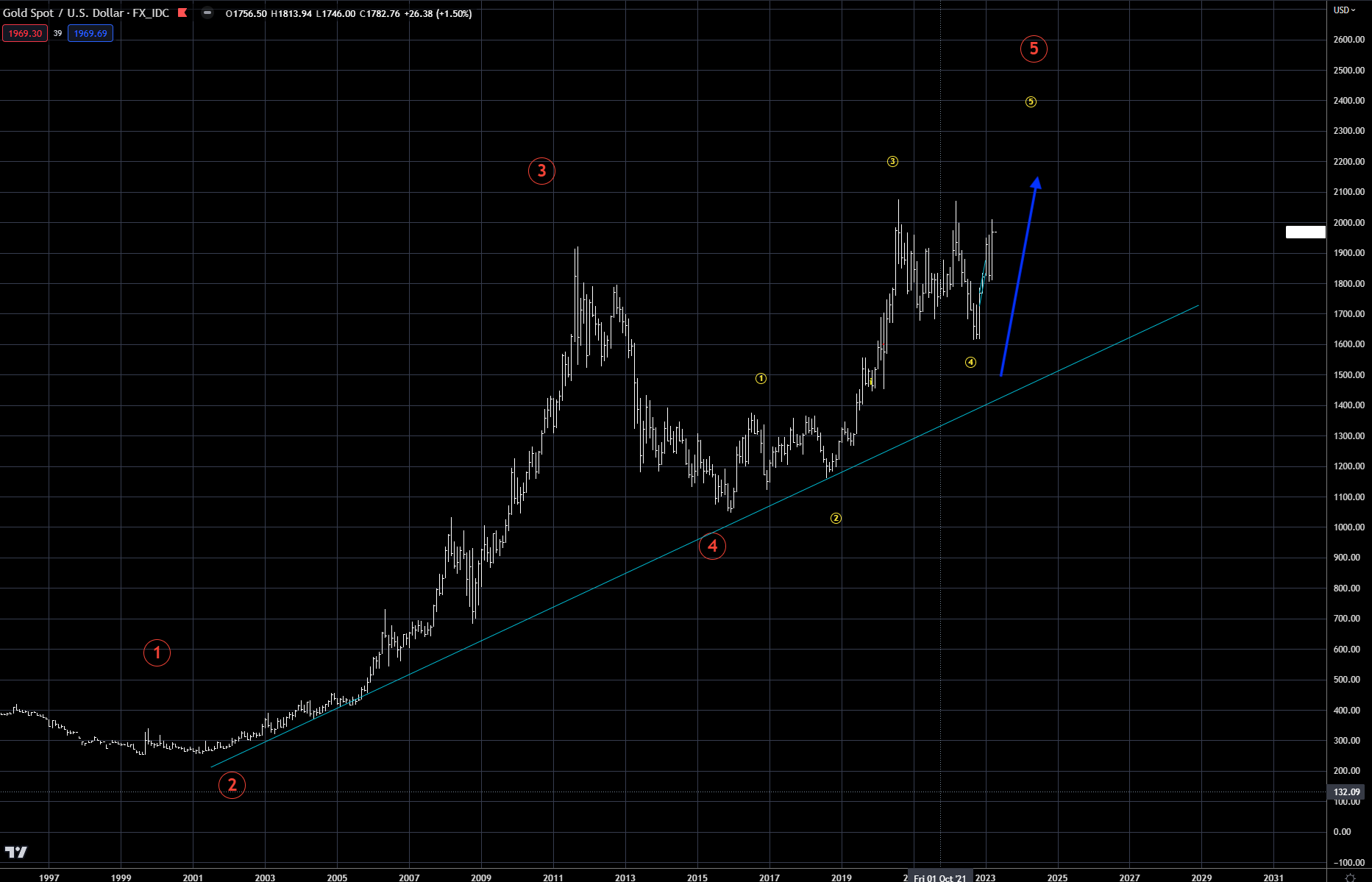
Chart 6: Gold price (LHS) vs Real rates (RHS)
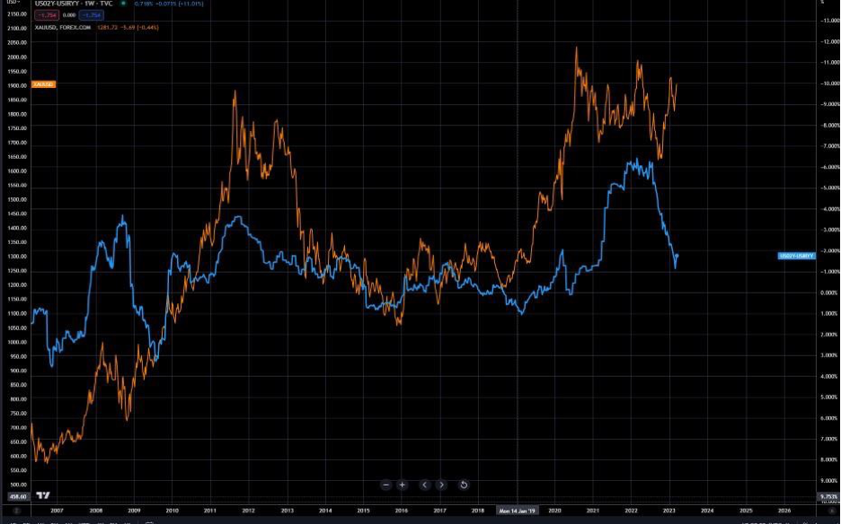
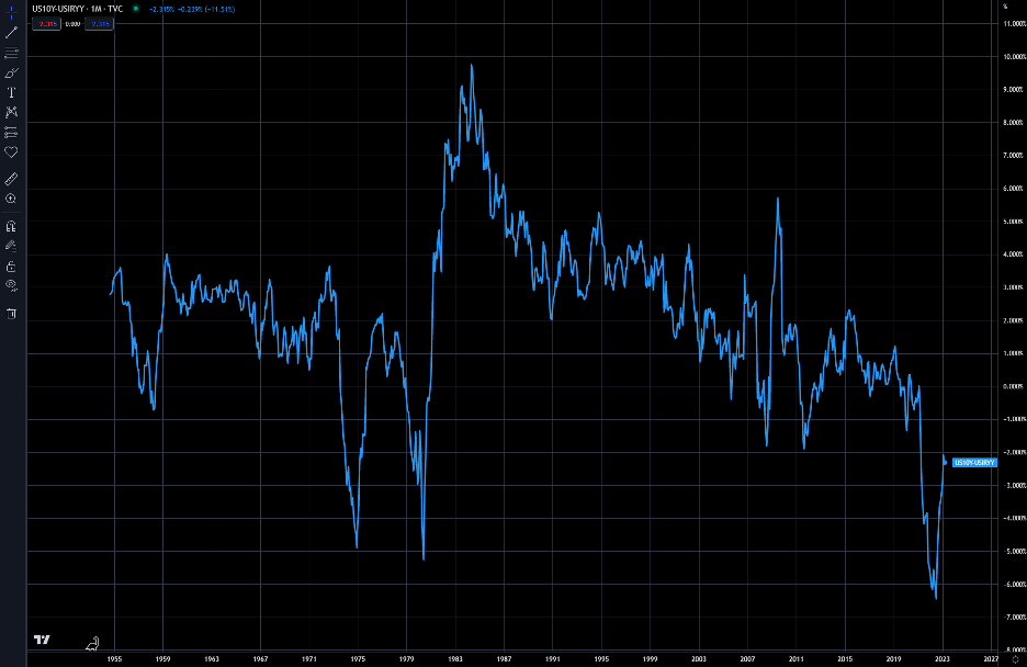
Chart 7: 10-yr real rates
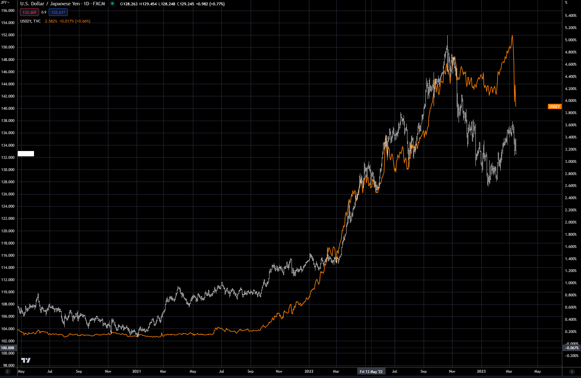
The Japanese yen has been highly correlated to the US two-year rate since the market (not the Federal Reserve) started tightening rates in 2021. Many argue the Fed chases the two-year rate, and is a price taker not maker. In Chart 8 below you can see the yen is weakening (a higher yen price in the chart) as the two-year rate goes higher. If the Bank of Japan were to tighten rates, this correlation would break down -- but as we pointed out in Part I, the BOJ has capped the level of rates at the moment. The end result is that their currency must weaken, until either US rates move lower or the BOJ changes its monetary policy. You can see this price action over the last few months as two-year rates have dropped and the yen has strengthened.
This is just another example of ways to trade the direction of US interest rates. If one were to trade options on this, option volatility is an area to explore -- so you get the greatest bang for the cost of the volatility. Over the last 20 years I have seen numerous opportunities in trading options on a correlated asset, which is cheaper to implement.
Chart 8: Japanese yen (LHS) vs US two-year rates (RHS)
Switching gears but staying with the same theme -- interest rates -- Chart 9 shows an overlay of the US 2-year rate (inverted left side) with the iShares CMBS ETF (right side). It is clear that central bank policy has driven the value of not just CMBSs but also REITs (Vanguard ETF VNQ ). Using Investopedia’s definition, CMBS securities are: ”Fixed-income investment products that are backed by mortgages on commercial properties rather than residential real estate. CMBS can provide liquidity to real estate investors and commercial lenders alike.” The bottom line is that they are very sensitive to the direction of interest rates. Chart 10 shows how REITs and CMBS securities have moved together the past few years.
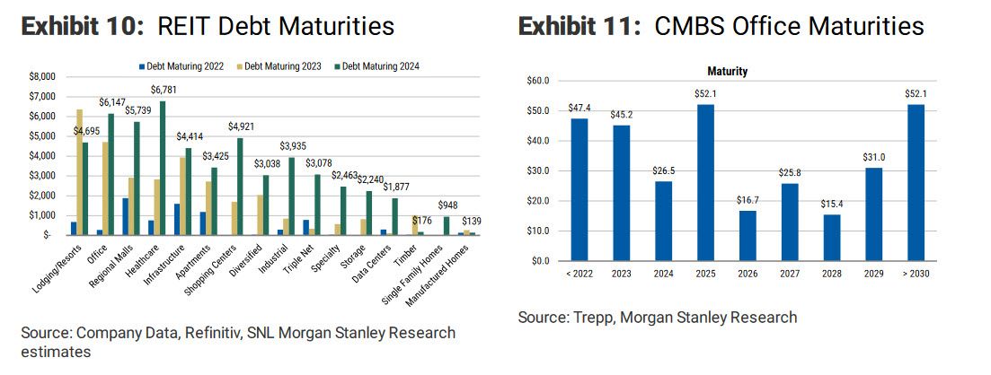
There can also be a lot of leverage (borrowing a high percentage of the purchase price) in these positions, which only amplifies the risk when interest rates move the wrong way -- up. Chart 11 below outlines debt that is maturing for both REITs and CMBS -- in most cases they will have to be rolled over at a higher rate or sold/defaulted on. The market is pricing in a tremendous amount of risk in these positions due to the higher cost of refinancing, the working-from-home phenomenon, which began during the Covid-19 pandemic, and too much financial leverage.
Chart 9: iShares ETF CMBS(LHS) vs 2 Yr Yield
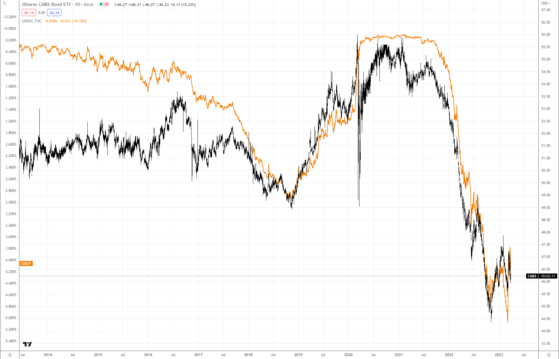
Chart 10: iShares ETF CMBS vs VNQ
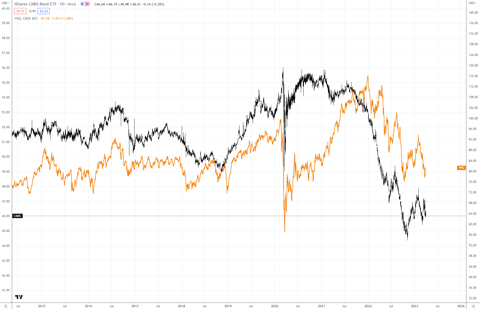
Chart 11
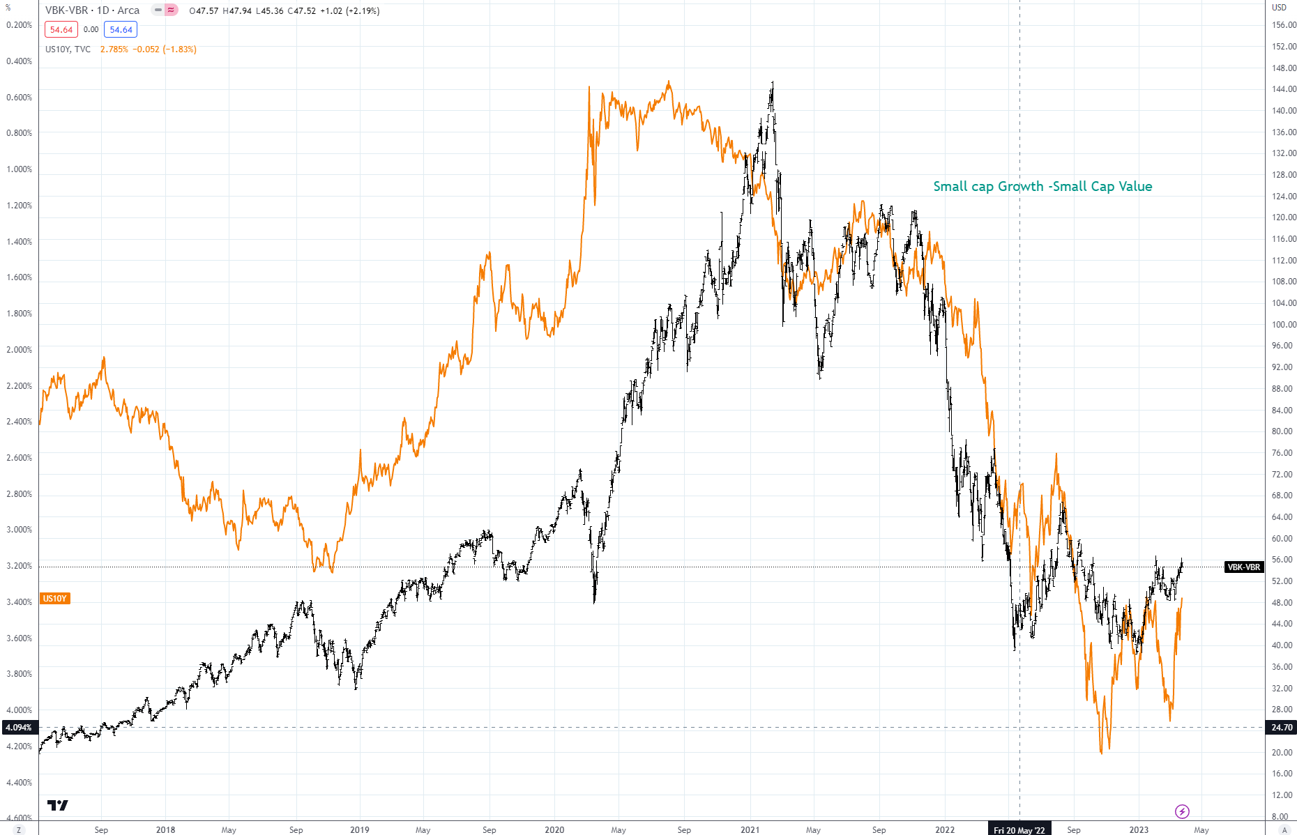
Another area that has shown high correlation to the easy money policy is growth stocks versus value stocks, especially in small-cap stocks. Chart 12 below shows US 10-year rates in yellow and the LHS, while the spread between growth and value is in black.
Using Vanguard ETF symbols VBK and VBR, growth stocks have been a great beneficiary of the lower interest policy, and this also rolled over to PE and Venture Capital as the race for yield made even the riskiest investments look worthwhile. You can see the unwind in real time as value stocks outperformed growth by over 17% in 2022 (VBK down 28.79% and VBR down 11.1%). You can find similar comparisons globally and in mid-cap and large-cap stocks. Here again is another way to play interest-rate direction and the potential Fed pivot (when they begin to pause or lower rates).
Chart 12: Small-Cap Growth (VBK) – Small-Cap Value (VBR) vs US Two-Year Rate (LHS)
Another not-so-subtle correlation to the Fed Balance sheet buildup (refer to Chart 10, Part 1) can be seen in Chart 13 below. Margin debt held in brokerage accounts has skyrocketed since 2008. This trend started to reverse its course since interest rates started increasing in 2021. This is a classic sign of over leveraging in the system and a classic example of the unwind of the interest rate carry trade -- as rates have gone up, margin is reduced and the risk is unwound (sell growth and buy value). In Chart 13, you can see how margin debt also tracks the value of the S&P 500 Index, so there is also market directionality tied into margin debt.
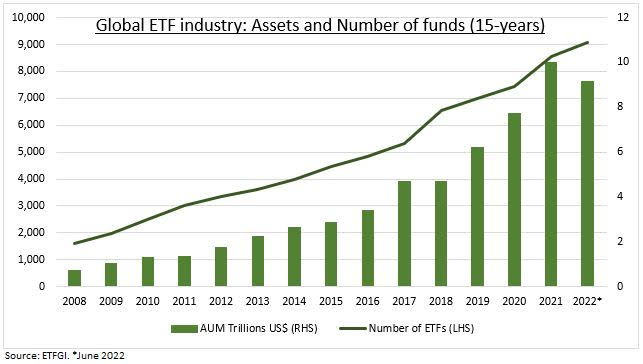
For further proof, look at the total assets in ETFs, shown in Chart 14. Note how cheap credit has propelled total assets under management since the 2008 financial crisis and the advent of QE and ZIRP. This is also in the early stages of winding down. One could also argue that ETFs have been popularized as active management has underperformed over the past three, five, and 10 years on average. According to a CNBC story, “Eighty-four percent of active managers underperform benchmarks after five years. That jumps to 90% after 10 years, and 95% after 20 years.”
Chart 13:
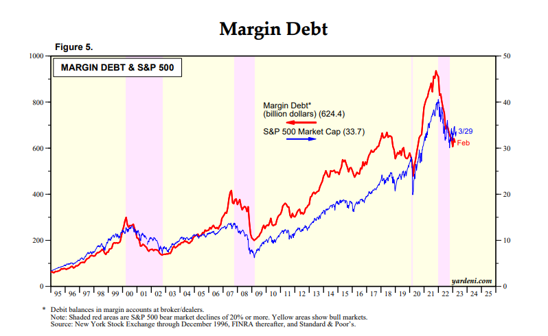
Chart 14:
One area that I have not touched upon, except for gold, has been commodities. There are two dominant commodity indexes followed by most investors. The first is the Goldman Sachs Commodity Index, or GSCI, and the second is the Bloomberg Commodity Index, or BCOM. In my analysis below I will use the GSCI index, but the comparisons are similar. The GSCI is a bit more energy-centric than the BCOM, but they are highly correlated. In Chart 15 below you can see the breakdown of how the index is allocated across multiple commodities. I will do further deep dives on commodity indexes in the future, as I have almost 10 years’ experience managing multi-billion-dollar commodity index portfolios.
Commodities have had two major bull markets in the past 15 years, both considered “Super Cycles”. You can see the two peaks in Chart 16 below. The first one started -- guess when -- right around the turn of the century and the beginning of cheap money. The second one was driven by the Russian invasion of Ukraine and the reduction of oil and natural gas exports from Russia and food commodity exports from Ukraine.
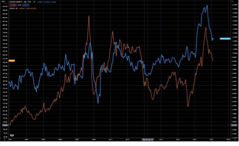
Commodities have become very highly correlated with real interest rates -- just like gold. Chart 17 shows the GSCI Index verse 10-year real interest rates and is another example of how all assets are tied to the cheap money policy of all central banks. As the Great Unwind continues, expect commodities to follow the path of real rates closely. After trading commodities for over 25 years, I’ve found that there are always surprises in individual markets. Weather and geopolitics can cause sudden spikes in price, but in the long term the path of real rates will rule.
Chart 15:
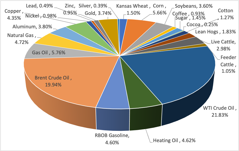
Chart 16: GSCI Commodity Index
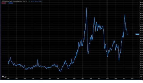
Chart 17: GSCI (LHS) vs 10-year real rates (RHS Inverted)
Demographics and geopolitics will be key
The goal of this article was to show how correlated the world has become to both lower interest rates and central bank liquidity. I have presented multi-asset classes and how they all react to interest-rate direction. The carry trade has been alive for a long time -- over 20 years -- and has been used universally across all asset classes.
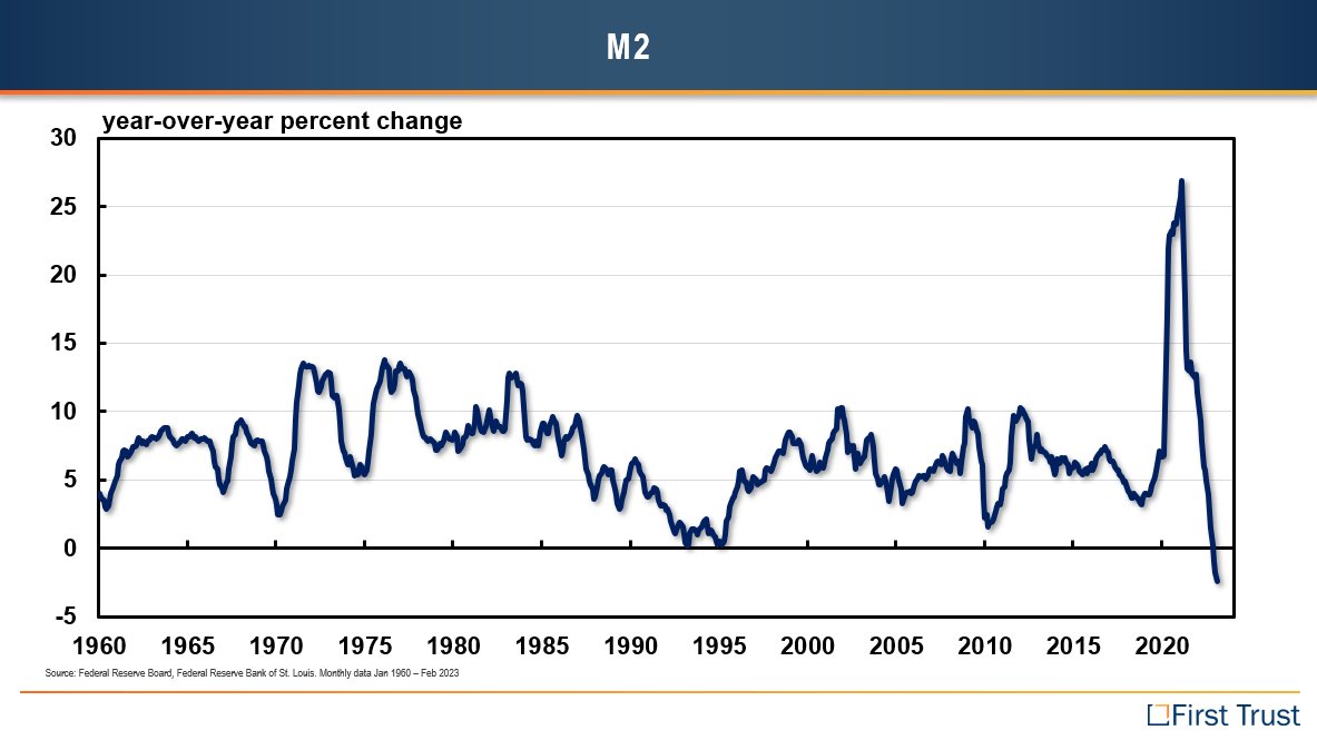
Now that the Great Unwind has begun there will be no safe place to hide -- except safe cash instruments. Something that took 20 years to build will take more than one central bank tightening cycle to alleviate. This Great Unwind will take multiple years to reduce debt and leverage down to levels that are deemed “Normal”. I don’t know what that level is, but I do know that it is much lower than today. We are currently near the end of the first central bank tightening cycle -- see the last chart below showing the money supply growth of the Federal Reserve, a classic example of a boom-bust policy. Money supply has let the inflation genie out of the bottle -- demographics and geopolitics will drive the next cycle. The Fourth Turning….
Part 3: Market Outlook Summary
I have made the case in this paper that the path of interest rates is driving multiple asset classes. If we can get the direction right, the market forecast for other asset classes can be made more confidently.
In the short run – the next 30-60 days -- global rates should be bottoming and setting up for a final move higher to end this tightening cycle, as shown in Chart 2 (Part 2). The key metric many are following is the 3-month to 10-year spread in the US. The current rate is -1.52% -- in other words, the 3-month rate is 1.52% higher than the 10-year rate. Most recessions are preceded by the inversion of this spread. See FRED data in Chart 1 below -- note the gray shaded area represents recessions.
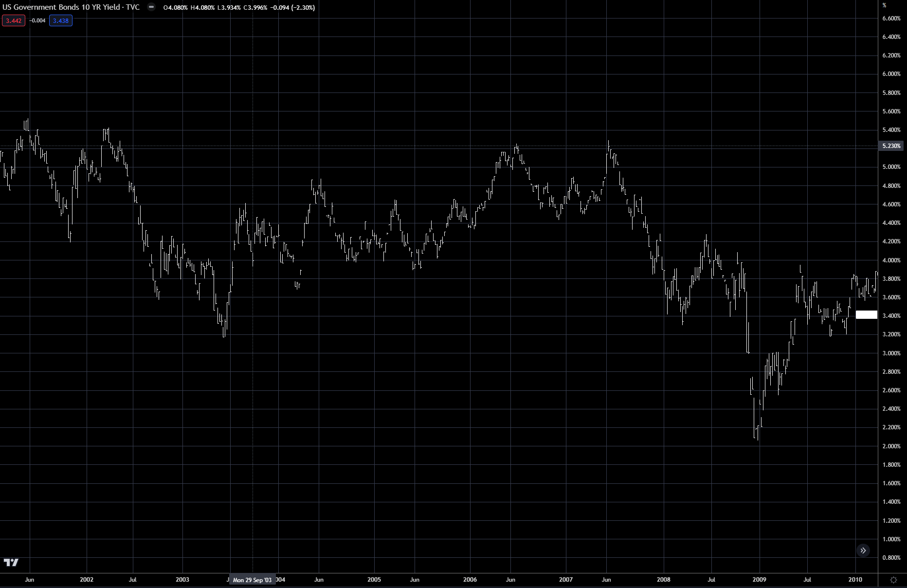
The current inversion is the greatest since at least 1980, using FRED’s data. As you can see, the actual recession occurs months after the inversion has already bottomed. Many believe that rates have already topped, but I will argue that a new high is still in the cards. In 2007, the 3-month/10-year spread bottomed in February/March, while the 10-year rate made a new high for the move in June 2007. In Chart 2 below, the blue dot marks the bottom of the 3-month/10-year inversion and the red dot marks the new high in 10-year yields.
With that said, I do believe the 3-month/10-year spread has bottomed, and the next leg up will be led by the 10-year – referred to as a Bear Steepener. The current high in the 10-year during this tightening cycle is around 4.3%. Our upside target would be at least this, with the possibility to push as high as 5%.
Once this high is complete, the market should sell off quite dramatically, with rates moving lower over the next 12-18 months. 2.50% would be a great target sometime in 2024-2025.
Chart 1
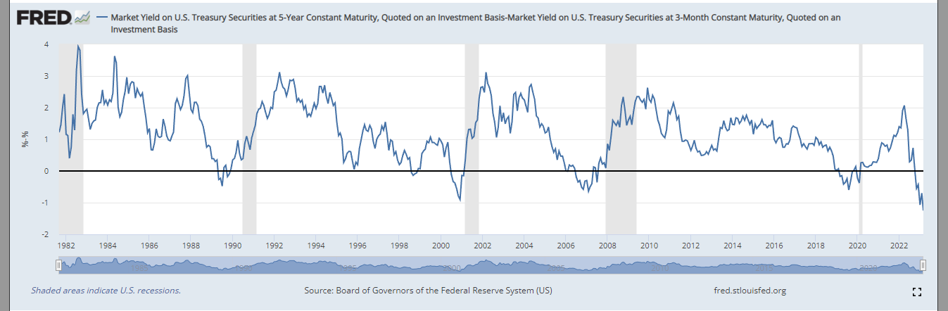
Chart 2
Based on our interest-rate forecast, this should also boost the dollar to complete its last leg up. See Chart 4, Part 2. The US dollar could mark its high near the high for interest rates, but I would not rule out further upside if we have a market crisis and flight to quality. This flight would be supportive and would be short-term bullish for the USD when this occurs. Ultimately, this is likely the last leg up for the USD, ending the bull market from the 2008 low.
Gold is currently approaching $2,100 an ounce and, using our analysis from Chart 5, Part 2, it is nearing the end of a bull run since 2000. In the short term, if 10-year rates are moving higher and real rates increase, it will pressure the gold market with a possible move down to the $1,700 area. Once rates top, as mentioned above, gold has the potential to then make its attempt for one final push higher as rates mover lower. But this is likely the last leg up for gold ,with upside targets eventually near $2,500. As a side note, final wave 5s in the Elliott Wave can be very tricky and fail. This move is not the one that you take a lot of risk on -- guarding for principal loss is very important during this phase.
Commodities as a basket, as shown earlier in Chart 16, Part 2, have already made their high last year. 2022’s double top with the highs from 2008 will mark the high through the coming market crisis. As I said in Part 1, this unwinding process has just begun. Because of the amount of global debt outstanding, commodity demand could be curbed for a number of years. This is a major contrarian call, however, as many are expecting another super cycle in commodities.
Equity markets have already put their high in last year and are now in a corrective rally bounce. Take opportunities to reduce equity exposure. Growth versus value, as presented earlier, will follow the path of interest rates in the short term, with higher rates leading to value outperforming. But on the next easing cycle I do not expect growth to outperform over the long term as the coming market crisis will be painful for growth and high-debt/levered companies.
Finally, a comment on the CMBS market and real estate in general (private equity and venture capital fall into this category also): over-leverage, changes in working demographics and an increase in carrying costs will weigh on these sectors. The Great Unwind has just begun, as discussed in Part 1 -- protecting principal should be the goal over the next couple of years!