Commodities as an Investment Option
Author: Bruce Liegel
Over the last year, there has been a lot of speculation that we are in the early stages of another commodity super cycle. The goal of this paper will be to break down the macro commodity opportunities and take a deep look at the economics driving the commodity complex.
Introduction
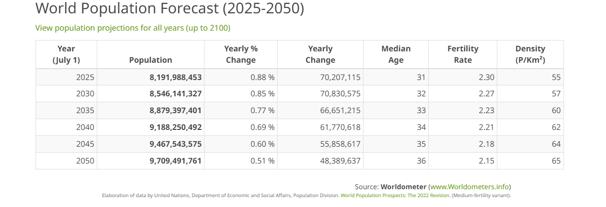
In previous deep dives, we looked at global demographics and major economic trend changes. To quickly update, Chart 1 shows the dramatic demographic shift that is developing as the global population ages, which is one of the biggest issues the world will have to focus on over the next 50 years. Note the aging crisis changes shown in yellow. Although population growth is slowing, shown in Chart 2, the overall population of the planet will continue to grow, as shown in Chart 3. The vast numbers alone argue that we will continue to see huge supply/demand imbalances going forward.
The focus of this paper will be to take a look at the current supply/demand and technical factors for a host of commodities and come up with a game plan for the short term and potentially longer term.
Commodity demand and supply is always challenging, as consumers' tastes change and substitutions are constantly available. The other wild card is technological changes – think AI, for example, or EVs – in multiple areas that make the unknown unknowns too hard to predict. And, of course, weather and geopolitics, which are always top of mind for commodity investors.
Chart 1
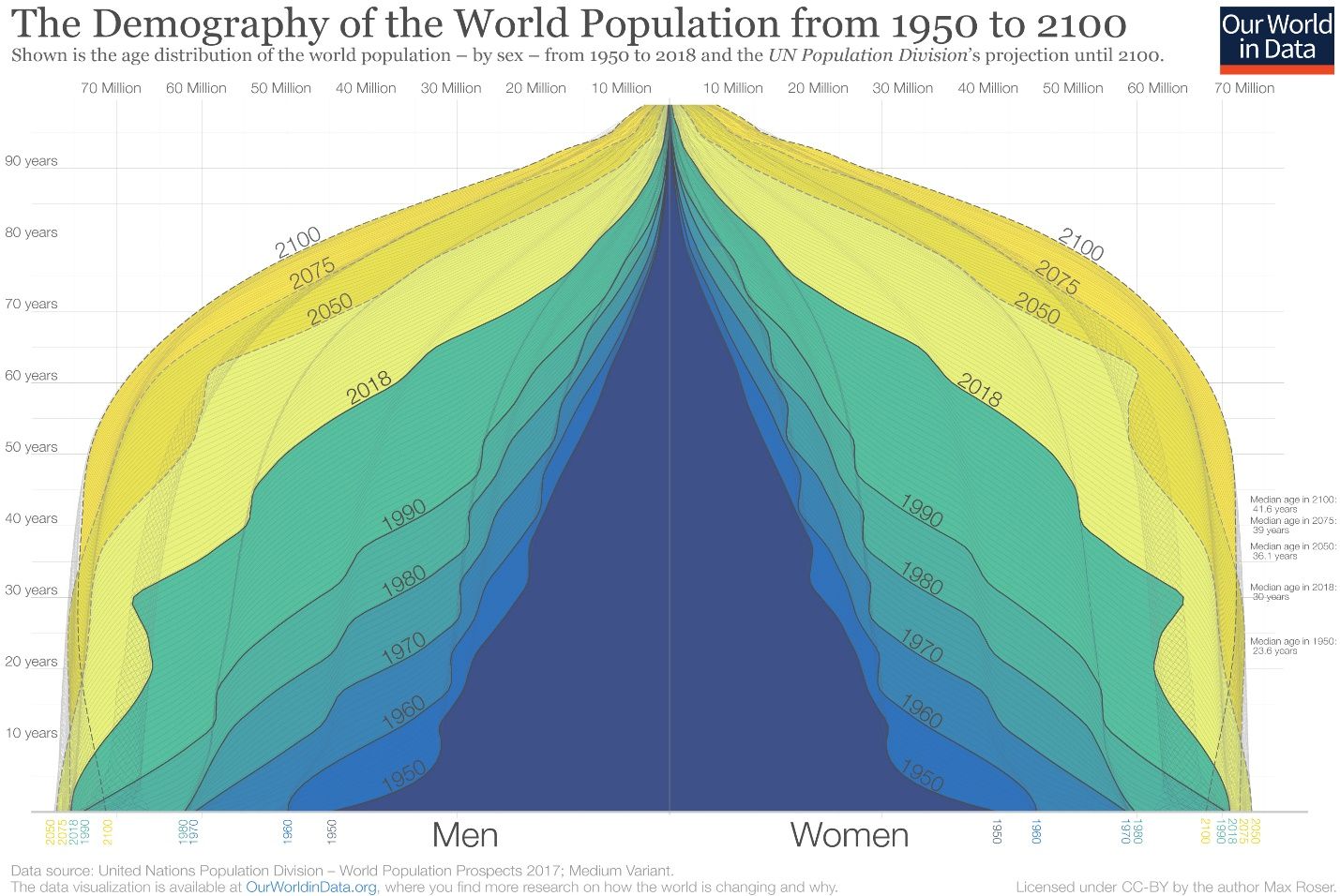
Chart 2
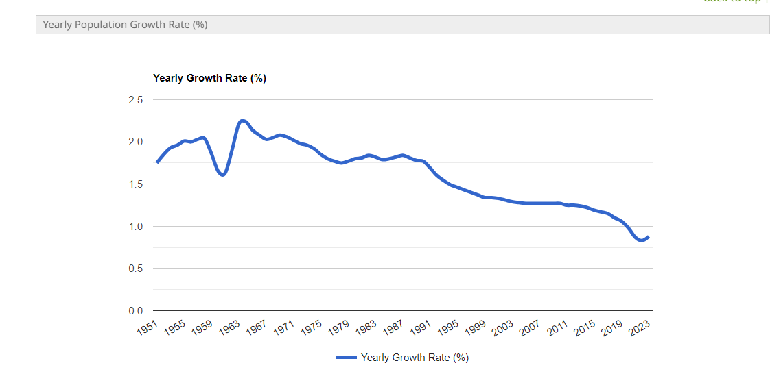
Chart 3
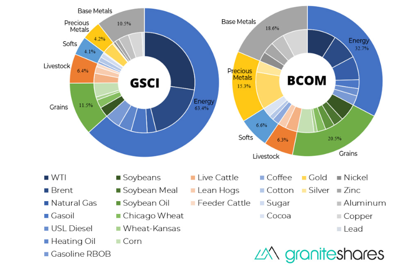
In Chart 4 below, the long-term price chart for the Goldman Commodity Index is shown. Remember that the GSCI is more energy-centric, while the BCOM (Bloomberg Commodity Index) is more diversified – see Chart 5 for comparison. In this paper the focus will be on the GSCI Index, but the correlation between the two can be quite high.
Since China’s entry into the WTO in 2001, commodities have been in a very wild, new-paradigm trading range, mainly led by China’s modernization but also India’s ascent too. The most recent rally in 2022 was led by the Russian conflict in Ukraine, resulting in a price surge not seen since the 2006-2008 bull market.
The huge trading range for the past 15 years is the market's method of finding the supply/demand equilibrium. It’s quite obvious that this has been a quite messy and a very difficult task. Just recently, the index has gone from 240 to 840 in less than two years – these are phenomenal moves, usually seen once or twice in an investor's lifetime.
Also, notice the significance of a potential double top (green arches), which could play a significant bearish technical signal over the next few years. If the long-anticipated global recession takes hold in 2024, this would also be bearish for commodities, and solidify the double-top techinal signal. But for now, commodities look oversold – more on this later in the paper.
Chart 4: S&P GSCI Index
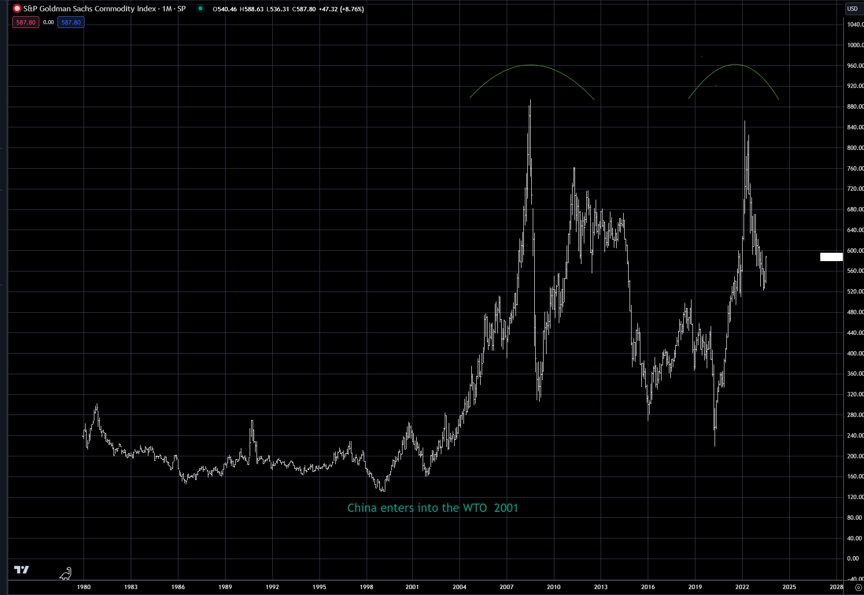
Chart 5: GSCI versus BCOM comparison
A unique diversification
Why focus on commodities at all if you’re a balanced portfolio manager – 60/40 stocks/bonds. Because commodities offer a unique diversification against inflation when other assets classes are vulnerable.
Chart 6 shows the high correlation between the GSCI and the US CPI rate. While there are periods when the correlation is almost nonexistent, in times of inflation, commodities do offer a true hedge. Since inflation exploded onto the scene in 2020, the GSCI index has been quite correlated to the US CPI rate and, as shown in Chart 6, it is also quite correlated to the 10-year real rate of interest over the past 25 years.
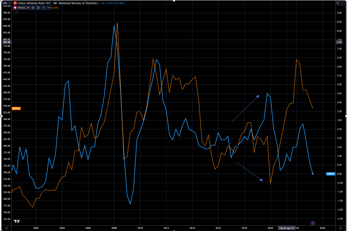
This correlation between commodities and inflation is not just a US phenomenon, but a global one – Chart 8 shows the overlay of China CPI and the GSCI Index. Notice the divergence over the past couple years, indicated by the two arrows, where Chinese CPI actually has been falling (deflation) versus the rest of the world. It does appear that over the past three months the two have become more intertwined as inflation has fallen globally.
Chart 6: S&P GSCI Index (RHS - white) versus CPI (LHS - orange)
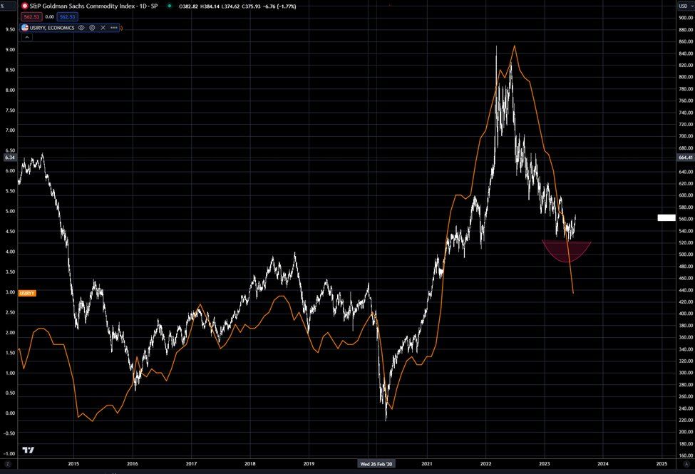
Chart 7: US 10-year real rate (RHS - blue) versus GSCI (LHS - orange)
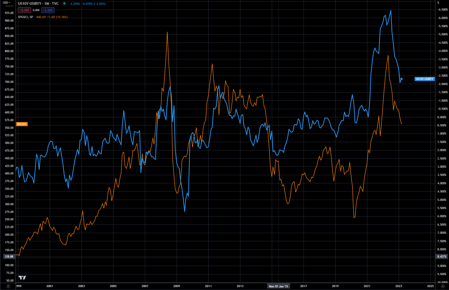
Chart 8: China CPI (RHS - blue) versus S&P GSCI Index (LHS - orange)
There is a common misperception that the dollar is negatively correlated to the price of commodities – this statement can be true and also false. Chart 9 shows the overlay of the DXY Index and the GSCI.
Take, for example, when you have a period of high inflation, which we just did in the US. The Federal Reserve was the first and most aggressive tightener in early 2021 and the dollar rallied along with the price of commodities. In this case, the dollar was driven by tighter monetary policy and commodities were driven by the higher rate of inflation.
There are other times when the Fed is in easing mode (2000-2003 and 2006-2010) and commodities have one of the greatest bull markets ever, peaking in 2008-2010. In this case, extreme easy monetary policy by the Fed under Chair Ben Bernanke drove the dollar lower, causing one of the greatest risk-on trades in a generation, with commodities one of the beneficiaries. Chart 10 shows the correlation between the DXY Index and the US 2-year yield.
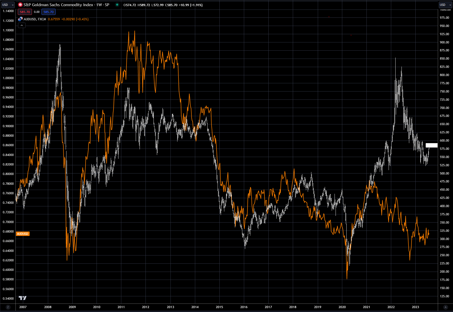
There are so-called 'commodity currencies' that do follow commodity prices more tightly. They are called commodity currencies because their economy is driven by commodity exports.
Chart 11 shows the tight correlation of the Australian dollar with the GSCI Index over the past 20 years. Even though Australia is not a big exporter of energy, the biggest component in the GSCI, they do export base metals, coal, grains and natural gas, mainly to China. In effect, getting long Australian dollars is another way to trade a long commodity view.
Do note how monetary policy ultimately drives FX prices, as the Australian dollar did not appreciate anywhere close to how the GSCI did from the 2020 low. The US Fed ran a more aggressive tightening campaign than the Australian central bank early on in this inflation cycle – hence the weakness in the Australian dollar versus the dollar.
Chart 9: DXY dollar (LHS orange) index versus GSCI (RHS Blue)
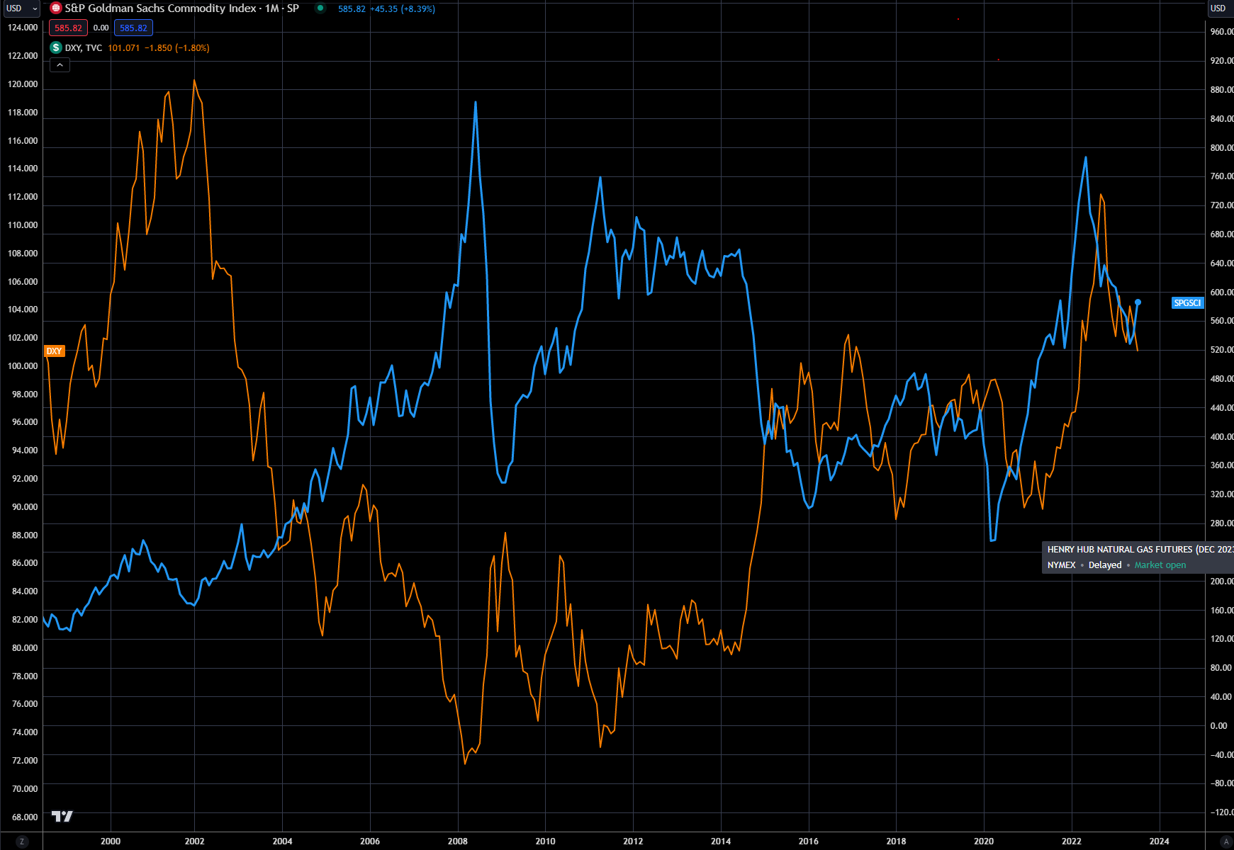
Chart 10: US 2-year (RHS Blue) versus DXY Dollar Index (LHS Orange)
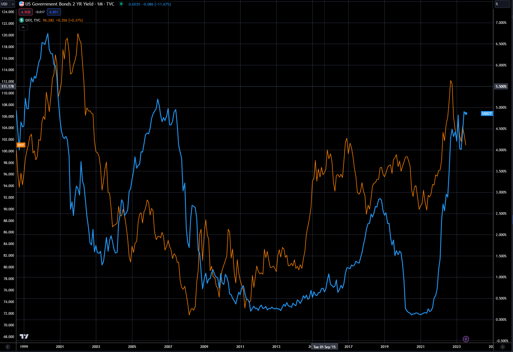
Chart 11: GSCI (RHS - white) versus Australian dollar (LHS - orange)
There are four distinct market cycles in commodities, as outlined in Chart 12.
The approach here is meant for a commodity allocation in a diversified portfolio of stocks and bonds. It's not always easy to determine what stage the commodity cycle is in, as weather or geopolitics can cause prices to turn on a dime. This summer’s weather or the Russian invasion of Ukraine are two great examples. Chart 12 does not go into how to allocate for inflationary periods, but inflation is usually too much money chasing too few goods – so that would categorize undersupply as the first factor (#3 or #4).
Chart 12
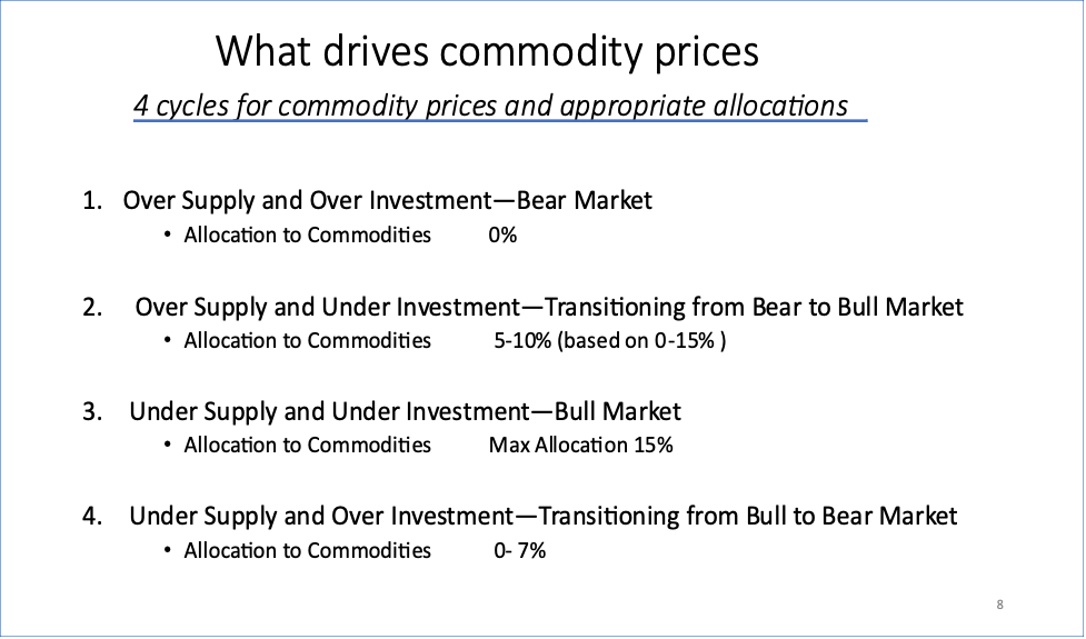
Cheap money drives investment and would be considered an overinvestment, as shown in #1 or #4, while a tighter monetary policy would drive underinvestment, as in #2 and #3. We are now in a tighter money, lower investment category, which would argue for #2 or #3 for the second factor.
So, where do we go from here?
Inflation is no doubt much lower than a year ago, setting up the stage for oversupply, but money is tight, putting us into the underinvestment camp. At this stage, cycle #2 makes the most sense, which would be underinvestment and potential oversupply. Why oversupply? Because inflation is weaker year over year, which normally occurs when there is more supply and tighter monetary conditions.
Net net, it still argues for a partial allocation to commodities, as we could be transitioning from a bear market to a bull market. Patience is important, as commodities are not typically a long-term investment, and can be termed a trading asset.
Commodities can also be thought of as a contrarian asset class - buy when the index looks bad and sell when it looks great.
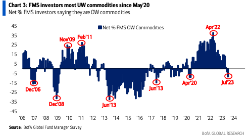
In Chart 13, the Bank of America Fund Manager Survey data is presented. The survey has its hits and misses for use as an investment guide. It did great in 2006 and 2008, but did awful from 2012 to 2016. The survey nailed the high in April of 2022, and is now potentially signaling a buying opportunity. I’m not a great fan of using this tool as an investment guide, but it does provide valuable information for where other managers are at in their allocation process.
Chart 13
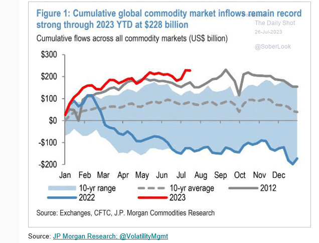
JPMorgan also releases data on commodity inflows – normally for both the GSCI or BCOM indexes. There is a very vibrant over-the-counter market for derivatives tied to both indexes. This is where many of the large banks will offer a customized price to buy or sell the index. This is an off-exchange transaction between the buyer and the seller.
Chart 14 shows both off-exchange and exchange data for commodity investment and indicates that inflows have been quite high in 2023, well above the 10-year average. This would argue that the ensuing rally from the June lows will be corrective in nature and not the start of Phase 2 in our inflationary cycle. But saying that, because of the long-term trend that we are potentially in, it still warrants a modest investment in commodities at this juncture.
Chart 14
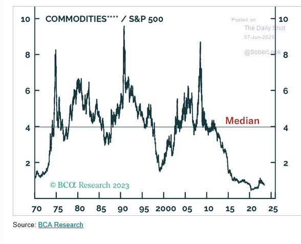
Another nonsensical comparison I see a lot of is how cheap commodities are compared with stocks. Chart 15 shows the ratio of commodities to the S&P 500. I have seen this chart now for almost 10 years, with the same result – it keeps going nowhere. But if our main thesis plays out - rising inflation over the next 10 years – this chart may see more mean reversion than has occurred in recent times.
I will point out that the commodity outperformance doesn’t last long – typically only 3-5 years, and then it comes crashing back down. Notice that even in the 1970s, the trend was quite volatile; I would expect similar price action for this next cycle.
Chart 15
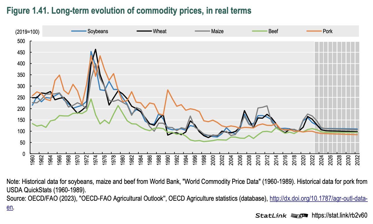
In Chart 16, the long-term valuation of commodities is shown in real terms. This is another graph that I have seen for over 20 years, and it is pretty much useless to use in deciding whether to invest in commodities or not.
Commodities in real terms look really cheap when compared with the great bull market of the late 1970s. Looking at commodities in real terms is always interesting, but they are traded in nominal terms, based on fluctuating supply and demand, geopolitical ramifications and of course technological changes. Comparing a bushel of corn today versus one in 1970 is like trying to compare a flat screen tv today with one from the 1970s. Both are totally different due to vast technological changes and supply-demand adjustments.
Chart 16
Early stages of a super cycle
If you read my first deep dive, The Carry in the Conundrum, you know that I believe we had a major long trend change in interest rates and inflation, starting in 2021. If you follow along with this thesis, and the demographic changes, it makes sense that we are in the early stages of another commodity super cycle. Charts 17 and 18 show the potential road map for inflation, as do charts I have shown in other deep dives.
It does mean that the next phase of the bull market may start in 1-2 years, especially if we have a recession in 2024. In Chart 17, the overlay is compared to the inflation scenario from the 1970s and what transpired then. If this analysis holds true, we should expect inflation to continue to grind sideways to lower into 2024 before the next inflation cycle begins.
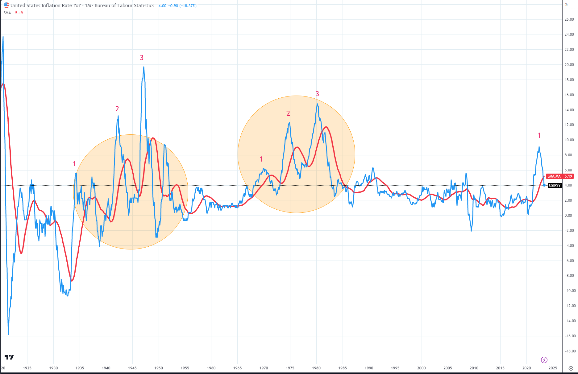
Chart 18, which is from my previous deep dive, shows the US CPI back over 100 years. Since 1900, there have been two distinct inflation cycles – each occurred with three cycles marked by the colored circles. Markets don’t always repeat the same way, but the arguments laid out in the previous deep dives are strong enough to suggest that this inflation cycle today is not a one-off, but just the start of a major transition.
Chart 17
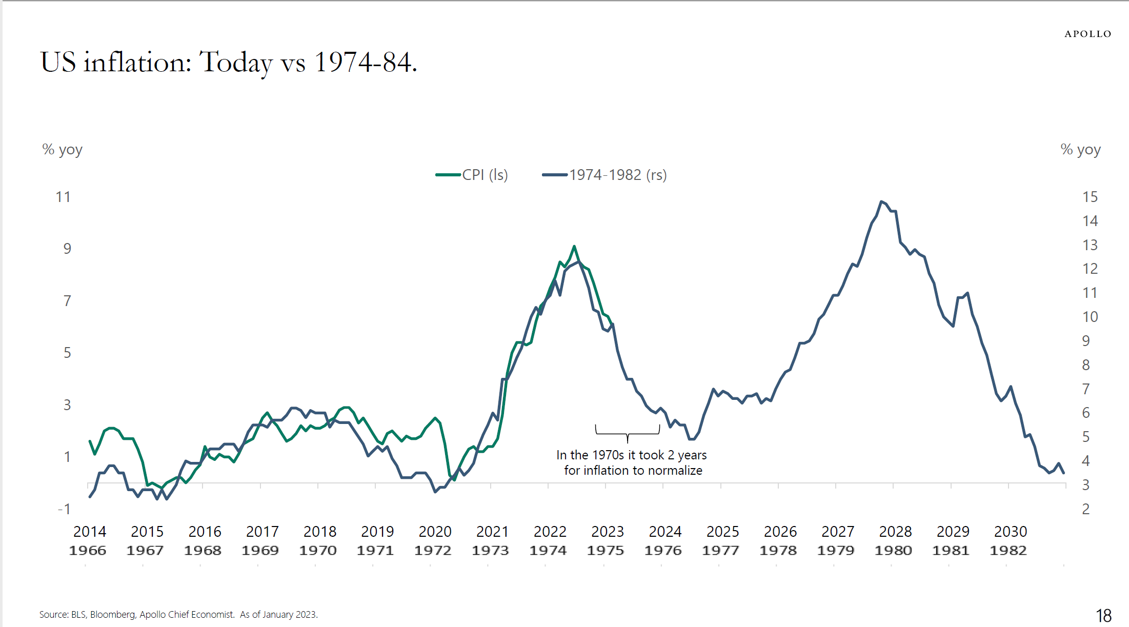
Chart 18: US inflation rate (blue) with 36-month moving average (red)
This paper is the start of a deep dive on the commodity complex, with 2-3 more due out over the next couple months. While there is risk in the short term that commodities have a strong second half of 2023, I think the big play will be beyond 2024, so we have plenty of time to put together a great strategy on how to participate.
The basic foundation for commodities as an asset class was presented here, while the next papers will break down market sectors and look for opportunities in individual commodities, foreign exchange and also equities. I’m looking forward to showing you how I have successfully navigated these asset classes for the past 25 years and sharing my knowledge on how and where to look.
Trading strategy is based on the author's views and analysis as of the date of first publication. From time to time the author's views may change due to new information or evolving market conditions. Any major updates to the author's views will be published separately in the author's weekly commentary or a new deep dive.
This content is for educational purposes only and is NOT financial advice. Before acting on any information you must consult with your financial advisor.