The Institutionalization of Gold
Author: Bruce Liegel
Executive summary:
- How gold, in a bull market since 2000, has become 'institutionalized'
- A look at gold ETFs, and the role of central banks, inflation and interest rates
- And a wider market outlook for gold as well as silver, palladium and platinum
Introduction
Our previous deep dive focused on the overall outlook for commodities via the S&P GSCI index. Over the next few months, I will be breaking down the sectors that encompass the index, with this month’s focus on precious metals. This includes gold, silver, platinum and palladium, and I will also focus on the equity mining group as well.
If you have been reading my reports for the past six months, you know that I believe we had a major change in both inflation and interest rates over the past couple of years – a change so compelling it only occurs once or twice in our lifetime.
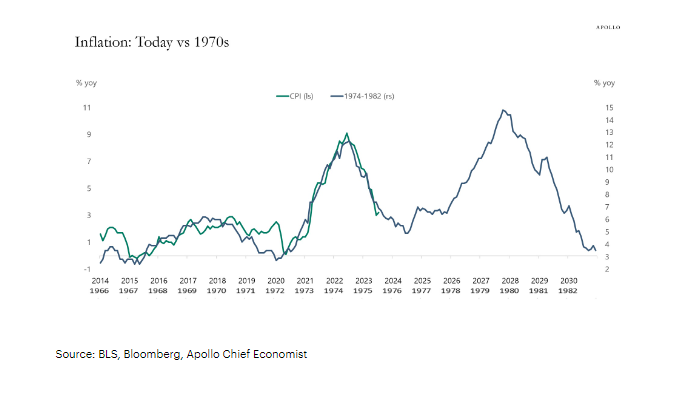
Chart 1 shows a very popular overlay, with today’s inflation cycle overlaid against the inflation period from the 1970s. Up to this point the overlay has been right on target, with a slowdown continuing for another year or two before the next cycle begins. Odds favor that this time will be different, as no two cycles repeat exactly the same way.
Chart 1
Gold, inflation and interest rates
Historically, gold appreciation has been highly correlated with higher inflation, and this cycle has not disappointed as gold rallied from the August 2018 low to the August 2020 high by almost 80% ($1160 to $2075).
But there is more to this gold story than just inflation, as gold has been in a raging bull market since 2000. Charts 2 and 3 show world debt growth and the price of gold, and they have been running in tandem, except for a couple of hiccups in the gold price. If we truly are nearing the end of debt creation – a big maybe – then gold should feel the pressure from the monetary and fiscal tightening.
Chart 2
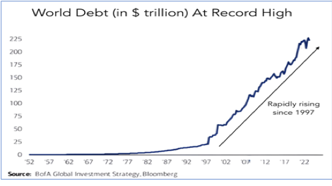
Chart 3: Gold spot price
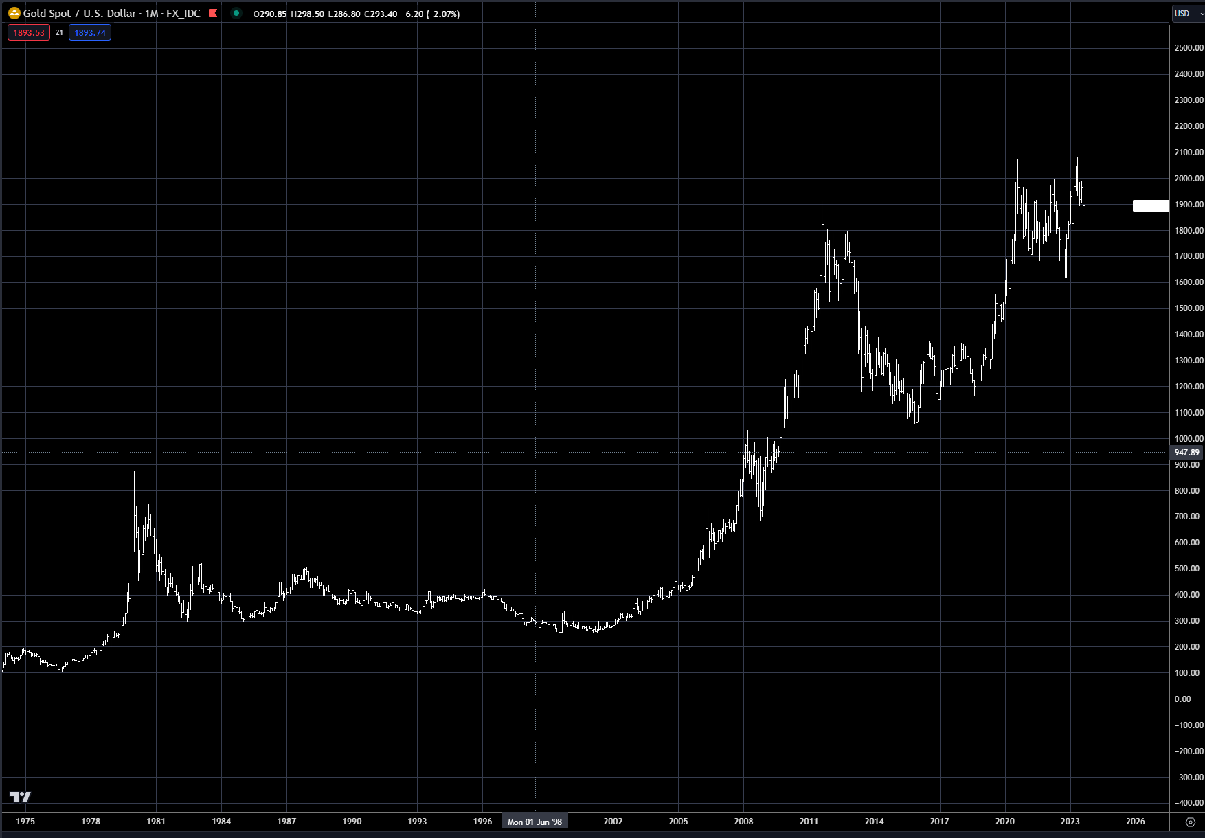
Some, if not many, in the market have been concerned about the monetization of debt, which really began about 25 years ago, and which has attracted gold bugs and others to buy gold as a hedge against central bank money printing and the global government debt binge. Charts 2 and 3 show that this group is rather large, as it takes more than a few gold bugs to get gold to go from below $300 in 2000 to over $2000 in the 2020s.
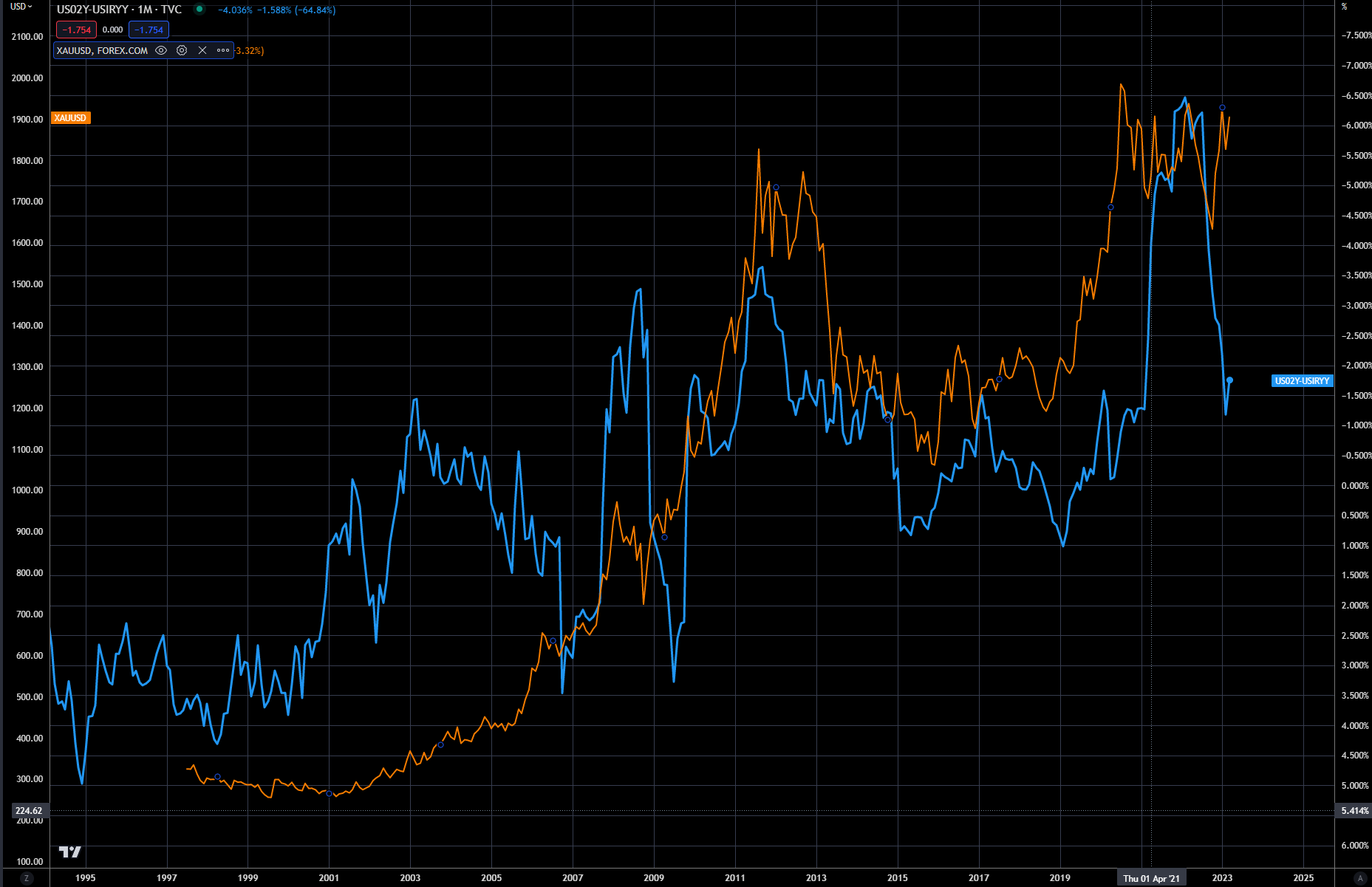
Gold is also highly correlated to the real rate of interest – as shown in chart 4. When real rates are negative, or really negative like they were in 2020 (-6%), it drives gold higher as negative rates drive the liquidity engine for investment, and eventually inflation. When real rates go positive, it tends to be a braking mechanism for the economy, reducing demand and ultimately lowering inflation.
But notice that the gold price has diverged in 2023, and has stubbornly not moved lower as real rates have increased. Why is that? Basically, the market is pricing in Fed monetization occurring again, just like it has for the past 20 years. The question is – is this the correct view, or are the Fed and other central banks going to continue the tight monetary policy for longer, or have to capitulate and ease aggressively, a la 2008.
Our argument has been that we are near the end of this tightening cycle, but not the end of higher rates, as the long-term breakout in rates and inflation has years to run until it is over. See previous deep dive, The Carry in the Conundrum.
Chart 4: Gold (LHS in orange) versus US two-year real interest rate (inverted - RHS in blue)
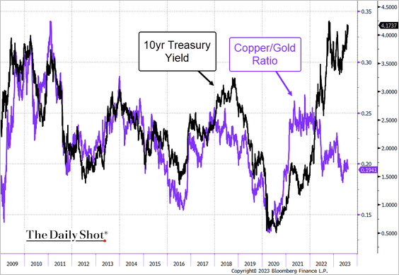
Another area of correlation with interest rates has been the copper/gold ratio, as shown in chart 5. There are many arguments when it comes to this ratio, but the most simplistic is that copper outperforms gold in a rising interest rate environment because the economic engine is purring, and when rates are moving lower, the economy needs extra stimulus to getting it purring again – typically during a recession when industrial demand is weak, reducing copper demand.
The real interest rate is also the other driver, as we mentioned previously. Notice the divergence between rates and the ratio – gold is not correcting like it normally does during a higher interest rate environment.
Are these two divergences a warning sign that gold may be due for a sharp correction, especially if the Fed maintains its hawkish stance?
Chart 5: Copper/gold ratio versus the US 10-year yield
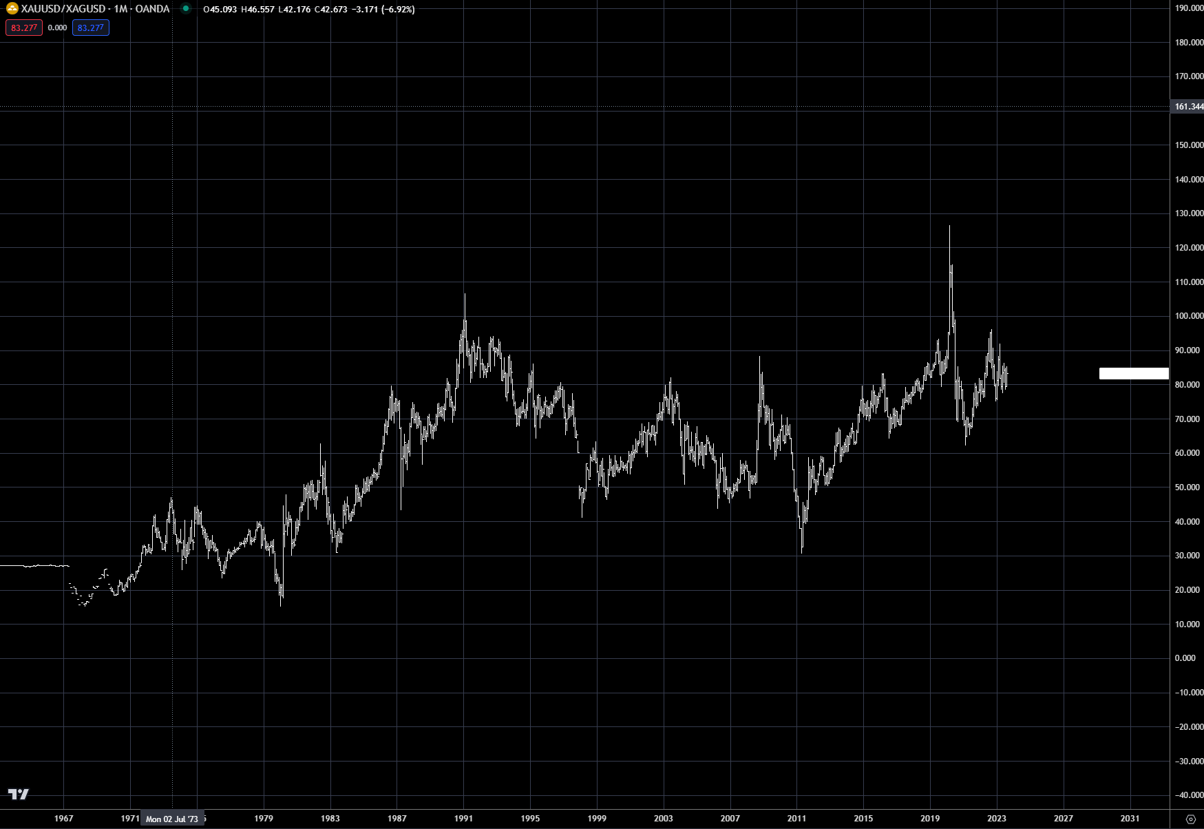
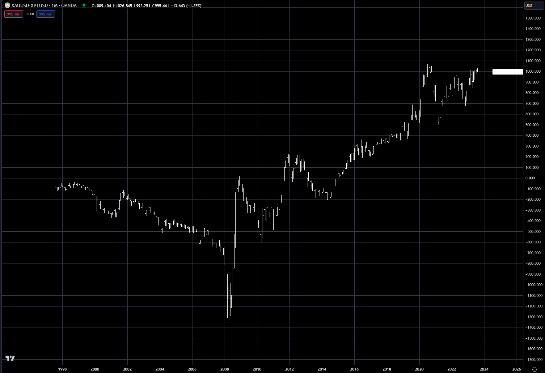
Other ratios that are important for gold watchers are the gold/silver ratio the gold-platinum spread, and the gold-palladium spread (see addendum).
ETFs in the gold market
The gold/silver spread traditionally was used to gauge the participation by retail customers in a precious metals rally. But this has all changed with the introduction of cheaper ETFs to participate in the gold market. Now you can invest in GLD or other gold ETFs and not have to invest as much as in a gold futures contract or physical gold. This opened up the market for the small investor, which caused demand switch from silver to gold.
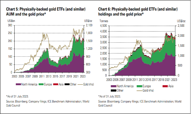
Chart 6 shows the enormous growth over the last 20 years in the global gold ETF market. This doesn’t mean the silver ETF market is small, as there is over $13 billion invested in eight silver ETFs in the US, but compared with the gold ETF market, which has over $200 billion, it is quite small.
The other option is that you can always invest in gold and silver coins, but this is a small aspect of the overall precious metals market. The institutional market has always been the driver in price, and will most likely continue to be. GLD and other equity ETFs allow institutional equity managers to now invest directly in gold; this was the other game changer.
Chart 6: Gold ETF market
Another area where a major change occurred with the advent of precious metals ETFs was the impact on gold equities.
Chart 7 shows the spread between the gold ETF GLD and GDX, which is a basket of the largest gold miners in the world. Since the explosive growth in gold ETFs, money flow has totally left the underlying equities, as can be seen by the trend in the spread.
GLD totally dominates investment into the gold equity space now, compared with 20 years ago. Part of the reason for this could also be the underperformance of equity miners, as labor cost pressure and rising mining costs have reduced profitability. But the big driver is a reflection of how large institutional investors place their bets: if you're bullish gold, why buy a miner when you can invest directly in the underlying metal.
Chart 7: GLD-GDX spread
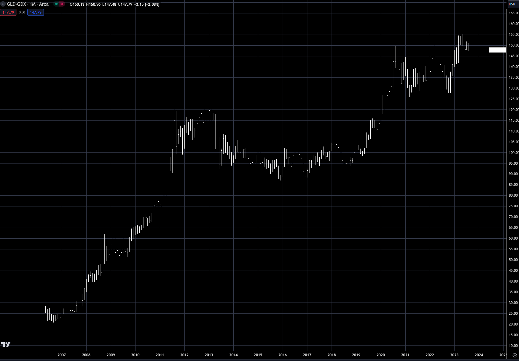
Chart 8 shows the gold price versus two of the premier gold miners, Newmont and Barrick. The underperformance is just amazing, and proves the argument that large institutional investors have left this space – gold miners. Maybe this will change when an arbitrage opens, but more than likely the spread will narrow when gold ultimately falls in price, NOT that gold stocks outperform.
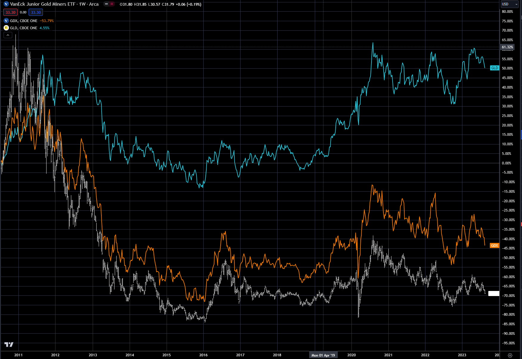
Chart 9 shows the performance of GDXJ, which is the ETF for the gold junior miners and also GLD and GDX since the top in 2011. This space has been decimated from the switch to the underlying gold ETFs. Historically, junior miners offered a levered play on the gold price, as these companies were very risky investments, but they did very well if the price of gold went higher.
Since 2011, GDXJ is down 70%, GDX is down near 45%, while GLD is up 50%. This underperformance by GDX and GDXJ is a killer for an asset class, hence the growth in GLD and other precious metal ETFs that track the price of the metal. One final note of reflection on Chart 9 is that in 2011, GDX and GDXJ both traded at a premium to GLD; both have been in a severe bear market ever since.
Chart 8: Gold (LHS in blue) versus Newmont Mining (RHS in gold) and Barrick Gold (RHS in white)
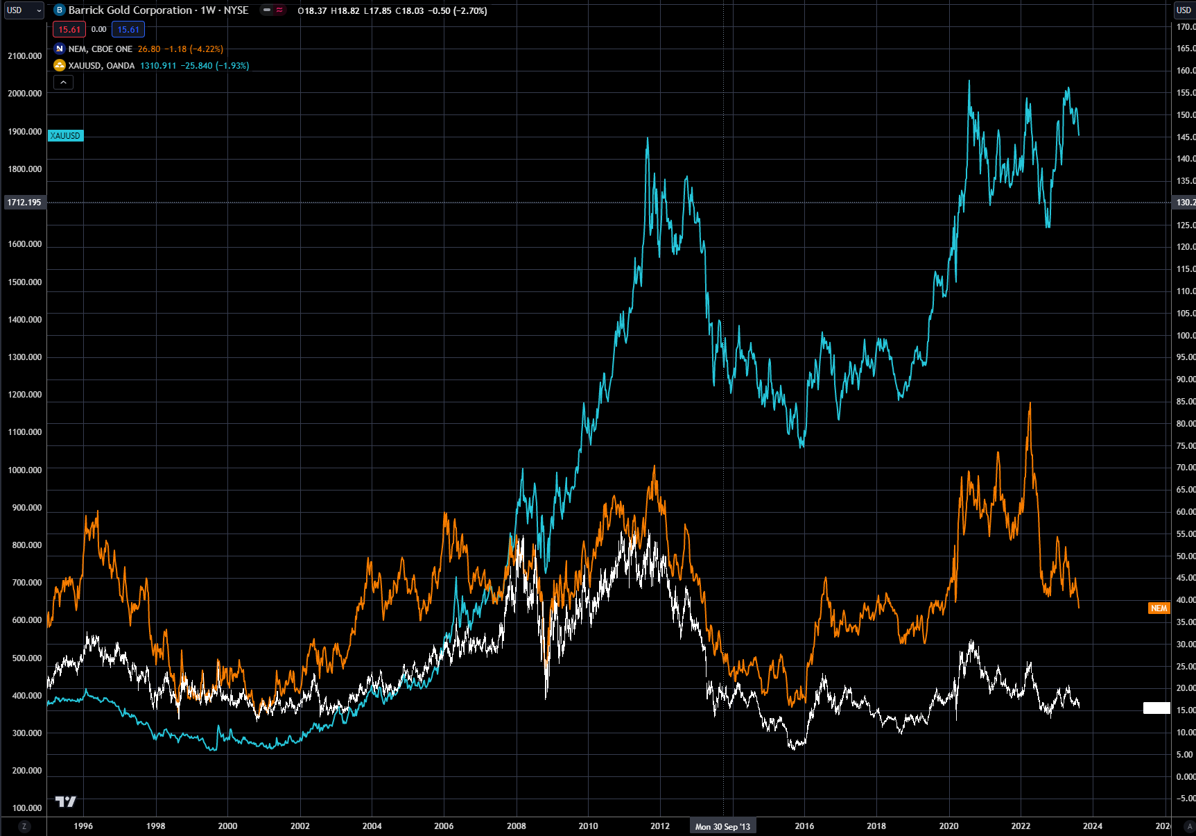
Chart 9: GLD in blue, GDX in white and GDXJ in orange
Central banks
Another driver for the gold price has been large central bank buying since 2010, as shown in chart 10. This has pretty much reversed the selling from the previous 10 years, but those sales were all below $500 per ounce, while the new purchases were well north of $500 per ounce. Not a great trade for the central banks!
Chart 10
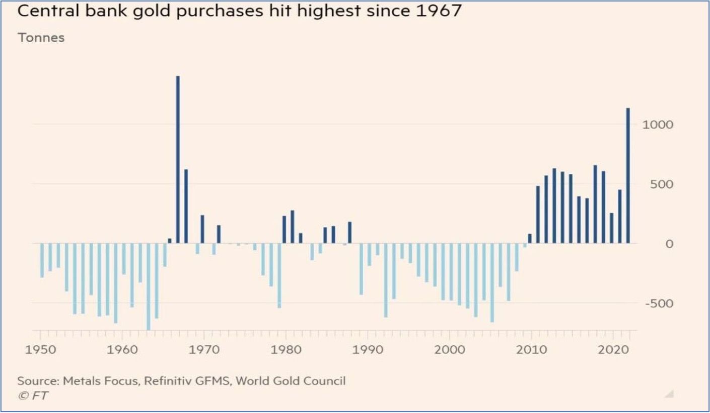
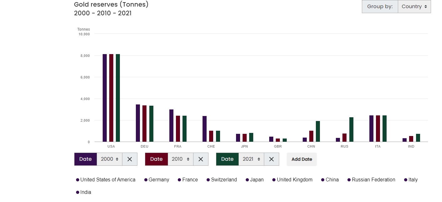
Chart 11 shows gold reserves as of last year for the largest central banks, with the US the largest holder on record, as not all central bank gold holdings data are reliable, but this is the data we have to work with. Chart 12 shows the change in the largest central bank holdings for three time periods. I have used 2000, 2010 and 2021 – this way we get a good view of the changes over time.
The central bank sellers from 2000-2010 were France, Switzerland and the UK, and for the most part they have not bought back any of the gold, as their reserves continue to be below the 2000 level.
The big buyers since 2000 have been China, Russia and India. All three of these countries are now part of the BRICS currency that will be backed by gold. Whether this currency actually becomes viable is yet to be seen, and whether it replaces the dollar as the reserve currency is food for thought down the road. But with China’s economy nearing a freefall and the Russian ruble in major decline, as is the Indian rupee, I think we have time to evaluate the BRICS experiment.
The World Gold Council’s website has a great tool if you want to break this data down further, and has a lot of other useful tools on gold.
Chart 11
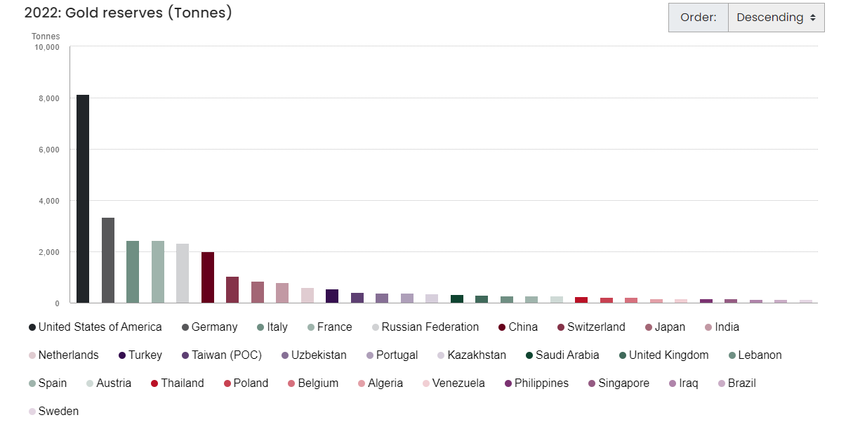
Chart 12
Market Outlook
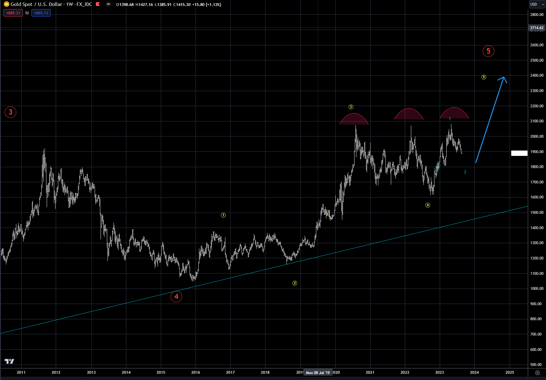
As we discussed earlier, gold has been in a bull market since 2000-2001, with some not-so-subtle corrections along the way. The last stage has been in progress since 2016-2018, when the last low was made.
In Chart 13 below, the outline for the ideal price scenario is laid out. A triple top, labeled by the three arcs, signifies in the short term that the market needs to correct - this was also documented in our May 19 and July 8 market outlooks. This type of triple top is normally not a major top pattern, but is typically a sideways-to-lower corrective phase, prior to the main uptrend resuming.
In the short term, be patient on the correction in progress as the market could easily test the $1800 level prior to bottoming. The upside target will then be new highs and a culmination of the bull market since 2000.
Chart 13: Gold
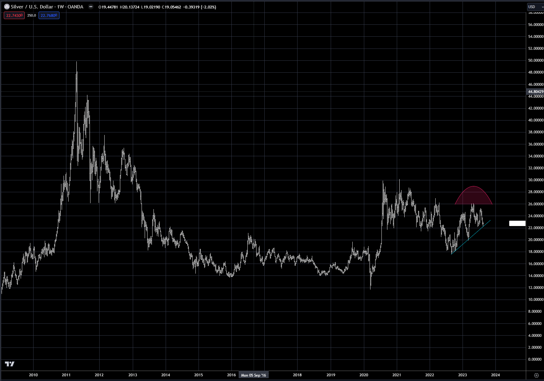
Silver, on the other hand, just like gold equities, has not participated in the rally since the 2011 high. Chart 14 shows the price of silver and, as mentioned, it has really been in a bear market for over 10 years, with a nice corrective bounce in 2020.
A triple top is in place, marked by the red arc, with the trendline support from last year now in jeopardy of getting broken to the downside. The $20 level should be the expected target in the short term, but again the big play on future central bank easing will be in gold, and not silver or mining stocks. Why? The large institutions play in gold, not silver. If this changes, then silver could outperform gold, but for that to happen, I think a new industrial use which increases the demand for silver needs to evolve for this to occur.
Chart 14: Silver
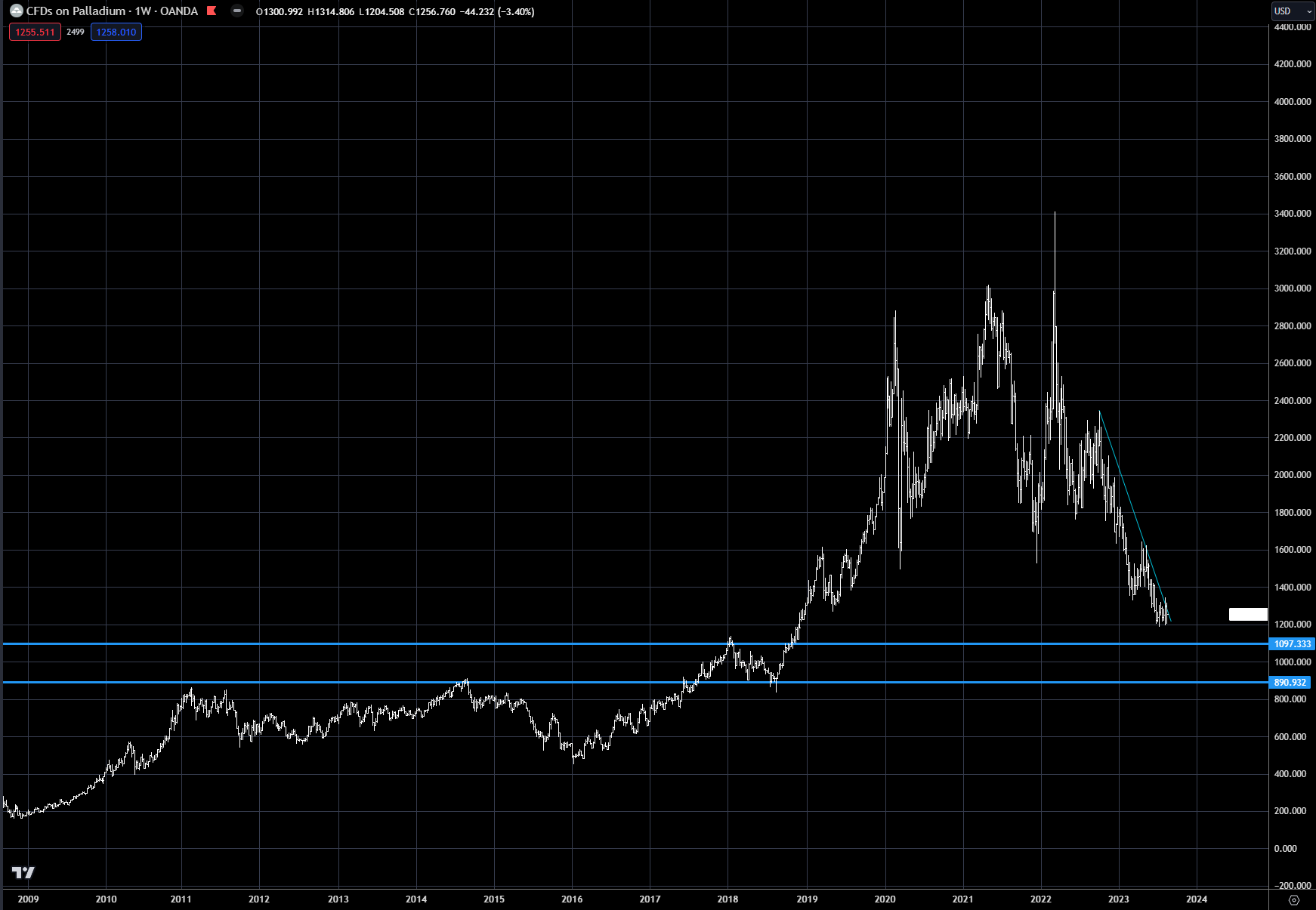
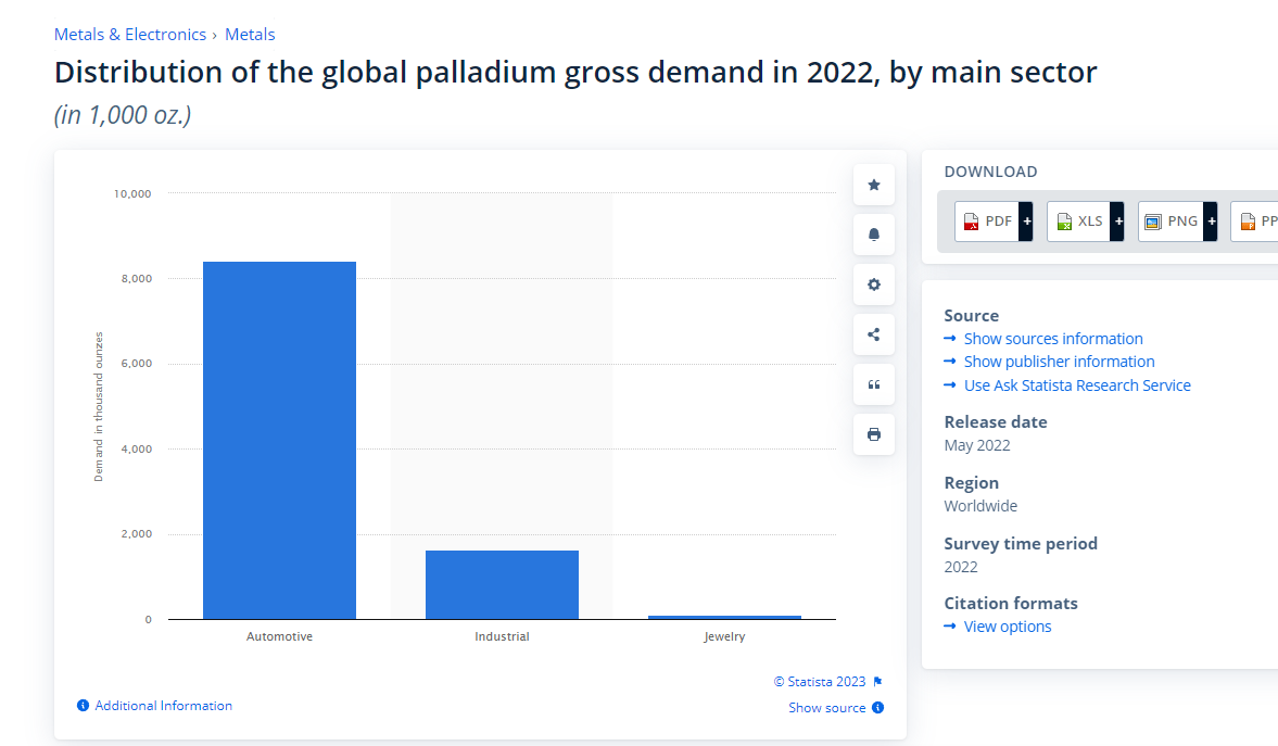
Palladium is a metal that appears to be past its prime, as its primary demand is slowly dwindling as the auto industry switches over to electric vehicles (EVs) from the Internal Combustion Engine (ICE). In the addendum, I have numerous charts and graphs on supply and demand for all metals, which I will not focus on but which have been used in my analysis.
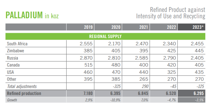
Palladium is an interesting metal, because of all the geopolitical risk associated with it, and the same can be said for platinum. For both metals, the majority of supply comes from South Africa, Zimbabwe and Russia, and with the state of affairs as they stand today, supply can get disrupted at a moment’s notice.
There is and will continue to be demand for palladium from the automotive industry. The EV transition will take decades to complete, but automotive demand will continue to decrease each year. Chart 15 shows the volatility of palladium over the past three years, increasing from $1000 an ounce to $3000 and now back towards $1000. The big support is now in the $900-1100 range, marked by the two blue lines, which should open up a buying opportunity sometime over the next three to six months.
Chart 15: Palladium
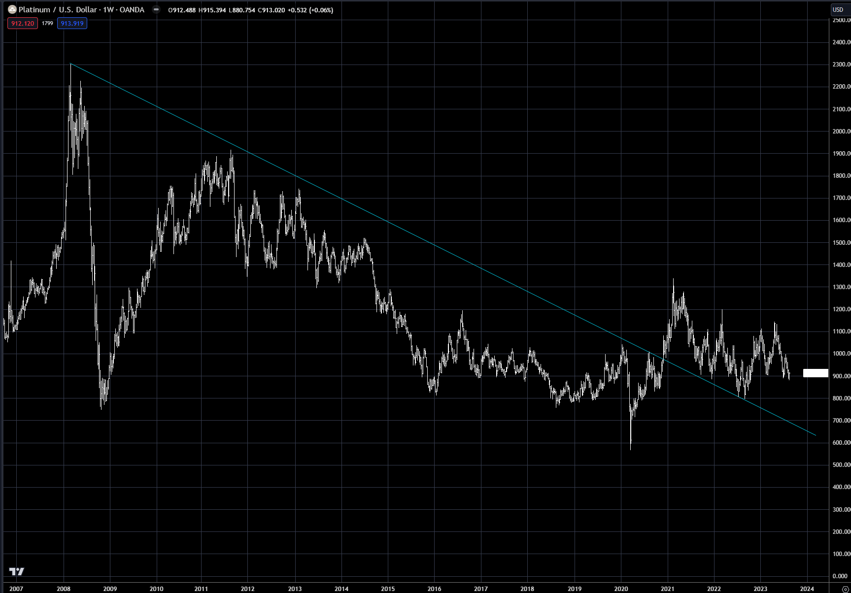
Platinum, like silver and mining equities, made its high in 2011-2012 and has been in a bear market since (see chart 16). The platinum market did have a significant rally with other metals in 2020-2021, breaking out of the 12-year downtrend, but since then it has traded sideways to lower.
With the outlook for lower gold prices, the best support area is near the old lows around $800. With EV expansion continuing to take platinum demand away, the upside in the short term is more of the same.
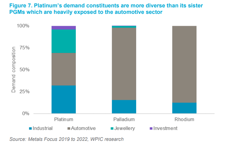
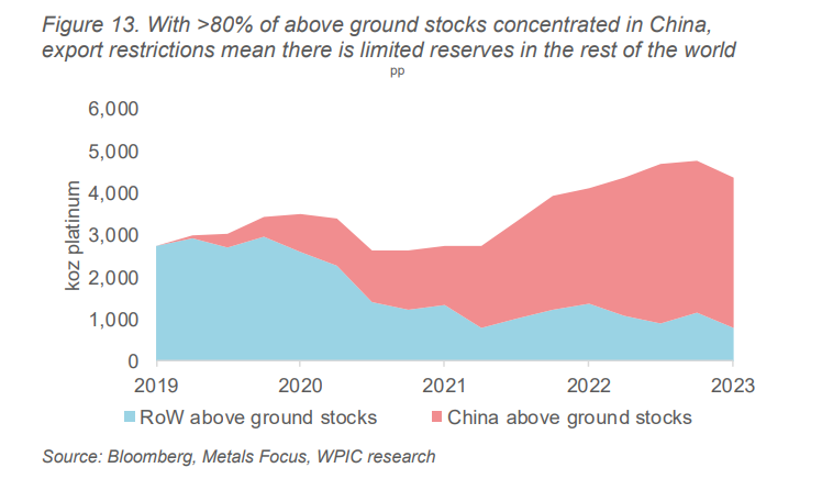
But platinum does have a more diverse demand base than palladium, with industrial and jewelry demand also driving price. Geopolitical disruptions are always a risk, and the fact China holds most of the above-ground stocks can lead to sharp short-covering rallies, so no short trades are recommended.
Chart 16: Platinum
Addendum:
Gold/silver ratio
Gold-palladium spread
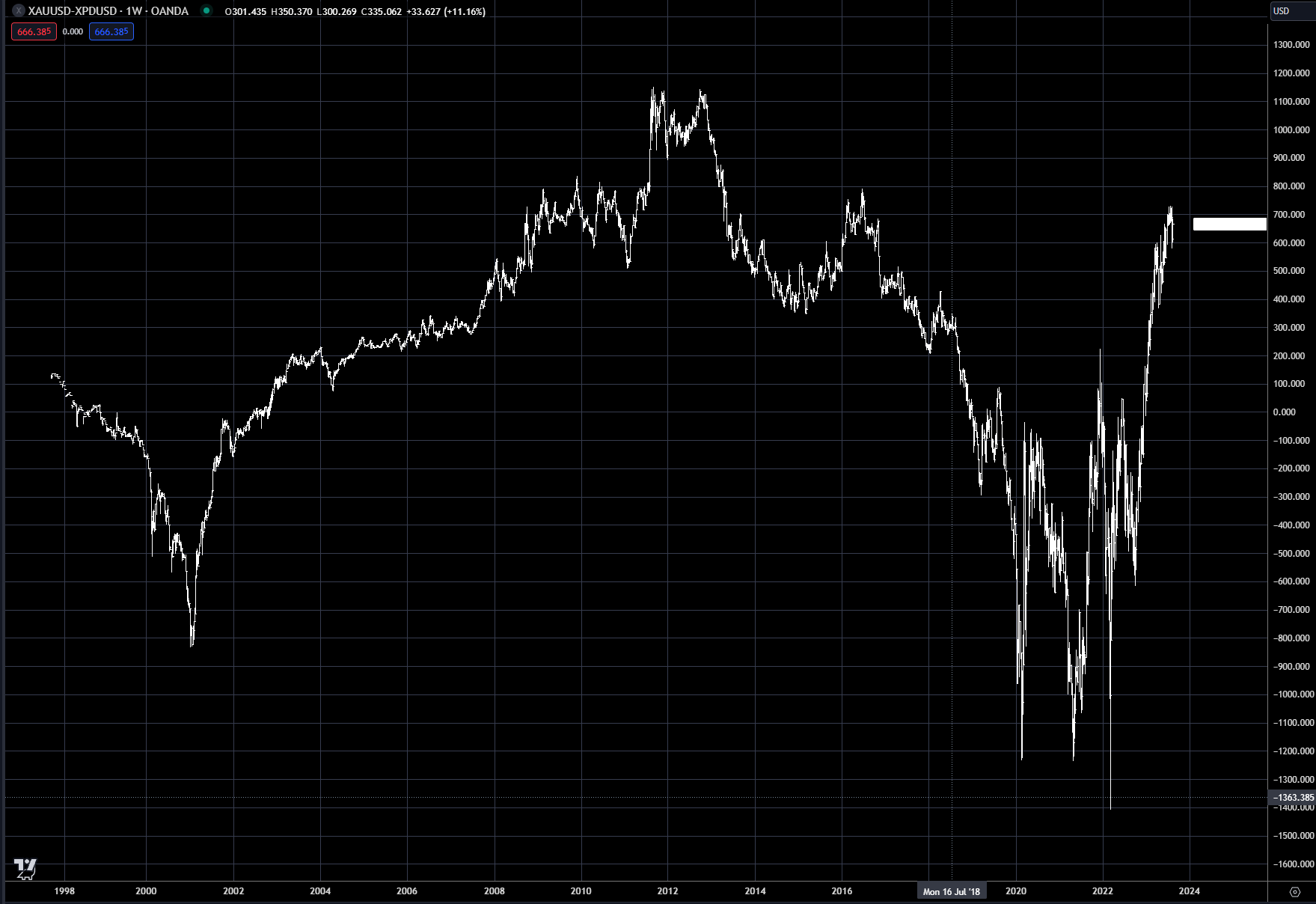
Gold-platinum spread
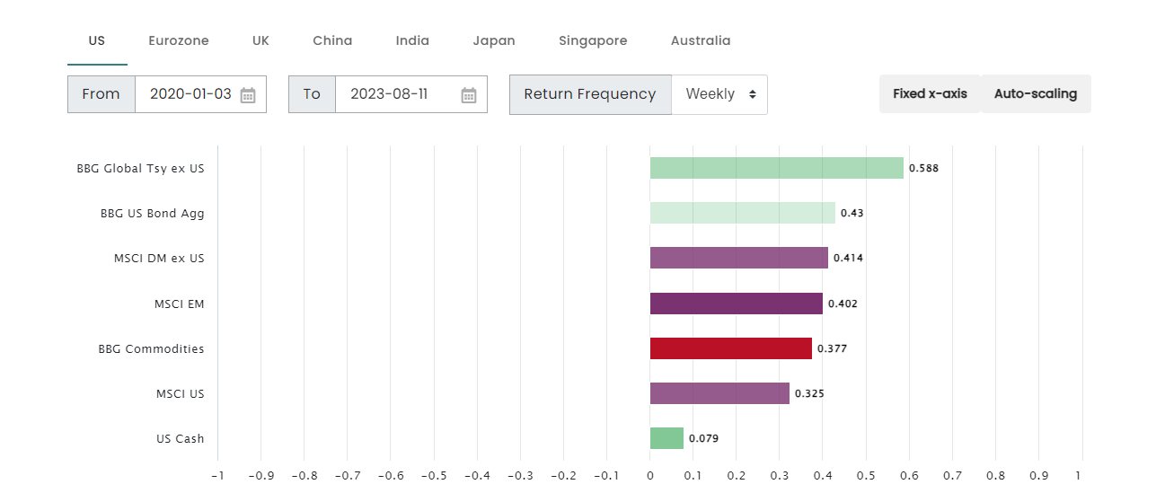
Gold correlations to other asset classes, 2020-2023
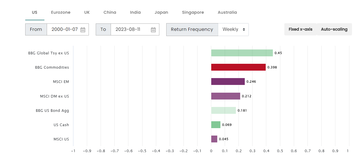
Gold correlations to other asset classes, 2000-2023
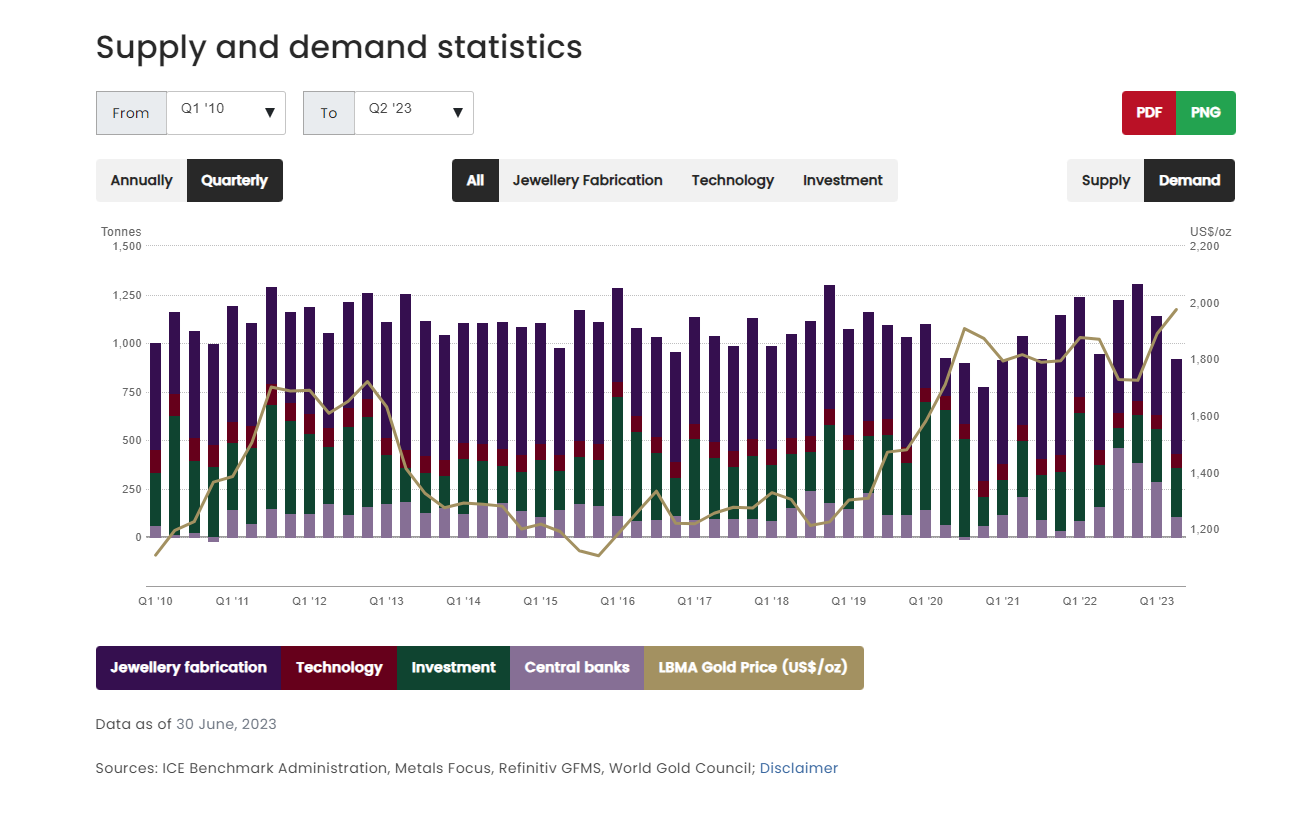
Gold supply and demand
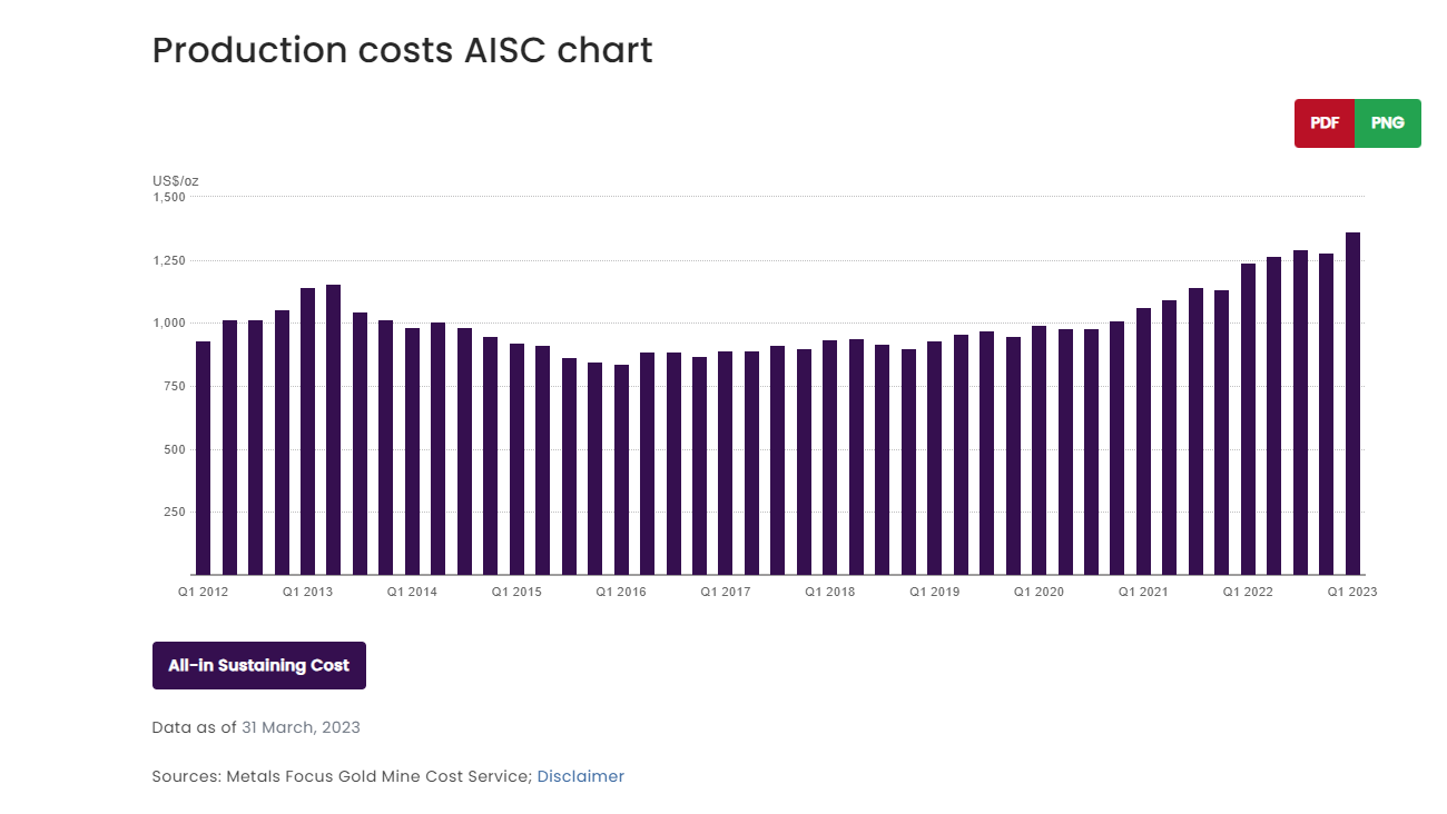
Gold production costs
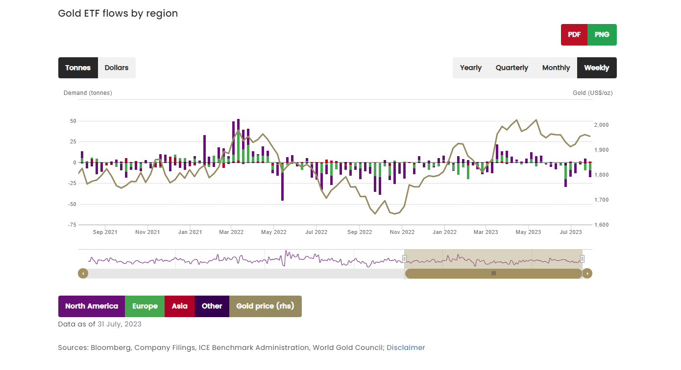
Gold ETF flows, 2021-2023
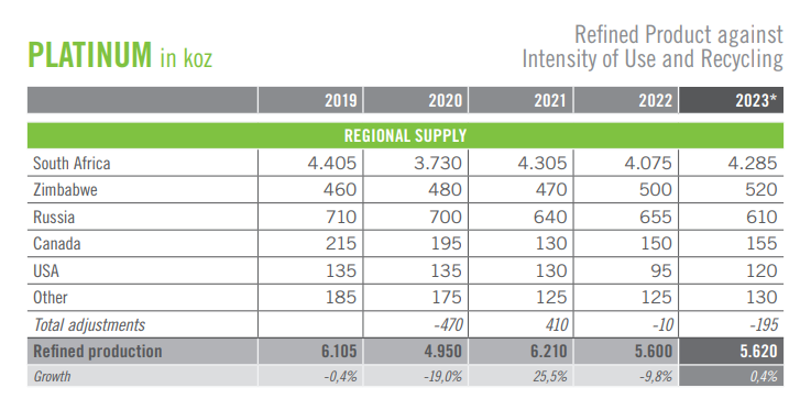
Platinum supply and demand
Platinum and palladium supply and demand
Chinese platinum stocks
Palladium demand sectors
Trading strategy is based on the author's views and analysis as of the date of first publication. From time to time the author's views may change due to new information or evolving market conditions. Any major updates to the author's views will be published separately in the author's weekly commentary or a new deep dive.
This content is for educational purposes only and is NOT financial advice. Before acting on any information you must consult with your financial advisor.