A Look at Long Term Charts
Author: Bruce Liegel
This week’s focus is going to be on long-term setups that are now developing in a number of markets. Typically, I glance at long-term charts weekly, but a few times a year I take a hard look if set-ups are occurring. This is the case in the markets that I will cover in this outlook.
This week I will walk you through the process of how I look at the long-term charts and what I look for. Sometimes these set-ups take years to develop, and then take an additional 3-6 months for the fundamentals to confirm. The problem with fundamentals in commodities is that the story can sometimes just happen - say a change in the weather, or a geopolitical event. In many cases though, it just takes time for the supply/demand imbalance to straighten out. That’s why it’s important to combine the long-term with the short-term view, to better time the trade entry.
Wheat prices are beginning to dig into long-term support levels, as shown in Chart 1. Notice the previous price paradigm from 1970-2005, where the price action consistently topped out near the $6.00 a bushel level - this area should now act as support as the price falls. This level is the green horizontal line.
There is also mild trendline support from the 2016 low - marked by the blue trendline. The intersection of these two trendlines can be a very powerful level for the market to reverse. The time window for this reversal will be the next few months. This is where we use short-term data to better time the potential trade entry.
Using the December CBOT futures contract to look at the short term is the easiest and best comparable to look at. In Chart 2, the contract is shown with the down trendline from the 2022 highs drawn in blue. Wave 4 did break out to the upside, but failed as it should and the price action has been following the trendline lower since summer. The other takeaway from the chart is the clear 5 wave pattern from last year’s high, which looks close to being complete. These two short-term signals, trendline support and the Elliott Wave pattern, give us the confidence that the low is getting put in.
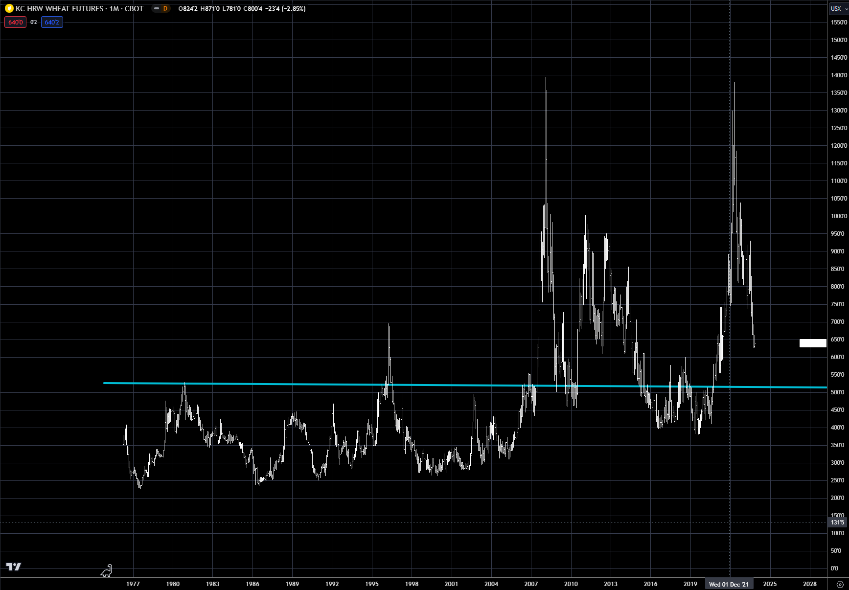
What is a bit concerning is that the price of wheat has spiked twice in the last 10 years, but this also happened multiple times from 1975 to 2000. I have argued in past deep dives that it is unlikely that the next commodity super cycle will occur for a few years, contrary to the conversation from Wall Street investment firms. The other concerning issue is chart 4, which is the KC hard red wheat (HRW) contract. Using the same long-term methodology, KC wheat looks to have more downside of potentially another $1 until support is reached. This is something to keep an eye on, as this divergence could cause the trade to chop around until this part is resolved.
Chart 1: Long-term view of CBOT wheat
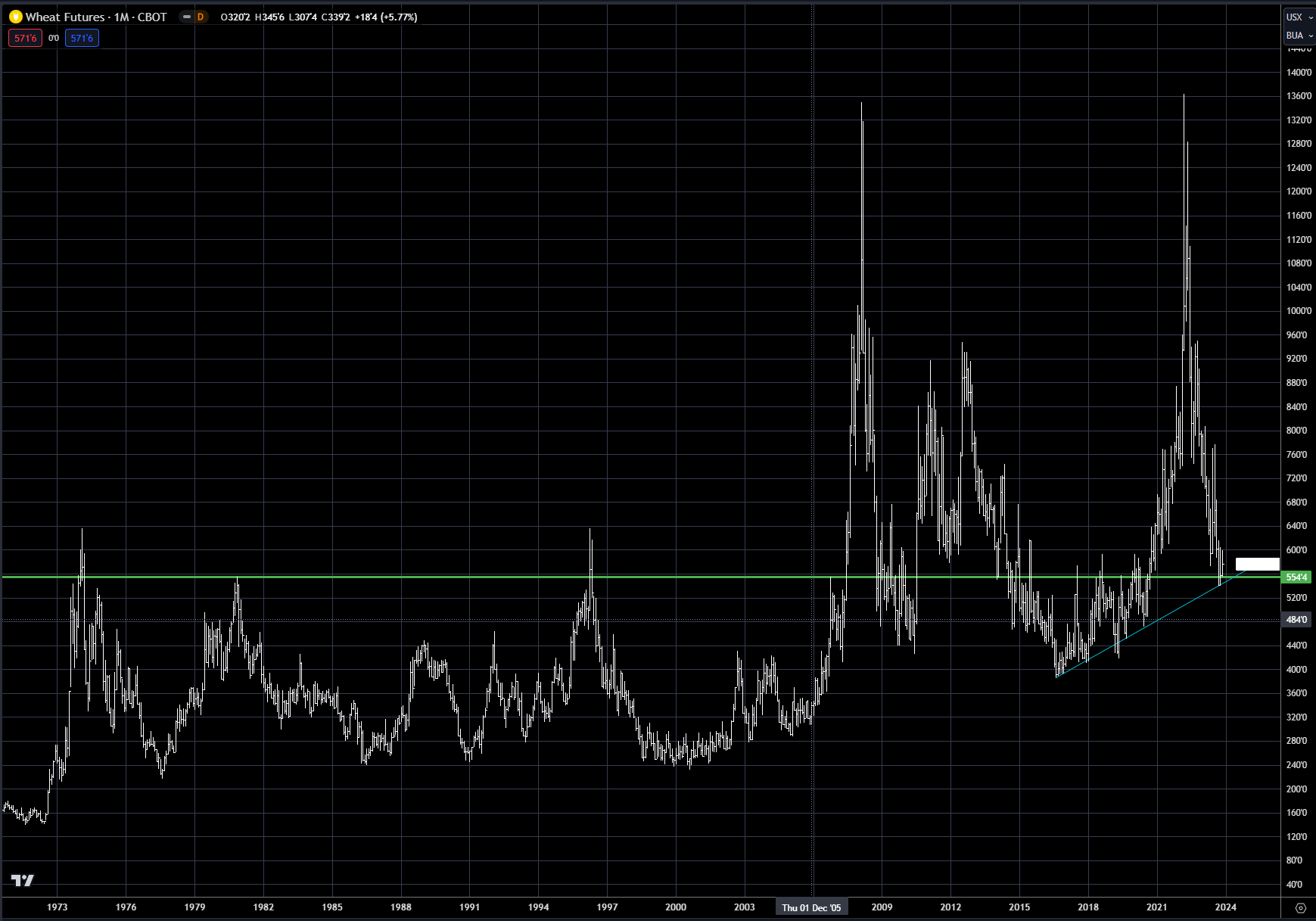
Chart 2: December CBOT wheat
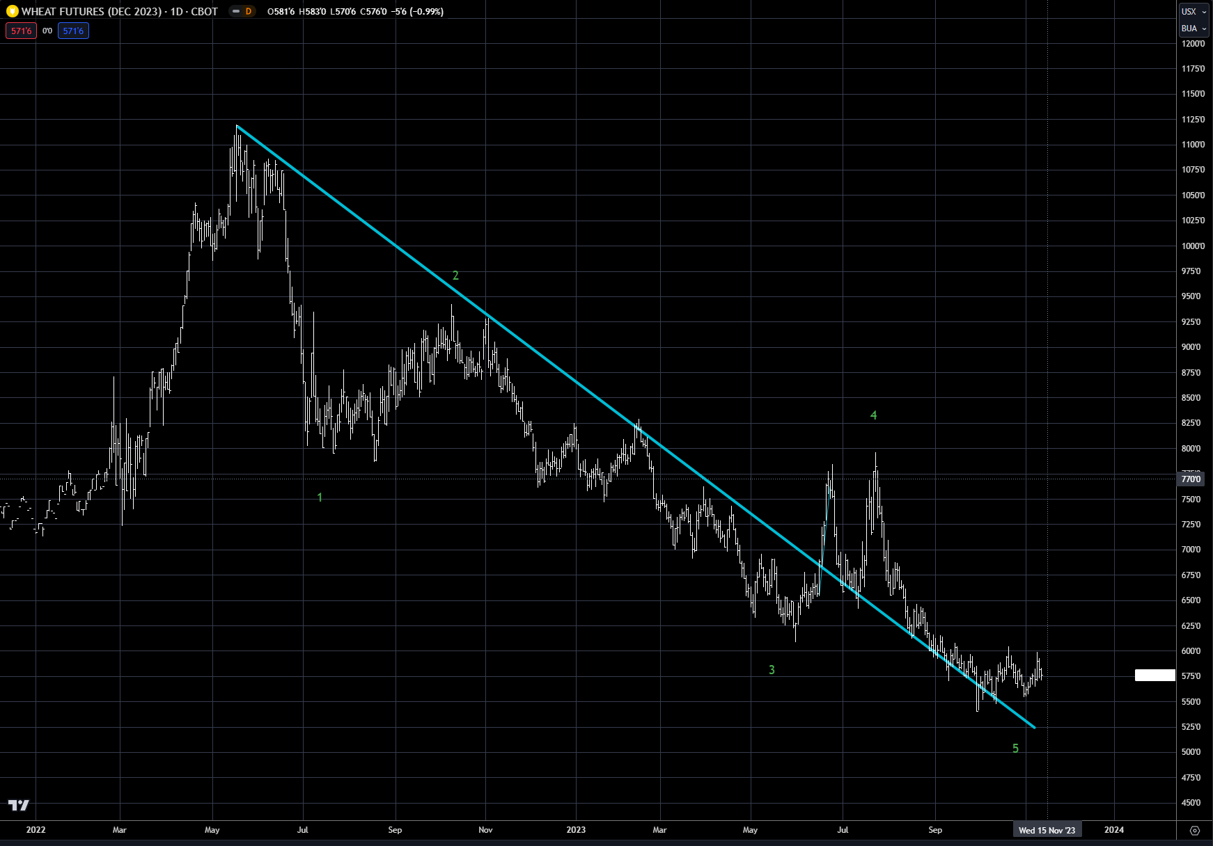
Chart 3: Long-term view of KC HRW wheat
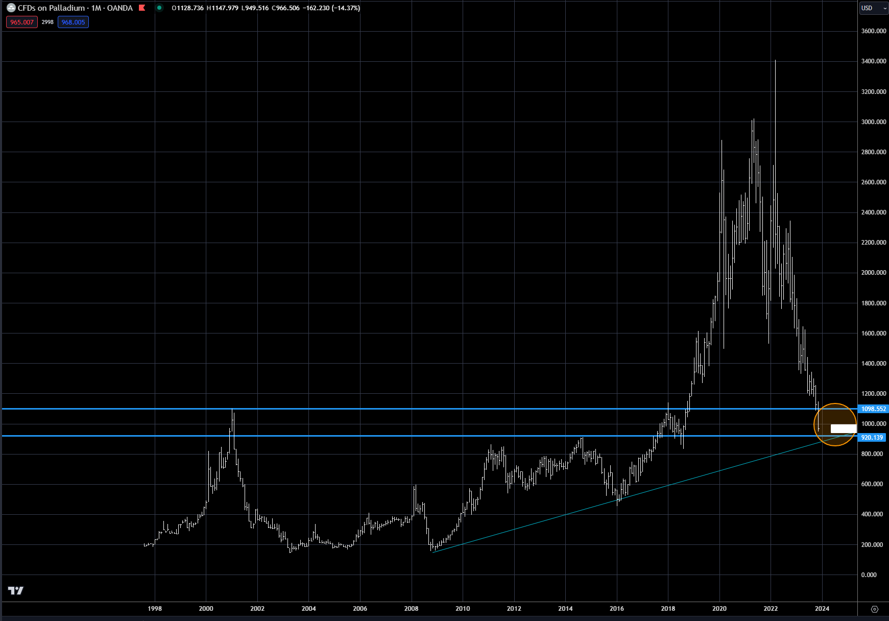
Another set-up is in the palladium market, which has been under extreme pressure because of the falling automotive demand. The price of palladium has plunged the last couple of weeks, falling almost 15% into our long-term buying zone. Chart 4 shows the zone indicated by the two horizontal blue lines, which represent the old highs over the past 25 years.
The other area of support is provided by the up trendline in blue from the 2008 low. The intersection of this line and the horizontal line is very close to the price last week. The orange circle represents the buying zone. There are a number of ways to trade palladium - one is via futures and the other is via the ETF-PALL.
Chart 4: Long-term palladium
Update on US stocks
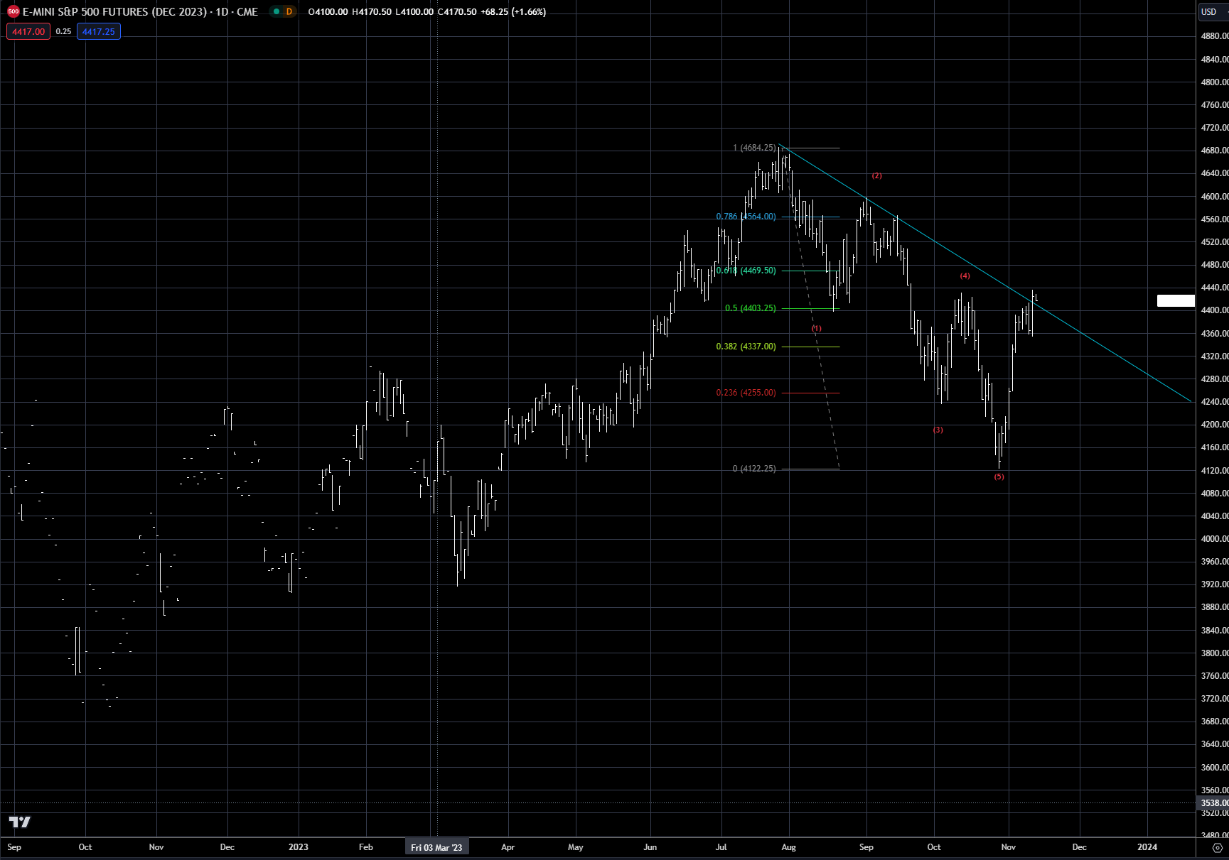
The S&P 500 continues to find overhead resistance near 4440, as shown in Chart 5. This area is marked by three significant technical signals. The first is the down trendline in blue from the July high, the second is the 50% retracement of the decline from the July high near 4400, and the third is the August lows near 4400 and the October highs near 4440. All of these technical indicators suggest the market should turn here. Whether this is the end of the rally is still questionable, but for now the market is due to correct.
Chart 5: S&P 500 index
Update on US interest rates
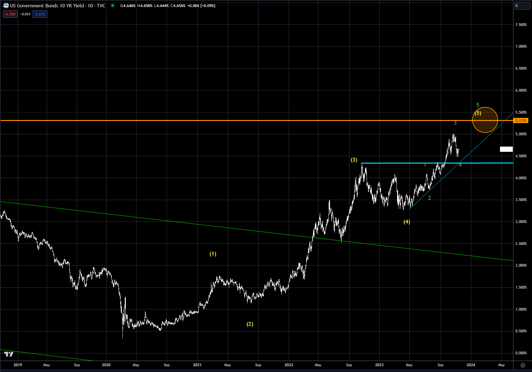
As outlined previously, the upside for the US 10-year is still a bit higher, as shown in Chart 6. The blue trendline from the May low is still intact, and the Elliott Wave argues for a final 5th wave to complete the pattern from the 2020 low. The upside target is still near the 5.50% level, indicated by the orange circle.
Chart 6: US 10-year interest rate
Trading strategy is based on the author's views and analysis as of the date of first publication. From time to time the author's views may change due to new information or evolving market conditions. Any major updates to the author's views will be published separately in the author's weekly commentary or a new deep dive.
This content is for educational purposes only and is NOT financial advice. Before acting on any information you must consult with your financial advisor.