The End of Cheap Labor
Author: Bruce Liegel
This paper contains three parts. Part I will set out the financial underpinning of why demographics are important to global macro investing. In Part II, I will explain how the current demographic trends are affecting labor costs, inflation, commodities, and pension funds. Part III will be a special topic where I will share my analysis on natural gas as a trading opportunity.
Let's dive in! 🔥
Part I: Why Demographics Matter To Global Macro Investing
The world as we know it is getting older. Though the world’s population continues to grow, the rate of growth (births) in all advanced economies is now lower than the replacement rate. See Chart 1 below. Since post-WWII, all advanced economies have been built on the belief that there will be a safety net there for you at retirement. Each country has their own program, with most offering some type of retirement pension or benefit, including medical. The math over the next 10-15 years is not working and many of the world’s governments will find themselves with too many retirees and not enough workers to satisfy their liabilities. This is not a secret to them as it is a third rail for most to touch, hoping the next administration will take care of the issue.
This paper will explore the demographic timebomb that is building, and how it relates to our previous paper, “The Carry in the Conundrum”. In that paper, it was argued that two significant long-term trends have been broken: lower interest rates and lower inflation. Both of these trends have now reversed and are now in long-term uptrends, which could last a decade or more. Before we look at the future, I understand it is beneficial to look at how things transpired to get where we are at today. The previous trend lower in interest rates and inflation occurred because demographics lined up over the past 25 years to keep wages low and savings high.
Chart 1
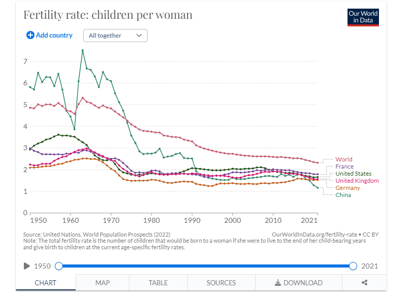
Source: Our World in Data
These disinflationary forces allowed global central banks to run very accommodative interest rate policies without any concern that they would be causing a mistake, a.k.a. inflation. In a well documented paper by former Federal Reserve Chairman Ben Bernanke, “Why are interest rates so low: The Global Savings Glut”, he explains some of the causes, many of them related to demographic issues in emerging markets (China, etc.)
The way demographics suppress wages and inflation is as follows:
- Globalization and Outsourcing: The advancement of technology, transportation, and communication has made it easier for companies to outsource operations to countries with lower labor costs. As a result, many businesses moved their production facilities to emerging markets, where the cost of labor was considerably cheaper compared to developed nations. This led to a surge in the availability of low-cost goods and services in the global market.
- Wage Suppression: The availability of cheap labor in these countries created intense competition for manufacturing jobs. As companies sought to cut costs and remain competitive, they could replace higher-cost domestic labor with cheaper overseas labor. This situation increased the supply of labor relative to demand, putting downward pressure on wages in developed countries.
- Deflationary Effect: The increased availability of low-cost goods and services due to outsourcing and globalization had a deflationary effect on prices. When companies could produce goods more cheaply overseas, they often passed those cost savings on to consumers through lower prices. This suppressed inflation, as the cost of goods and services remained relatively stable or even decreased over time.
The goal of this paper will be to do a deep in-depth review of the changes that are taking place in the global workforce and their impact on economic forces. But first, let’s look at what caused the deflationary forces that have been in place since the early 1990s and then show how this is ending and its impact on financial markets.
In their book, “The Great Demographic Reversal” by Goodhart and Pradhan, they talk about three major demographic changes that occurred in the last 25-35 years. The first was the urbanization of China, where hundreds of millions of citizens moved from the country to the city. The second was the fall of the USSR and the availability of 200m workers in Eastern Europe and the mass migration of millions of workers to Western Europe and the rest of the world (ROW). The third was the number of women who entered the workforce globally. They argue, and I agree, that these three profound changes have impacted workforce availability for the past 30+ years, resulting in deflationary forces allowing central banks to open the spickets without any inflationary worries.
In charts 2a and 2b below, you can see the massive change in the workforce urbanization in China over the last 50 years, but the trend has really accelerated since 1990. This migration has spurred cheap labor which competed against other advanced economies and accelerated globalization or labor arbitrage by large corporations. This also kept a cap on wage pressure, keeping inflation pegged at 2% or below for most advanced economies.
This “factory of the world” resulted from the opening up of China and its entrance into the WTO around the turn of the century. A great piece outlining the WTO decision is titled “What happened when China joined the WTO”, arguing what the benefits were. Twenty years later we now can see the deflationary benefits.
None of this would have been important if not for the demographic set-up in China when this occurred. In Chart 3, the population pyramid of China in 2000 is presented. Take a few minutes to study the graphical presentation, but the takeaway is that China was a large and young country at the turn of the century. A majority of their population was below the age of 40 – willing and ready to go to work and build a new life. If you’re not familiar with the population pyramid, a young population is shown to have a large lower base, as shown in Chart 3. As a population ages, the pyramid will flip upside down. In a normal pyramid the bottom will support the top, but it would be quite an engineering feat to flip it upside down and not have it come crashing down. This is the same in the aging pyramid – in an upside-down scenario, the young population will not be able to support the old, and the economy will struggle or potential crash upon its debt load.
Chart 2a
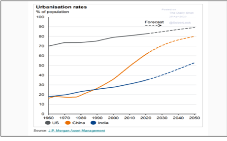
Chart 2b
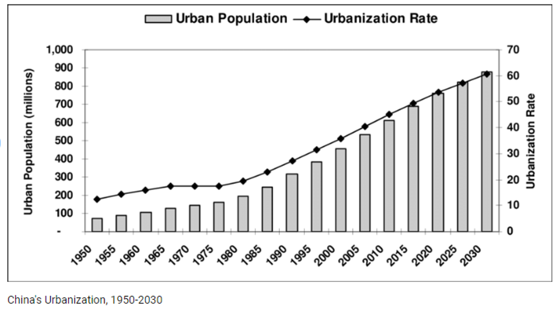
Source: ResearchGate
Chart 3
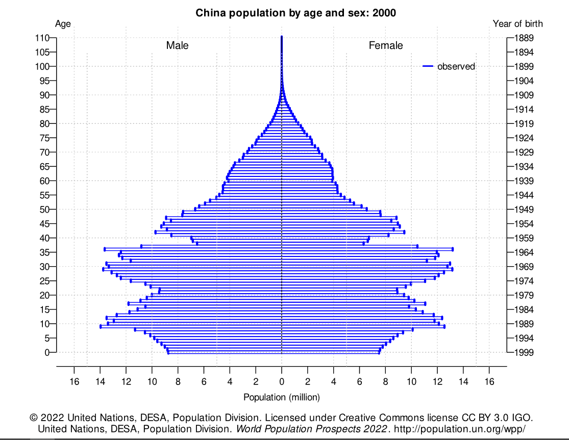
Source: United Nations
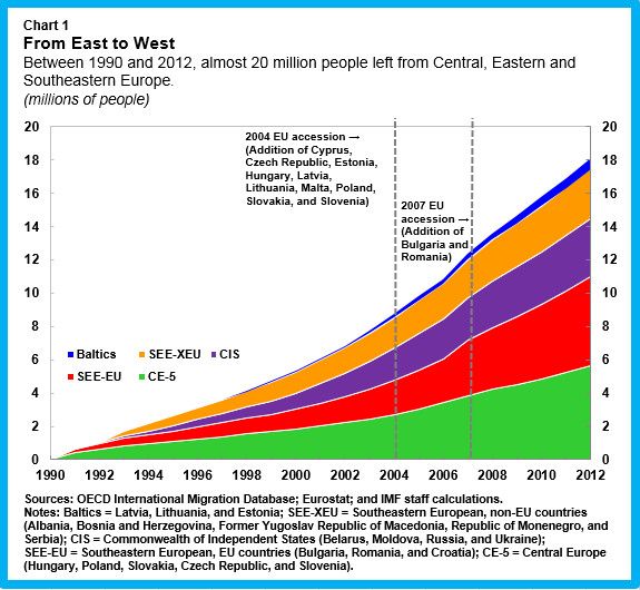
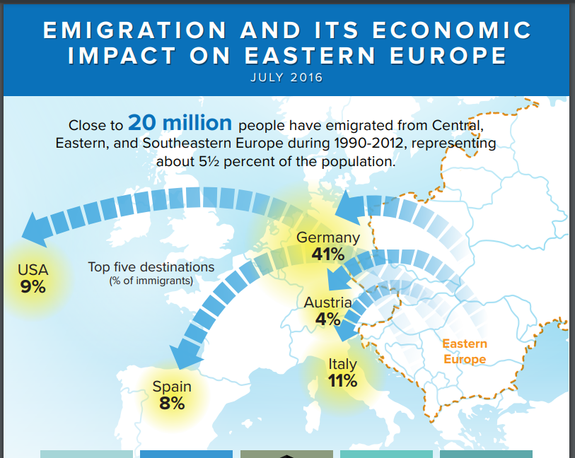
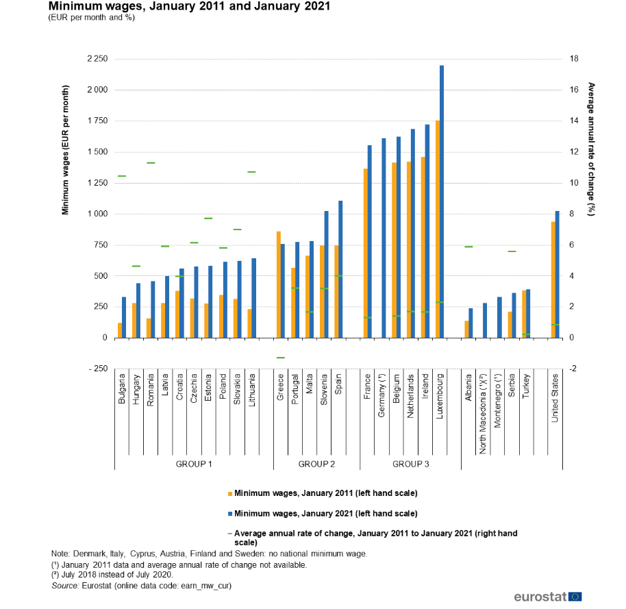
There were other changes going on in the world at the same time. In 1989 the Berlin Wall fell with the collapse of the former USSR. This opened up Eastern Europe for investment and migration not seen since the end of WWII. In Chart 4 and 5, the IMF data shows the migration of nearly 20 million from Eastern Europe to the ROW. Note this does not include the migration from North Africa that was also going on – and continues today. Because of the lower standard of living in Eastern Europe verse Western Europe and the US there was a large labor arbitrage, as shown in Chart 6. I am showing the data from 2011 versus 2021, but you can only surmise the arbitrage was even greater in 2000. Even today, Eastern Europe offers cheap labor versus Western Europe and the US, but there lies a bigger issue with aging demographics which I will delve into later – and this is the crux of the problem.
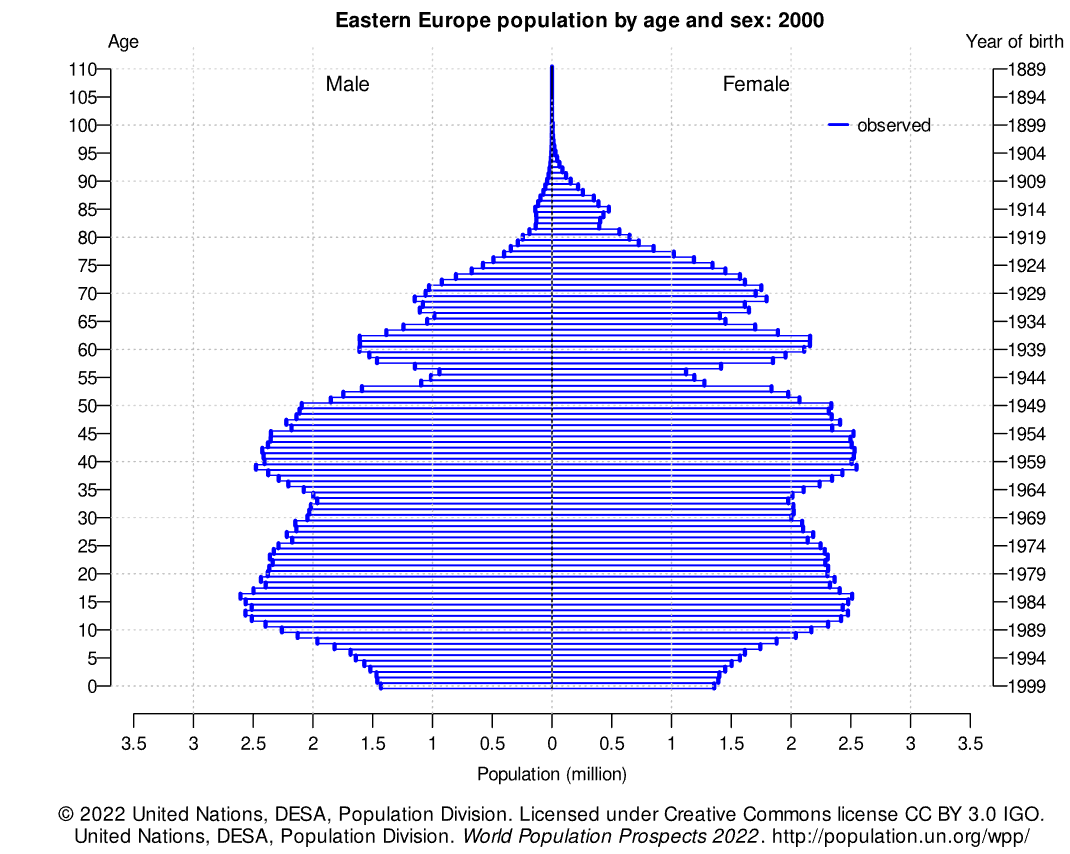
The final point for Eastern Europe is laid out in Chart 7, which shows the population pyramid for 2000. As the data shows, Eastern Europe had a very young and mobile population base that was ready for economic change, very similar to China but not as young and, of course, not as large. But, the majority of the population base is still quite young and in their prime working age. This combination and opportunities growing at home and abroad drove wage pressure downward and again allowed easy money policies to drive investment decisions.
Chart 4
Source: International Monetary Fund
Chart 5
Source: IMF
Chart 6
Source: Emerging Europe
Chart 7
Source: UN
The last major change in working demographics is shown in Chart 8 with the dramatic change in women working in the labor force. While the US has flatlined since 2000, the other advanced economies have continued to grow over the last 25 years, especially in Europe and Asia. This demographic change is also quite correlated with Chart 1 and the decline in global fertility rates. This change in birth rates has set the stage for the global greying crisis looming on the horizon.
Chart 8
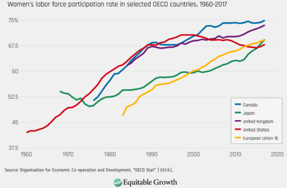
Source: Equitable Growth
This sets the stage for the second half of the paper where we will focus on what these changes mean and the ramifications they have on investing. As I will show, the population pyramid will change dramatically for most of the world, ending cheap labor and result in a burdening balance sheet to support retirees’ lifestyles. These changes will continue to drive wages higher, with labor shortages common in many countries. The end result will drive interest rates and inflation higher, as outlined in our previous deep dive.
Part II: The Evolution of a Demographic Timebomb
Let’s begin our focus on the demographic dilemma of China first and examine the demographic outlook that is beginning to transpire. Using the UN population data base, Chart 1 below shows the population pyramid over four distinct time periods. I have found it useful to look at the stages over time and then you can see the transformation graphically. Starting from the top left is the population pyramid for the year 2000, which we outlined in Part I. The graph in the top right is 2023, bottom left 2035 and bottom right 2050. By visualizing the changes over time, you can see the aging of China quite easily. You can see the dramatic change from 2000 to 2023 and how China is aging rapidly. This tightening of the labor force will only keep getting worse as time goes on; not only will we see it in less supply of labor, but also in the ability to fund pension liabilities. This puts pressure on global savings, pushing up interest rates and also increasing labor costs, putting upward pressure on inflation.
By 2035 (bottom left), a majority of China’s population will be over the age of 45, and the number of people aged 60 and older is growing faster than the under-40 population – in essence, there will not be enough workers to support the retirees. The problem only exacerbates as we move through time (bottom right).
Chart 1
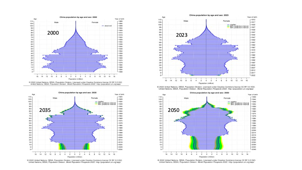
Source: UN
Because of China’s one-child policy from 1980 to 2016 the overall population has begun to decline, as shown in Chart 2 below. China’s birth rate has continued to decline, as shown on page 1 – it's now just over one child per couple.
So besides aging, China is set to be a much smaller population, falling by 15-20% over the next 25 years. This has the potential to put long-term downward pressure on commodities, with India having the potential to be the next China (Chart 3).
I will focus more on India in a future paper, but the population of India is similar to that of China. It is not clear yet if India or even Africa can have the economic growth that China has witnessed over the last 25 years – if it can, it might be able to fill in the global shortage of workers. But for now, the assumption is that it will fall short... only time will tell.
Chart 2
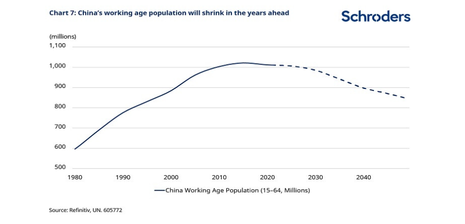
Source: Schroders
Chart 3
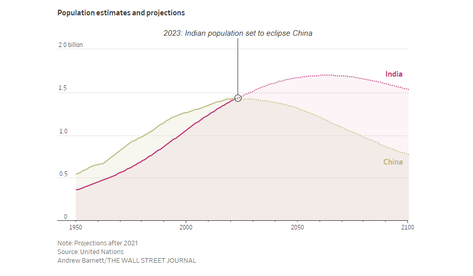
Source: The Wall Street Journal
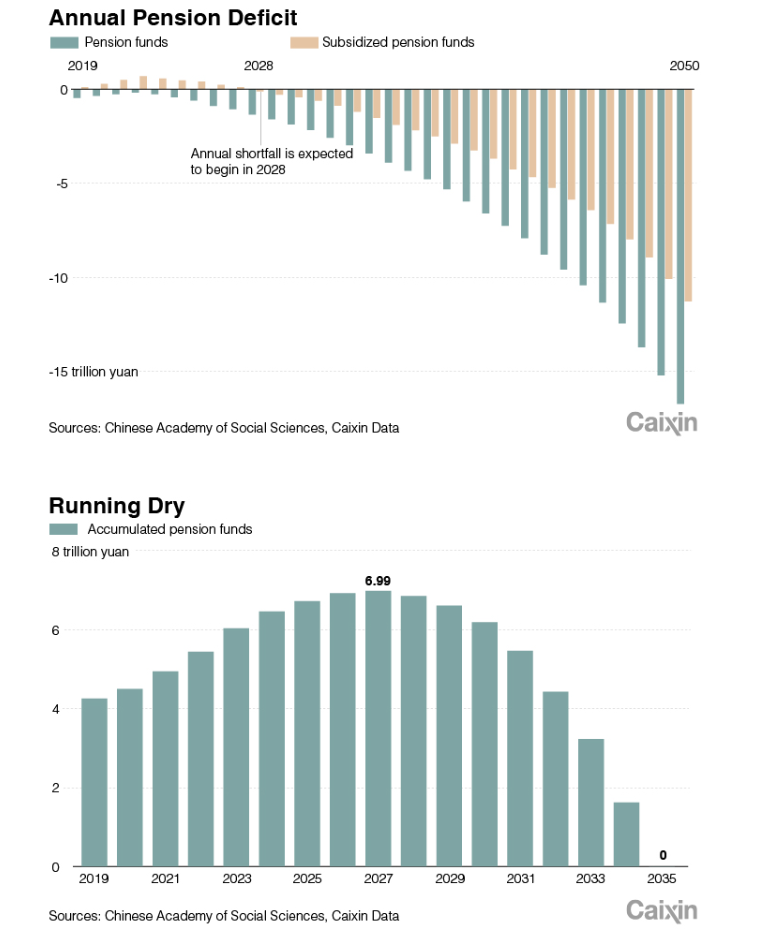
Rounding out the discussion on China, I refer to chart 4 and the impending pension crisis that is brewing. Based on data from Caixin, beginning in 2028 China will begin running a pension deficit and by 2035 their funds will have run out of cash. I’m skeptical on this part, but it should be a red flag for future observation.
An article reported by CNN argues that Chinese cities are so broke that they are cutting medical benefits for seniors. The article also references the over $18 trillion in government debt outstanding, which was discussed in our previous deep dive and touches on the greying issues of China.
Chart 4
Source: Caixin Global
China is not the only greying issue – this is a global phenomenon with major investing ramifications. Let’s now turn our attention to Japan.
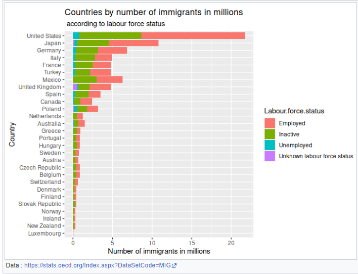
Japan’s demographic profile, which is a decade or more ahead of China, is presented in Chart 5. The top left is data for 2023, and already shows that Japan has an aging population. Moving across the profile, you can see that Japan has a huge retirement issue. As we go through time, the number of retirees will overwhelm workers. Japan has been aware of this developing problem, and has been allowing foreign workers to come into the country to work – Chart 6 shows this data from 2000 to 2020. Even though they have allowed millions to come into the country, they are not all working and potentially could be an additional strain on their system.
Chart 5
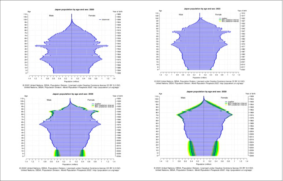
Source: UN
Chart 6 (2000-2020)
Source: Wikipedia
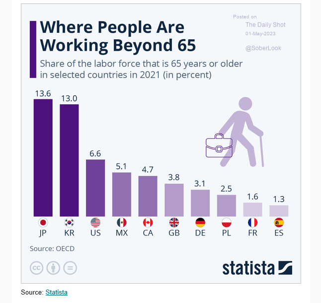
Other areas where Japan is attempting fill the labor gap are shown in Chart 7, where Japan leads the advanced economies in people over the age of 65 still working.
The final area highlighted in this report is the number of women who are joining the workforce in Japan. Over the last 10-15 years there has been a tremendous change, as shown in Chart 8 below. The number of women in the workforce has increased from 55m to over 70m.
Chart 7
Source: Statista
Chart 8
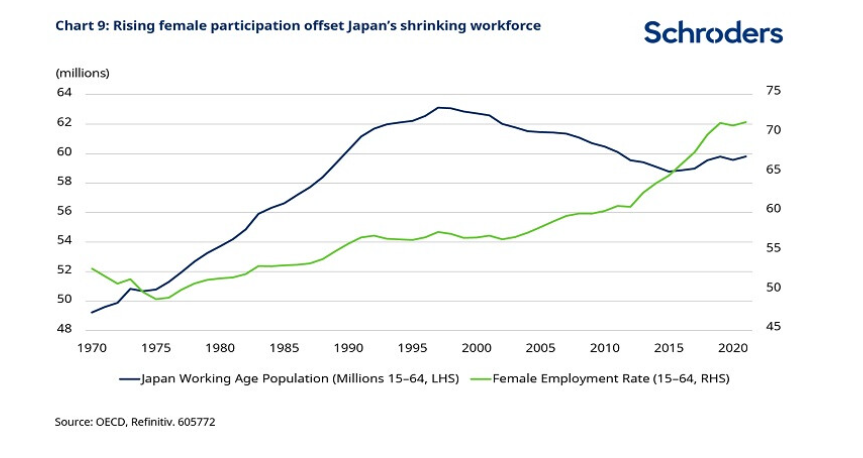
Source: Schroders
As the previous three slides documented, Japan has been working on its worker shortage for a number of years, without any major impact on its economy. But that is changing – as Chart 9 below shows, labor tightness is now working its way into the system as wages have moved significantly higher this year. This is significant as this also increases the impact on inflation, which has moved over 3% this year, the highest since the 1980s.
Japan’s aging population is going to cause obvious issues with funding its pension plan going forward but, as documented in our previous deep dive, Japanese debt is the Godzilla in the marketplace. Chart 10 shows Japan’s debt-to-GDP ratio – one of the highest among the advanced economies.
Chart 9
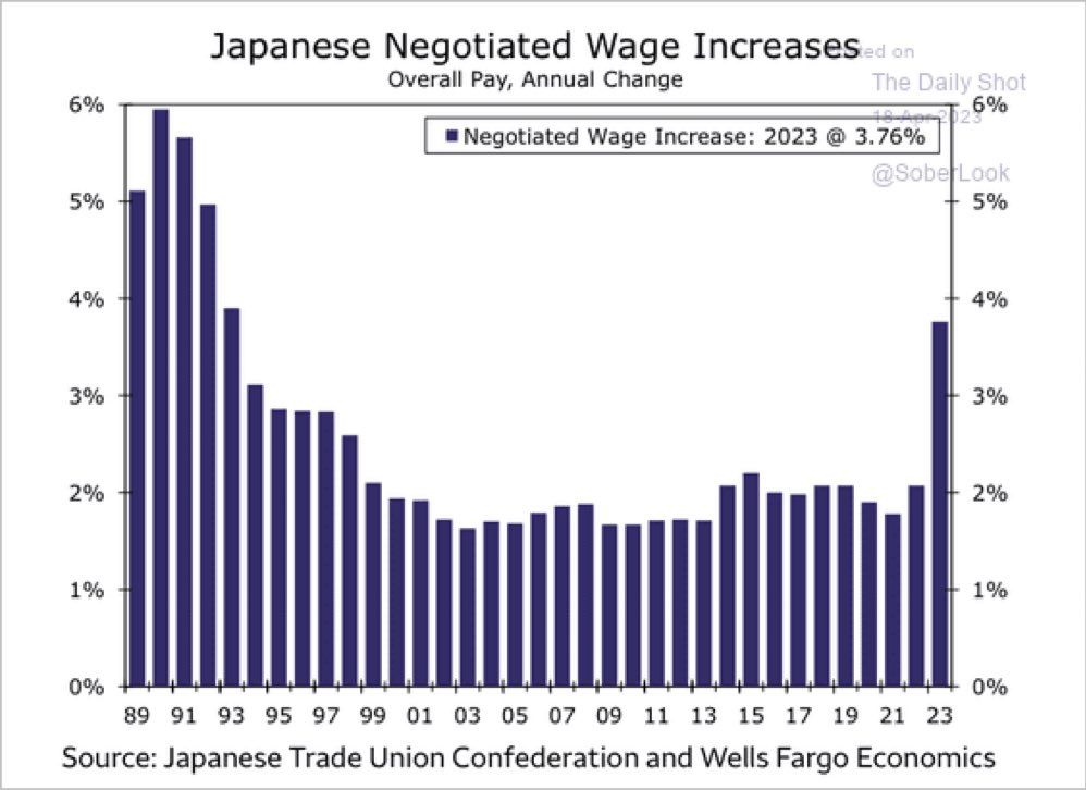
Source: The Daily Shot
Chart 10
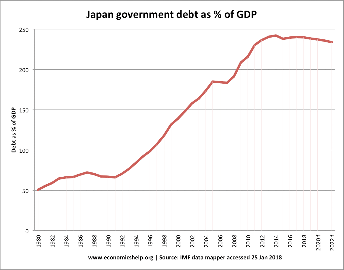
Source: economicshelp.org
As outlined in our opening, Eastern Europe has been another area of labor growth for the previous 25 years. Chart 11 shows a population pyramid similar to those that we have discussed for China and Japan. While their demographics in 2000 were very opportunistic, going forward it begins to get very top heavy, as can be seen in 2023 and then 2035 and beyond.
Chart 11
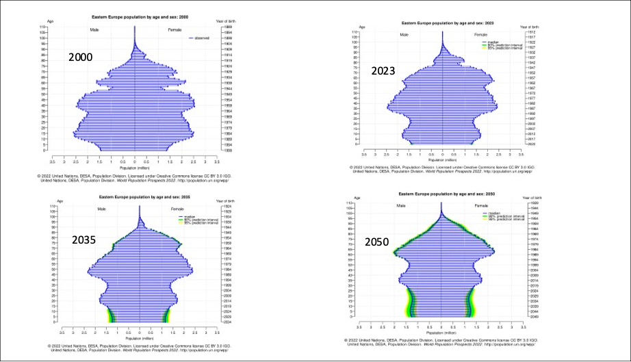
Source: UN
The aging issue is filtering into labor costs and inflation, as shown in Charts 12 and 13. From January 1, 2022 to January 1, 2023, Poland’s minimum wage increased 15.95% while its CPI index rose 15.35%. Hungary’s minimum wage growth was up 16% and CPI up 25%. Even Western Europe is getting impacted, with Germany’s minimum wage jumping 22.2% and its CPI up 9.61%.
I have argued in both this paper and in the previous one that we are in the early stages of a sea change in global economics and finance. The banking issues that have come to the forefront with duration mismatch and liquidity issues are just the tip of the iceberg. Commercial property markets are also showing stress, as what worked at zero interest rates does not work at the rates we have today.
Across the spectrum, people are waking up to the fact that the game is changing, and hope is being replaced by concern and fear, as it looks likely rates will stay higher for longer.
In our next deep dive, we will look closer at the demographics for Western Europe, Latin America and the US. Another area that marries in with our story is the building pension crisis caused by mis-investment based on low interest rates and adding too much risk in private equity, venture capital and other similar private investments that have delayed mark to markets for their investors.
Chart 12
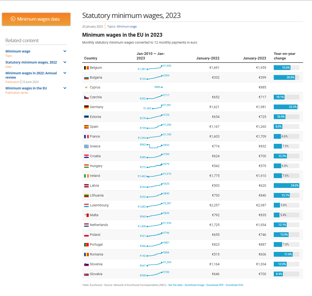
Source: Eurofound
Chart 13
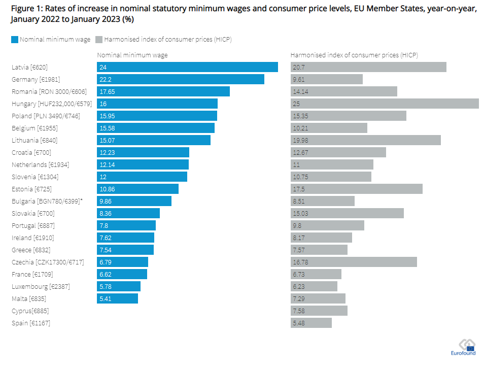
Source: Eurofound
Part III (Special Topic): Natural Gas
Natural Gas prices have fallen dramatically in both the US and global markets after the explosive run up last year after Russia invaded Ukraine and shut down exports into Western Europe. Chart 1 shows the spot price for Natural gas in the US (Orange), Netherlands (Green) and the UK (Blue) for the last few years.
Chart 2 shows the daily price going back about 20 years for US Henry Hub futures. As you can see, the $2.00 level has been the floor for prices over this time period. I will argue here that the fundamentals are still very supportive, and there is a long-term opportunity to be long Natural Gas via futures, options and equites.
Chart 3 and Chart 4 show storage levels for natural gas in both Europe and the US, and in both cases, they show ample storage levels for this time of year via the EIA website. In order to get a framework to work from—it is helpful to analyze why the market is in the current state — and what will change it.
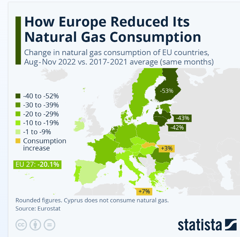
After Russia invaded Europe—there was tremendous demand destruction in order to ration supply. Chart 5 shows the demand destruction that occurred, with totals for all of EU down over 20%. The other factor keeping demand down last winter was Europe had its second warmest winter on record, based on data from NOAA.
Chart 1 Global natural gas prices
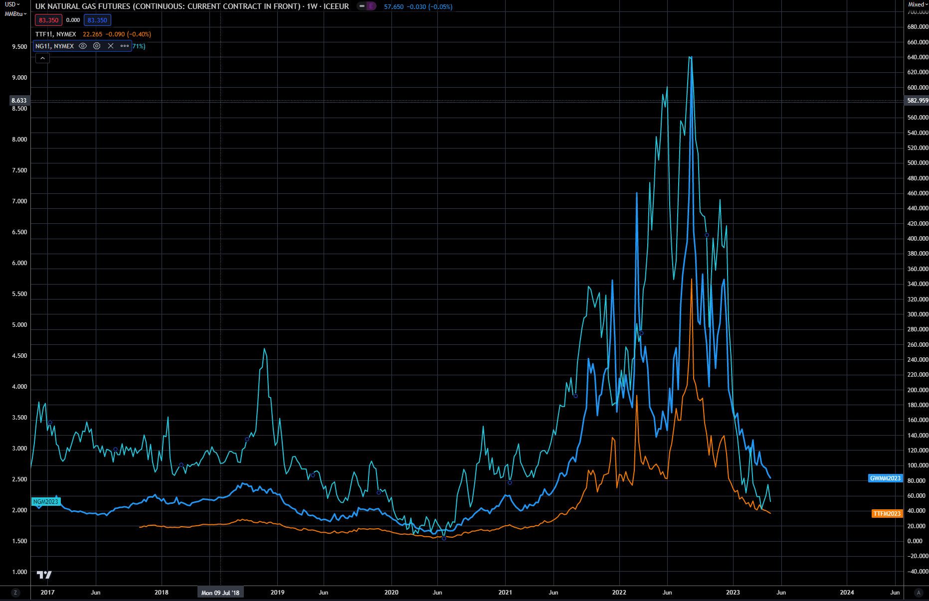
Chart 2—Daily Natural Gas prices basis Henry Hub
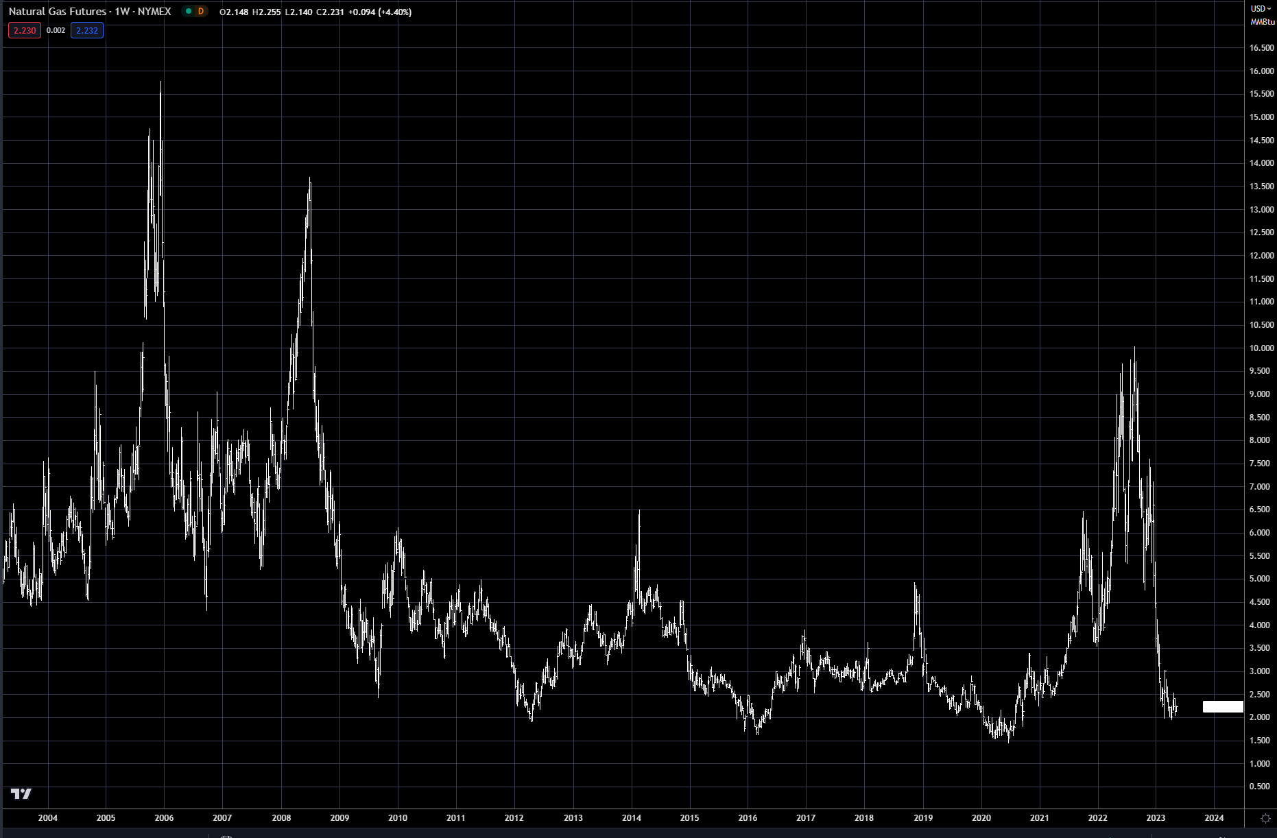
Chart 3
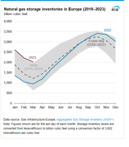
Chart 4
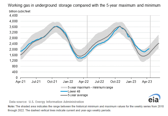
Chart 5
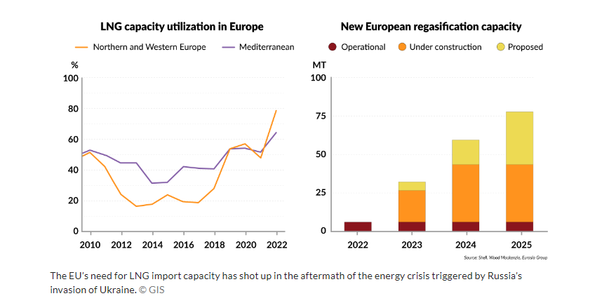
Another reason for the offset of supply from Russia was the amazing amount of infrastructure that was and is taking place for LNG in Europe — see Chart 6. Most of this infrastructure will be for forward demand, but there was a dramatic increase put in place last fall and winter.
Chart 6
https://www.gisreportsonline.com/r/eu-lng/
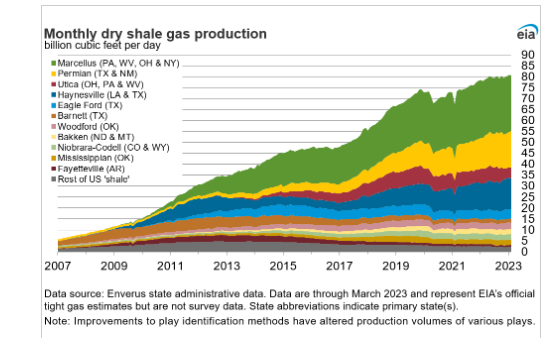
Another supportive area was in the US, as demand was quite weak in Jan/Feb due to warmer than normal weather shown in Chart 7. Helping support both the US and global demand during this crisis was the continuing growth of US shale production — see Chart 8.
Chart 7
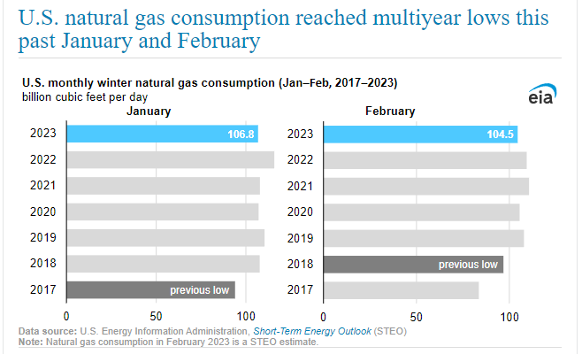
Source: EIA
Chart 8
To sum it up, massive demand destruction, second warmest winter on record, and LNG imports helped support a massive shortage. In other words—everything went perfect last winter to cover demand usage in the US, Europe and Asia. The question for 2023-2024 winter is—can this happen two years in a row, and will Russia still curtail production to Europe. I would argue that with prices at the very low end of the last 20-year price range—the risk here is LOW.
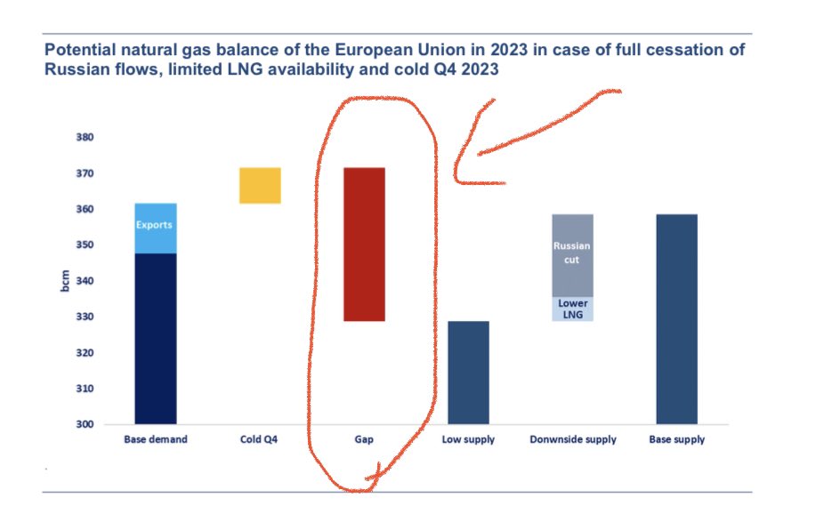
We also have supporting data from IEA data forecasting Natural Gas supply to remain tight this coming winter as shown in Chart 9 and in Chart 10, using worse case scenario analysis we can see the large potential supply gap in supply.
Part of the problem in making this trade is the large carry between current prices and forward Dec 2023 prices. The current price of Dec is trading at $3.50 verse June trading at $2.20. The only way to capture this spread is to be able to put gas in storage—and this is not an option for most investors. The premium that December price over June is based on cost of storage, interest, insurance and of course a risk premium.
Nevertheless, with June prices so low, I believe it warrants being long at these levels, and then rolling to the next contract prior to expiration. The roll cost will be most likely be negative—meaning when you sell the June the July price will be higher, but I think overall the trade upside and risk/reward still makes sense.
Chart 9
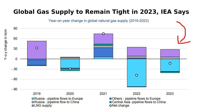
Chart 10
Trading Natural Gas producers via long equities is another way to express a bullish view. Below in Chart 11 — you can see how correlated the natural gas stocks have been to each other and they tend to follow the direction of the price of natural gas.
Chart 11
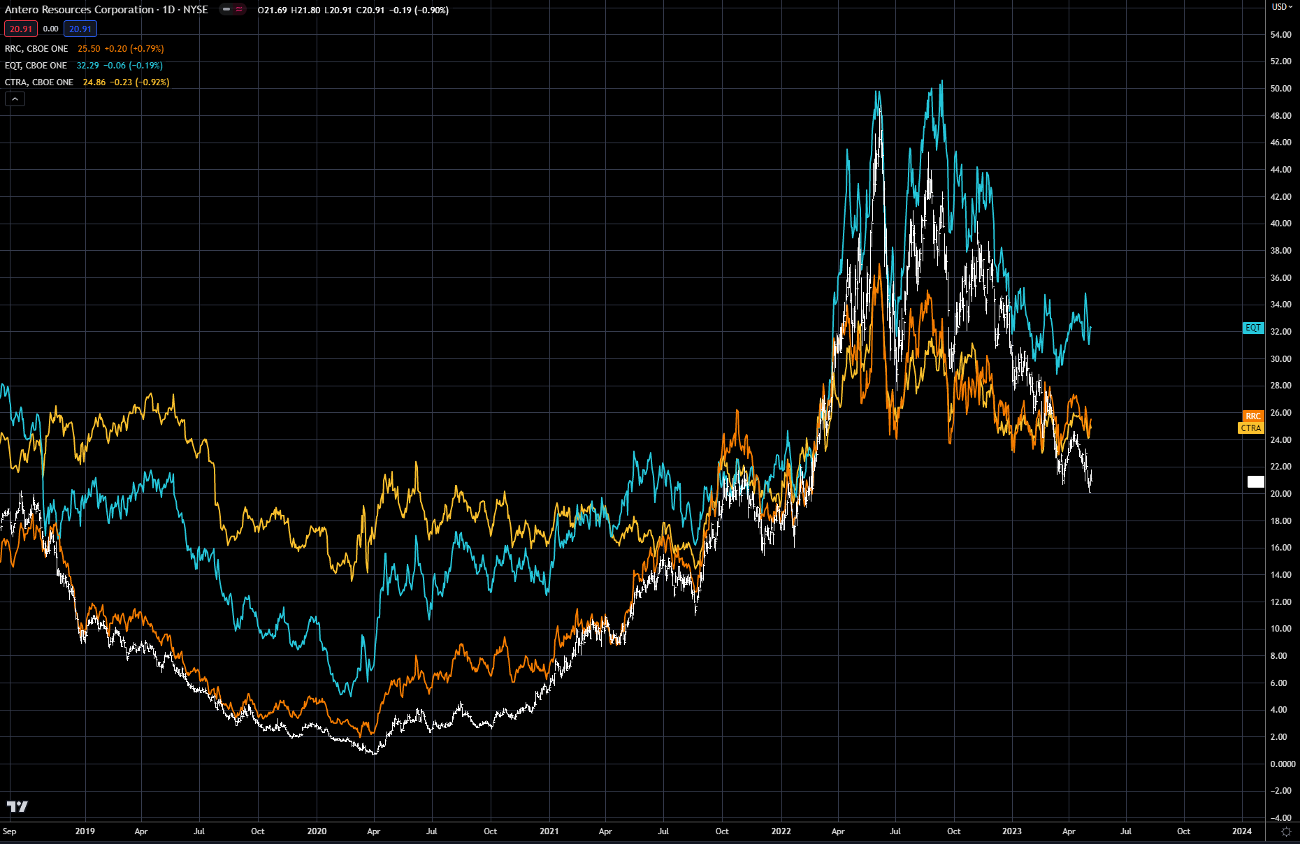
Antero Resources (AR) is in the white, Range Resources (RRC) is in the orange, EQT is in the blue and Coterra (CTRA) is in the yellow. EQT would be considered the best of these names, but if natural gas prices rally as expected they tend to be quite correlated as the last couple years price action shows. I would avoid natural gas ETF’s that track the underlying physical market—as their correlation is not great, due to the forward carry built into the natural gas prices—discussed earlier.
Another way to trade the bullish view on Nat gas is to buy a calendar bull spread via futures. These types of spreads tend to be very highly correlated to the price direction of the commodity—in this case natural gas. Chart 12 shows the forward curve for natural gas from June 2023 out to December 2024. As you can see the curve is steep or in carry/contango from June(M) 2023 until Jan(F) 2024 and then the prices drops off after peak demand is over. The shoulder months of winter or Feb (G) thru April (J) can be very volatile, with the March(H)/April(J) spread termed the widow maker for its demise of a number of trading shops.
Chart 12 Natural Gas Curve and Futures Symbols
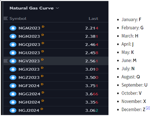
Source: TradingScreen
For this trade idea, the July/December calendar spread is the one I will be looking at. You could do others also, as the curve will tend to move together. In Chart 13 below the graph of the July/December spread is shown with the price of December ($3.50) and the price of July ($2.38)—Dec is trading at approx. a $1.12 premium to July. Our trade idea is to buy the spread, or buy the July and sell the Dec—with the expectations that it will narrow (fall in price) over time. This trade has about 4-6 weeks to work, after which we could take it off or roil the July to the next month August—keeping the sale of the December on.
The last chart—Chart 14 shows how correlated the July-December calendar spread is to the underlying futures price. You can see that they have moved together for the past year. The blue line is the July-December spread (inverted)(LHS) and the orange line is the July futures price (RHS)
One final note on these types of spreads—they are great ways to play market bottoms with less risk than just buying the outright (July Futures). In some cases, I may take off the short leg, or some of it, if my confidence becomes stronger that the low is in. I did not cover options on this trade idea, but Natural gas futures options are very liquid. I may add an option trade on Natural Gas and go over the dynamics of that in a future article.
Chart 13 NG Dec 2022-NG July 2022
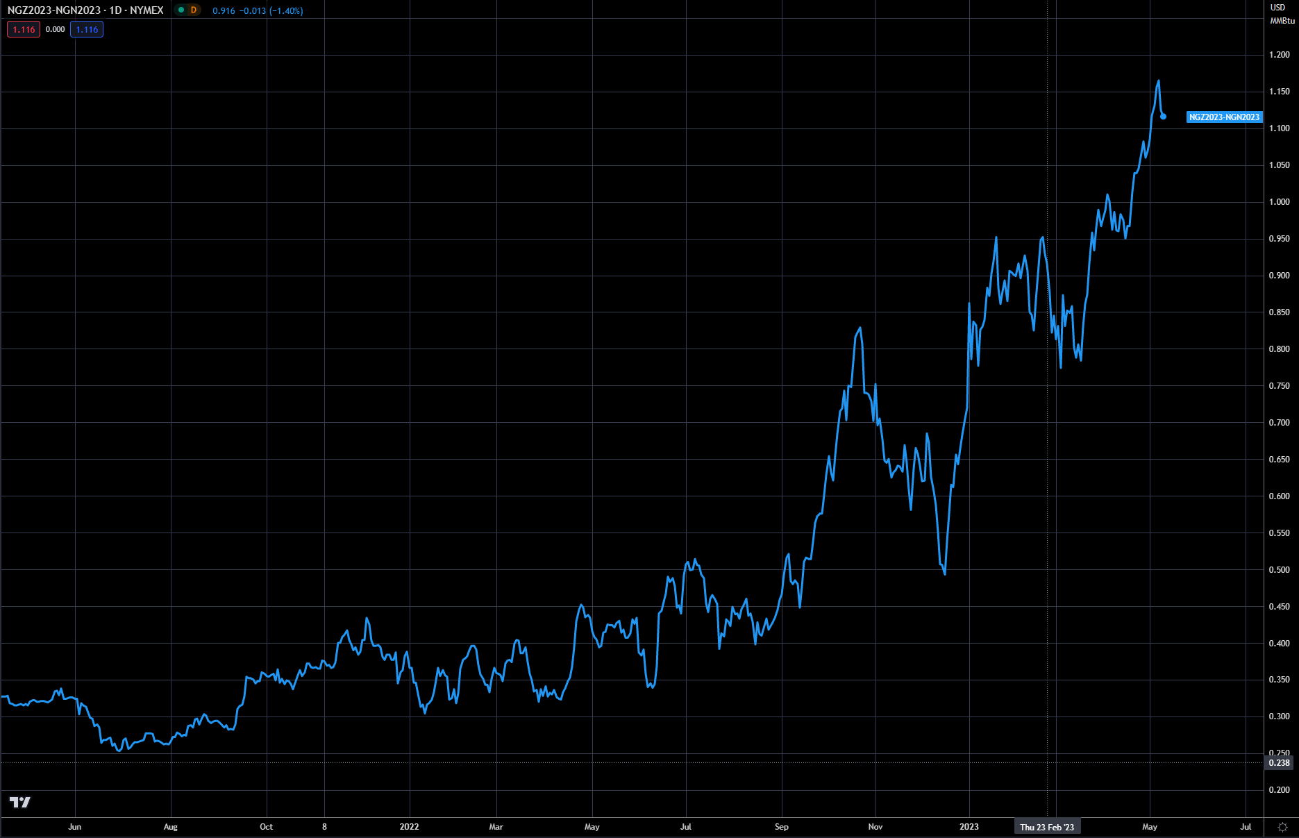
Source: TradingScreen
Chart 14-- Comparison between July futures and calendar spread(July/December)
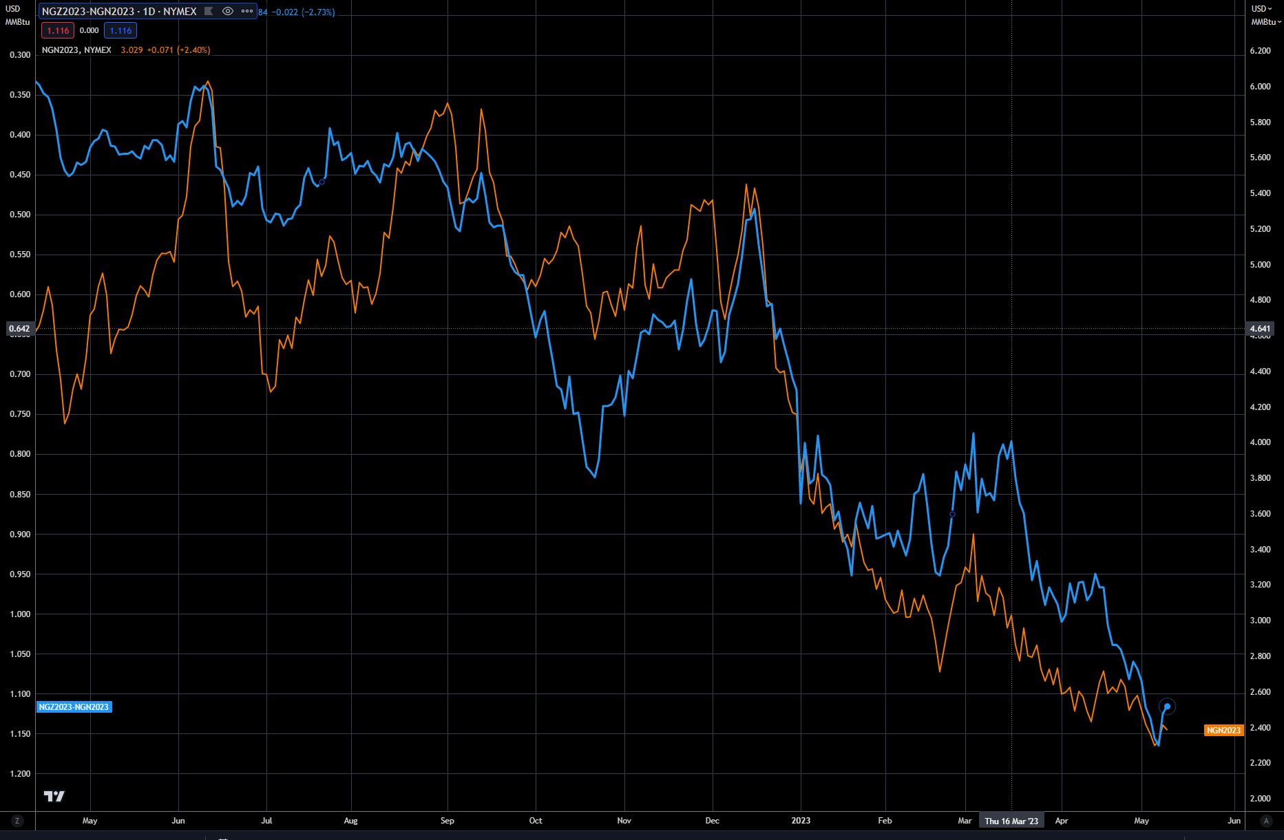
Source: TradingScreen
Trading strategy is based on the author's views and analysis as of the date of first publication. From time to time the author's views may change due to new information or evolving market conditions. Any major updates to the author's views will be published separately in the author's weekly commentary or a new deep dive.
This content is for educational purposes only and is NOT financial advice. Before acting on any information you must consult with your financial advisor.